class: center, middle, inverse, title-slide # Linear Regression ## Computational Mathematics and Statistics ### Jason Bryer, Ph.D. ### March 4, 2025 --- # One Minute Paper Results .pull-left[ **What was the most important thing you learned during this class?** <img src="08-Linear_Regression_files/figure-html/unnamed-chunk-2-1.png" style="display: block; margin: auto;" /> ] .pull-right[ **What important question remains unanswered for you?** <img src="08-Linear_Regression_files/figure-html/unnamed-chunk-3-1.png" style="display: block; margin: auto;" /> ] --- # SAT Scores We will use the SAT data for 162 students which includes their verbal and math scores. We will model math from verbal. Recall that the linear model can be expressed as: `$$y = mx + b$$` Or alternatively as: `$$y = {b}_{1}x + {b}_{0}$$` Where m (or `\(b_1\)`) is the slope and b (or `\(b_0\)`) is the intercept. Therefore, we wish to model: `$$SAT_{math} = {b}_{1}SAT_{verbal} + {b}_{0}$$` --- # Data Prep To begin, we read in the CSV file and convert the `Verbal` and `Math` columns to integers. The data file uses `.` (i.e. a period) to denote missing values. The `as.integer` function will automatically convert those to `NA` (the indicator for a missing value in R). Finally, we use the `complete.cases` eliminate any rows with any missing values. ``` r sat <- read.csv('../course_data/SAT_scores.csv', stringsAsFactors=FALSE) names(sat) <- c('Verbal','Math','Sex') sat$Verbal <- as.integer(sat$Verbal) sat$Math <- as.integer(sat$Math) sat <- sat[complete.cases(sat),] ``` --- # Scatter Plot The first step is to draw a scatter plot. We see that the relationship appears to be fairly linear. <img src="08-Linear_Regression_files/figure-html/scatterplot-1.png" style="display: block; margin: auto;" /> --- # Descriptive Statistics .pull-left[ Next, we will calculate the means and standard deviations. ``` r ( verbalMean <- mean(sat$Verbal) ) ``` ``` ## [1] 596.2963 ``` ``` r ( mathMean <- mean(sat$Math) ) ``` ``` ## [1] 612.0988 ``` ] .pull-right[ ``` r ( verbalSD <- sd(sat$Verbal) ) ``` ``` ## [1] 99.5199 ``` ``` r ( mathSD <- sd(sat$Math) ) ``` ``` ## [1] 98.13435 ``` ``` r ( n <- nrow(sat) ) ``` ``` ## [1] 162 ``` ] --- # Correlation The population correlation, rho, is defined as `\({ \rho }_{ xy }=\frac { { \sigma }_{ xy } }{ { \sigma }_{ x }{ \sigma }_{ y } }\)` where the numerator is the *covariance* of *x* and *y* and the denominator is the product of the two standard deviations. -- The sample correlation is calculated as `\({ r }_{ xy }=\frac { { Cov }_{ xy } }{ { s }_{ x }{ s }_{ y } }\)` -- The covariates is calculated as `\({ Cov }_{ xy }=\frac { \sum _{ i=1 }^{ n }{ \left( { X }_{ i }-\overline { X } \right) \left( { Y }_{ i }-\overline { Y } \right) } }{ n-1 }\)` -- ``` r (cov.xy <- sum( (sat$Verbal - verbalMean) * (sat$Math - mathMean) ) / (n - 1)) ``` ``` ## [1] 6686.082 ``` ``` r cov(sat$Verbal, sat$Math) ``` ``` ## [1] 6686.082 ``` --- # Correlation (cont.) `$${ r }_{ xy }=\frac { \frac { \sum _{ i=1 }^{ n }{ \left( { X }_{ i }-\overline { X } \right) \left( { Y }_{ i }-\overline { Y } \right) } }{ n-1 } }{ { s }_{ x }{ s }_{ y } }$$` ``` r cov.xy / (verbalSD * mathSD) ``` ``` ## [1] 0.6846061 ``` ``` r cor(sat$Verbal, sat$Math) ``` ``` ## [1] 0.6846061 ``` http://bcdudek.net/rectangles --- # z-Scores Calcualte z-scores (standard scores) for the verbal and math scores. $$ z=\frac { y-\overline { y } }{ s } $$ ``` r sat$Verbal.z <- (sat$Verbal - verbalMean) / verbalSD sat$Math.z <- (sat$Math - mathMean) / mathSD head(sat) ``` ``` ## Verbal Math Sex Verbal.z Math.z ## 1 450 450 F -1.47002058 -1.65180456 ## 2 640 540 F 0.43914539 -0.73469449 ## 3 590 570 M -0.06326671 -0.42899113 ## 4 400 400 M -1.97243268 -2.16131016 ## 5 600 590 M 0.03721571 -0.22518889 ## 6 610 610 M 0.13769813 -0.02138665 ``` --- # Scatter Plot of z-Scores Scatter plot of z-scores. Note that the pattern is the same but the scales on the x- and y-axes are different. <img src="08-Linear_Regression_files/figure-html/scatterzscores-1.png" style="display: block; margin: auto;" /> --- # Correlation Calculate the correlation manually using the z-score formula: `$$r=\frac { \sum { { z }_{ x }{ z }_{ y } } }{ n-1 }$$` ``` r r <- sum( sat$Verbal.z * sat$Math.z ) / ( n - 1 ) r ``` ``` ## [1] 0.6846061 ``` -- .pull-left[ Or the `cor` function in R is probably simplier. ``` r cor(sat$Verbal, sat$Math) ``` ``` ## [1] 0.6846061 ``` ] -- .pull-right[ And to show that the units don't matter, calculate the correlation with the z-scores. ``` r cor(sat$Verbal.z, sat$Math.z) ``` ``` ## [1] 0.6846061 ``` ] --- # Calculate the slope. `$$m = r\frac{S_y}{S_x} = r\frac{S_{math}}{S_{verbal}}$$` ``` r m <- r * (mathSD / verbalSD) m ``` ``` ## [1] 0.6750748 ``` --- # Calculate the intercept Recall that the point where the mean of x and mean of y intersect will be on the line of best fit). Therefore, `$$b = \overline{y} - m \overline{x} = \overline{SAT_{math}} - m \overline{SAT_{verbal}}$$` ``` r b <- mathMean - m * verbalMean b ``` ``` ## [1] 209.5542 ``` --- # Scatter Plot with Regression Line We can now add the regression line to the scatter plot. The vertical and horizontal lines represent the mean Verbal and Math SAT scores, respectively. <img src="08-Linear_Regression_files/figure-html/scatterwithregressionline-1.png" style="display: block; margin: auto;" /> --- # Examine the Residuals To examine the residuals, we first need to calculate the predicted values of y (Math scores in this example). ``` r sat$Math.predicted <- m * sat$Verbal + b sat$Math.predicted.z <- m * sat$Verbal.z + 0 head(sat, n=4) ``` ``` ## Verbal Math Sex Verbal.z Math.z Math.predicted Math.predicted.z ## 1 450 450 F -1.47002058 -1.6518046 513.3378 -0.99237384 ## 2 640 540 F 0.43914539 -0.7346945 641.6020 0.29645598 ## 3 590 570 M -0.06326671 -0.4289911 607.8483 -0.04270976 ## 4 400 400 M -1.97243268 -2.1613102 479.5841 -1.33153958 ``` --- # Examine the Residuals (cont.) The residuals are simply the difference between the observed and predicted values. ``` r sat$residual <- sat$Math - sat$Math.predicted sat$residual.z <- sat$Math.z - sat$Math.predicted.z head(sat, n=4) ``` ``` ## Verbal Math Sex Verbal.z Math.z Math.predicted Math.predicted.z residual residual.z ## 1 450 450 F -1.47002058 -1.6518046 513.3378 -0.99237384 -63.33782 -0.6594307 ## 2 640 540 F 0.43914539 -0.7346945 641.6020 0.29645598 -101.60203 -1.0311505 ## 3 590 570 M -0.06326671 -0.4289911 607.8483 -0.04270976 -37.84829 -0.3862814 ## 4 400 400 M -1.97243268 -2.1613102 479.5841 -1.33153958 -79.58408 -0.8297706 ``` --- # Scatter Plot with Residuals Plot our regression line with lines representing the residuals. The line of best fit minimizes the residuals. <img src="08-Linear_Regression_files/figure-html/scatterwithresiduals-1.png" style="display: block; margin: auto;" /> --- # Scatter Plot with Residuals Using the z-scores ensures that a 1-unit change in the *x*-axis is the same as a 1-unit change in the *y*-axis. This makes it easiert to plot the residuals as squares. <img src="08-Linear_Regression_files/figure-html/scatterplotwithresidualscquares-1.png" style="display: block; margin: auto;" /> --- # Minimizing Sum of Squared Residuals ## What does it mean to minimize the sum of squared residuals? To show that `\(m = r \frac{S_y}{S_x}\)` minimizes the sum of squared residuals, this loop will calculate the sum of squared residuals for varying values of between -1 and 1. ``` r results <- data.frame(r=seq(-1, 1, by=.05), m=as.numeric(NA), b=as.numeric(NA), sumsquares=as.numeric(NA)) for(i in 1:nrow(results)) { results[i,]$m <- results[i,]$r * (mathSD / verbalSD) results[i,]$b <- mathMean - results[i,]$m * verbalMean predicted <- results[i,]$m * sat$Verbal + results[i,]$b residual <- sat$Math - predicted sumsquares <- sum(residual^2) results[i,]$sumsquares <- sum(residual^2) } ``` --- # Minimizing the Sum of Squared Residuals Plot the sum of squared residuals for different slopes (i.e. r's). The vertical line corresponds to the r (slope) calcluated above and the horizontal line corresponds the sum of squared residuals for that r. This should have the smallest sum of squared residuals. <img src="08-Linear_Regression_files/figure-html/sumofsquares-1.png" style="display: block; margin: auto;" /> --- # Regression Line with RSS <img src="images/ols_animation.gif" style="display: block; margin: auto;" /> --- # Example of a "bad" model To exemplify how the residuals change, the following scatter plot picks one of the "bad" models and plot that regression line with the original, best fitting line. Take particular note how the residuals would be less if they ended on the red line (i.e. the better fitting model). This is particularly evident on the far left and far right, but is true across the entire range of values. ``` r b.bad <- results[1,]$b m.bad <- results[1,]$m sat$predicted.bad <- m.bad * sat$Verbal + b.bad ``` --- # Example of a "bad" model <img src="08-Linear_Regression_files/figure-html/scatterbadmodel-1.png" style="display: block; margin: auto;" /> --- # Residual Plot Next, we'll plot the residuals with the independent variable. In this plot we expect to see no pattern, bending, or clustering if the model fits well. The rug plot on the right and top given an indication of the distribution. Below, we will also examine the histogram of residuals. ``` r ggplot(sat, aes(x=Verbal, y=residual)) + geom_point() + geom_rug(sides='rt') ``` <img src="08-Linear_Regression_files/figure-html/residualplot-1.png" style="display: block; margin: auto;" /> --- # Scatter and Residual Plot, Together In an attempt to show the relationship between the predicted value and the residuals, this figures combines both the basic scatter plot with the residuals. Each Math score is connected with the corresponding residual point. <img src="08-Linear_Regression_files/figure-html/residualplot2-1.png" style="display: block; margin: auto;" /> --- # Histogram of residuals ``` r ggplot(sat, aes(x=residual)) + geom_histogram(alpha=.5, binwidth=25) ``` <img src="08-Linear_Regression_files/figure-html/histogramofresiduals-1.png" style="display: block; margin: auto;" /> --- # Calculate `\({R}^{2}\)` ``` r r ^ 2 ``` ``` ## [1] 0.4686855 ``` This model accounts for 46.9% of the variance math score predicted from verbal score. --- # Prediction Now we can predict Math scores from new Verbal. ``` r newX <- 550 (newY <- newX * m + b) ``` ``` ## [1] 580.8453 ``` <img src="08-Linear_Regression_files/figure-html/predictnew-1.png" style="display: block; margin: auto;" /> --- # Using R's built in function for linear modeling .code70[ The `lm` function in R will calculate everything above for us in one command. ``` r sat.lm <- lm(Math ~ Verbal, data=sat) summary(sat.lm) ``` ``` ## ## Call: ## lm(formula = Math ~ Verbal, data = sat) ## ## Residuals: ## Min 1Q Median 3Q Max ## -173.590 -47.596 1.158 45.086 259.659 ## ## Coefficients: ## Estimate Std. Error t value Pr(>|t|) ## (Intercept) 209.55417 34.34935 6.101 7.66e-09 *** ## Verbal 0.67507 0.05682 11.880 < 2e-16 *** ## --- ## Signif. codes: 0 '***' 0.001 '**' 0.01 '*' 0.05 '.' 0.1 ' ' 1 ## ## Residual standard error: 71.75 on 160 degrees of freedom ## Multiple R-squared: 0.4687, Adjusted R-squared: 0.4654 ## F-statistic: 141.1 on 1 and 160 DF, p-value: < 2.2e-16 ``` ] --- # Predicted Values, Revisited We can get the predicted values and residuals from the `lm` function ``` r sat.lm.predicted <- predict(sat.lm) sat.lm.residuals <- resid(sat.lm) ``` Confirm that they are the same as what we calculated above. .pull-left[ ``` r head(cbind(sat.lm.predicted, sat$Math.predicted), n=4) ``` ``` ## sat.lm.predicted ## 1 513.3378 513.3378 ## 2 641.6020 641.6020 ## 3 607.8483 607.8483 ## 4 479.5841 479.5841 ``` ] .pull-right[ ``` r head(cbind(sat.lm.residuals, sat$residual), n=4) ``` ``` ## sat.lm.residuals ## 1 -63.33782 -63.33782 ## 2 -101.60203 -101.60203 ## 3 -37.84829 -37.84829 ## 4 -79.58408 -79.58408 ``` ] --- # Residuals - Implications for Grouping Variables First, let's look at the scatter plot but with a sex indicator. <img src="08-Linear_Regression_files/figure-html/scattersex-1.png" style="display: block; margin: auto;" /> --- # Residual Plot by Sex And also the residual plot with an indicator for sex. <img src="08-Linear_Regression_files/figure-html/residualsex-1.png" style="display: block; margin: auto;" /> --- # Histograms The histograms also show that the distribution are different across sex. <img src="08-Linear_Regression_files/figure-html/residualhistogramsex-1.png" style="display: block; margin: auto;" /> --- # Grouping Variable Upon careful examination of these two figures, there is some indication there may be a difference between sexes. In the scatter plot, it appears that there is a cluster of males towoards the top left and a cluster of females towards the right. The residual plot also shows a cluster of males on the upper left of the cluster as well as a cluster of females to the lower right. Perhaps estimating two separate models would be more appropriate. To start, we create two data frames for each sex. ``` r sat.male <- sat[sat$Sex == 'M',] sat.female <- sat[sat$Sex == 'F',] ``` --- # Descriptive Statistics Calculate the mean for Math and Verbal for both males and females. .code80[ ``` r (male.verbal.mean <- mean(sat.male$Verbal)) ``` ``` ## [1] 590.375 ``` ``` r (male.math.mean <- mean(sat.male$Math)) ``` ``` ## [1] 626.875 ``` ``` r (female.verbal.mean <- mean(sat.female$Verbal)) ``` ``` ## [1] 602.0732 ``` ``` r (female.math.mean <- mean(sat.female$Math)) ``` ``` ## [1] 597.6829 ``` ] --- # Two Regression Models Estimate two linear models for each sex. .pull-left[ ``` r sat.male.lm <- lm(Math ~ Verbal, data=sat.male) sat.male.lm ``` ``` ## ## Call: ## lm(formula = Math ~ Verbal, data = sat.male) ## ## Coefficients: ## (Intercept) Verbal ## 250.1452 0.6381 ``` ] .pull-right[ ``` r sat.female.lm <- lm(Math ~ Verbal, data=sat.female) sat.female.lm ``` ``` ## ## Call: ## lm(formula = Math ~ Verbal, data = sat.female) ## ## Coefficients: ## (Intercept) Verbal ## 158.9965 0.7286 ``` ] --- # Two Regression Models Visualized We do in fact find that the intercepts and slopes are both fairly different. The figure below adds the regression lines to the scatter plot. <img src="08-Linear_Regression_files/figure-html/scattersexregression-1.png" style="display: block; margin: auto;" /> --- # `\(R^2\)` Let's compare the `\(R^2\)` for the three models. ``` r cor(sat$Verbal, sat$Math) ^ 2 ``` ``` ## [1] 0.4686855 ``` -- .pull-left[ ``` r cor(sat.male$Verbal, sat.male$Math) ^ 2 ``` ``` ## [1] 0.4710744 ``` ] .pull-right[ ``` r cor(sat.female$Verbal, sat.female$Math) ^ 2 ``` ``` ## [1] 0.5137626 ``` ] -- The `\(R^2\)` for the full model accounts for approximately 46.9% of the variance. By estimating separate models for each sex we can account for 47.1% and 51.4% of the variance for males and females, respectively. --- # Examining Possible Outliers Re-examining the histogram of residuals, there is one data point with a residual higher than the rest. This is a possible outlier. In this section we'll examine how that outlier may impact our linear model. <img src="08-Linear_Regression_files/figure-html/histogramoutlier-1.png" style="display: block; margin: auto;" /> --- # Possible Outlier We can extract that record from our data frame. We can also highlight that point on the scatter plot. ``` r sat.outlier <- sat[sat$residual > 200,] sat.outlier ``` ``` ## Verbal Math Sex Verbal.z Math.z Math.predicted Math.predicted.z residual residual.z predicted.bad ## 162 490 800 F -1.068091 1.914735 540.3408 -0.7210412 259.6592 2.635776 716.9152 ``` <img src="08-Linear_Regression_files/figure-html/scatteroutlier-1.png" style="display: block; margin: auto;" /> --- # Possible Outlier (cont.) We see that excluding this point changes model slightly. With the outlier included we can account for 45.5% of the variance and by excluding it we can account for 47.9% of the variance. Although excluding this point improves our model, this is an insufficient enough reason to do so. Further explenation is necessary. .pull-left[ ``` r (sat.lm <- lm(Math ~ Verbal, data=sat)) ``` ``` ## ## Call: ## lm(formula = Math ~ Verbal, data = sat) ## ## Coefficients: ## (Intercept) Verbal ## 209.5542 0.6751 ``` ] .pull-right[ ``` r (sat.lm2 <- lm(Math ~ Verbal, data=sat[sat$residual < 200,])) ``` ``` ## ## Call: ## lm(formula = Math ~ Verbal, data = sat[sat$residual < 200, ]) ## ## Coefficients: ## (Intercept) Verbal ## 197.4697 0.6926 ``` ] --- # `\(R^2\)` with and without the outlier ``` r summary(sat.lm)$r.squared ``` ``` ## [1] 0.4686855 ``` ``` r summary(sat.lm2)$r.squared ``` ``` ## [1] 0.5013288 ``` --- # More outliers For the following two examples, we will add outliers to examine how they would effect our models. In the first example, we will add an outlier that is close to our fitted model (i.e. a small residual) but lies far away from the cluster of points. As we can see below, this single point increases our `\(R^2\)` by more than 5%. ``` r outX <- 1200 outY <- 1150 sat.outlier <- rbind(sat[,c('Verbal','Math')], c(Verbal=outX, Math=outY)) ``` --- # Regression Models .pull-left[ ``` r (sat.lm <- lm(Math ~ Verbal, data=sat)) ``` ``` ## ## Call: ## lm(formula = Math ~ Verbal, data = sat) ## ## Coefficients: ## (Intercept) Verbal ## 209.5542 0.6751 ``` ] .pull-right[ ``` r (sat.lm2 <- lm(Math ~ Verbal, data=sat.outlier)) ``` ``` ## ## Call: ## lm(formula = Math ~ Verbal, data = sat.outlier) ## ## Coefficients: ## (Intercept) Verbal ## 186.372 0.715 ``` ] --- # Scatter Plot <img src="08-Linear_Regression_files/figure-html/scatteroutlier1-1.png" style="display: block; margin: auto;" /> --- # `\(R^2\)` ``` r summary(sat.lm)$r.squared ``` ``` ## [1] 0.4686855 ``` ``` r summary(sat.lm2)$r.squared ``` ``` ## [1] 0.5443222 ``` --- # Outliers Outliers can have the opposite effect too. In this example, our `\(R^2\)` is decreased by almost 16%. ``` r outX <- 300 outY <- 1150 sat.outlier <- rbind(sat[,c('Verbal','Math')], c(Verbal=outX, Math=outY)) ``` .pull-left[ ``` r (sat.lm <- lm(Math ~ Verbal, data=sat)) ``` ``` ## ## Call: ## lm(formula = Math ~ Verbal, data = sat) ## ## Coefficients: ## (Intercept) Verbal ## 209.5542 0.6751 ``` ] .pull-right[ ``` r (sat.lm2 <- lm(Math ~ Verbal, data=sat.outlier)) ``` ``` ## ## Call: ## lm(formula = Math ~ Verbal, data = sat.outlier) ## ## Coefficients: ## (Intercept) Verbal ## 290.8915 0.5459 ``` ] --- <img src="08-Linear_Regression_files/figure-html/unnamed-chunk-35-1.png" style="display: block; margin: auto;" /> --- # `\(R^2\)` ``` r summary(sat.lm)$r.squared ``` ``` ## [1] 0.4686855 ``` ``` r summary(sat.lm2)$r.squared ``` ``` ## [1] 0.2726476 ``` --- # NYS Report Card NYS publishes data for each school in the state. We will look at the grade 8 math scores for 2012 and 2013. 2013 was the first year the tests were aligned with the Common Core Standards. There was a lot of press about how the passing rates for most schools dropped. Two questions we wish to answer: 1. Did the passing rates drop in a predictable manner? 2. Were the drops different for charter and public schools? ``` r load('../course_data/NYSReportCard-Grade7Math.Rda') names(reportCard) ``` ``` ## [1] "BEDSCODE" "School" "NumTested2012" "Mean2012" "Pass2012" "Charter" "GradeSubject" ## [8] "County" "BOCES" "NumTested2013" "Mean2013" "Pass2013" ``` --- # `reportCard` Data Frame .font70[ <div class="datatables html-widget html-fill-item" id="htmlwidget-e990a8438cb4fdda7441" style="width:100%;height:auto;"></div> <script type="application/json" data-for="htmlwidget-e990a8438cb4fdda7441">{"x":{"filter":"none","vertical":false,"fillContainer":false,"data":[["010100010020","010100010030","010100010045","010100860867","010100860876","010201040001","010306060007","010402060008","010500010008","010601060012","010601060013","010615020001","010623060009","010701030001","010802060008","011003060003","011200010010","020101040002","020601040001","020702040001","020801040001","021102040001","021601040004","022001040001","022101040001","022302040004","022401040003","022601060002","022902040001","030101060004","030200010015","030200010016","030501040003","030601060005","030701060005","031101060005","031301040003","031401060002","031501060009","031502060005","031601060041","031701060004","040204040001","040302060004","040901040002","041101040002","041401040001","042302040004","042400010016","042801060005","042901040002","043001040002","043011020001","043501060004","050100010009","050301040002","050401040002","051101040004","051301040003","051901040005","060201060006","060301040004","060401040006","060503040001","060601040003","060701040003","060800010010","061101040007","061501040002","061503040003","061601040001","061700010006","061700010010","061700010012","062201060002","062301040003","062401040001","062601040003","062901040004","070600010018","070600010019","070901060010","070902060004","080101040003","080201040001","080601040004","081003040003","081200050003","081401040001","081501040001","082001040003","090201040005","090301060005","090501040007","090601020002","090901040002","091101060006","091200010005","091402060007","100308020001","100501040005","101001040006","101300010001","101401040006","101601040003","110101040003","110200010011","110304040002","110701060006","110901040001","120102040001","120301040001","120401040001","120501040004","120701040001","120906040002","121401040001","121502040001","121601060005","121701040001","121702040001","121901040003","130200010004","130502020004","130801060006","131101040007","131201040003","131301040004","131500010011","131601060007","131601060012","131601060015","131602020004","131701060004","131801040003","132101060009","132101060010","132201040001","140101060005","140201060001","140203060001","140203060009","140203060012","140203060015","140207060005","140301030004","140600010001","140600010003","140600010006","140600010018","140600010019","140600010027","140600010031","140600010032","140600010033","140600010037","140600010039","140600010042","140600010043","140600010053","140600010056","140600010059","140600010066","140600010069","140600010072","140600010074","140600010076","140600010080","140600010081","140600010093","140600010094","140600010097","140600010102","140600010107","140600010118","140600010119","140600010122","140600010129","140600010130","140600010133","140600010308","140600860817","140600860838","140600860851","140600860853","140600860856","140600860861","140600860874","140600860896","140701060007","140701060008","140702030005","140703020004","140707030004","140709030003","140801060008","141101060004","141201060001","141301060005","141401060009","141501060005","141601060006","141604060007","141800010005","141800860044","141901060007","142101040003","142201040001","142301060002","142500010009","142601030003","142601030011","142601030022","142601860031","142801060005","142801060011","150203040001","150301040001","150601040001","150801040001","150901040004","151001040001","151102040001","151401040001","151501060007","151601040001","151701040001","160101060001","160801040002","161201040005","161401060003","161501060015","161601040002","161801040001","170301020001","170500010008","170600010007","170801040002","170901040001","171001040001","171102040003","180202040003","180300010005","180901040002","181001060002","181101040001","181201040001","181302040002","190301040004","190401060007","190501040004","190701040001","190901040001","191401040001","200401040001","200601040001","200701040001","200901040001","210302040003","210402060005","210501060005","210502040001","210601060005","210800050006","211003040004","211103040001","211701040001","211901020001","212001040005","220101040006","220202040002","220301060008","220401040004","220701040004","220909040010","221001040001","221301040001","221401040001","222000010013","222201060011","230201040001","230301040002","230901040003","231101040006","231301040004","240101040003","240201040003","240401040001","240801060003","240901040001","241001060003","241101040001","241701040004","250109040001","250201060001","250301040001","250401040004","250701040001","250901060004","251101040003","251400010008","251501040001","251601060003","260101060008","260401060004","260501060013","260501060020","260501060023","260801060012","260803060002","260901060005","261001060005","261101060005","261201060008","261301060002","261301060004","261313030002","261401060008","261401060011","261501060008","261600010003","261600010004","261600010005","261600010008","261600010016","261600010017","261600010019","261600010029","261600010044","261600010045","261600010058","261600010061","261600010066","261600010068","261600010069","261600010073","261600010074","261600010089","261600010101","261600860811","261600860877","261600860906","261600860910","261600860985","261701060014","261701060015","261801060005","261901060007","261901060010","262001040003","270100010009","270301040003","270601040003","270701040003","271102040004","280100010008","280201030010","280202030008","280202030009","280203030008","280203030009","280205030010","280205030013","280206030005","280208030009","280208860024","280209030006","280210030012","280211030009","280212030006","280214030006","280215030008","280218030006","280219030002","280220030005","280220030006","280221030002","280223030006","280226030002","280227030004","280231020001","280251070001","280251070002","280251070003","280252070002","280252070003","280252070004","280252070005","280252070006","280253070002","280253070004","280300010006","280401030006","280402030002","280403030009","280404030008","280406030005","280407030012","280407030013","280409030007","280410030007","280411030003","280501060005","280502060011","280502060012","280503060002","280504060006","280504060014","280506060002","280515030006","280517030011","280518030001","280521030008","280522030008","280523030010","310100010034","310100010140","310100010184","310100010188","310100010301","310100010332","310100010345","310100010378","310100010839","310100011292","310100011450","310100011539","310100860866","310200010104","310200010111","310200010114","310200010126","310200010131","310200010167","310200010217","310200010255","310200010260","310200010276","310200010289","310200010312","310200010347","310200010413","310200010896","310200011225","310200011407","310200011408","310200011422","310200011442","310200011655","310300010054","310300010076","310300010149","310300010165","310300010180","310300010191","310300010243","310300010245","310300010247","310300010250","310300010256","310300010258","310300010333","310300010334","310300010421","310300010862","310300011415","310300011859","310300011860","310300860871","310300860881","310400010007","310400010012","310400010013","310400010045","310400010050","310400010057","310400010096","310400010108","310400010171","310400010224","310400010372","310400010377","310400010406","310400010825","310400011381","310400011610","310400860812","310400860849","310500010046","310500010123","310500010129","310500010161","310500010286","310500010302","310500010410","310500011362","310500011367","310500011469","310500011499","310500011670","310500860848","310500860858","310500860864","310500860883","310500860886","310500860894","310500860928","310500860989","310600010018","310600010052","310600010143","310600010187","310600010210","310600010218","310600010223","310600010278","310600010311","310600010319","310600010322","310600010324","310600010326","310600010328","310600010349","310600010528","310600011293","310600011346","310600011348","310600860887","310600860929","320700010029","320700010031","320700010151","320700010162","320700010203","320700010223","320700010224","320700010296","320700010298","320700010343","320700011221","320700011500","320700011551","320700860820","320800010071","320800010101","320800010123","320800010125","320800010131","320800010301","320800010302","320800010337","320800010366","320800010371","320800010375","320800010424","320800010448","320800010467","320800011269","320800011367","320800011376","320800860903","320900010004","320900010022","320900010117","320900010128","320900010145","320900010215","320900010218","320900010219","320900010229","320900010232","320900010303","320900010313","320900010323","320900010325","320900010327","320900010328","320900010339","320900010454","320900011241","320900011324","320900011413","320900011505","320900860807","320900860823","320900860835","320900860839","321000010003","321000010015","321000010020","321000010037","321000010045","321000010080","321000010095","321000010118","321000010206","321000010225","321000010228","321000010244","321000010254","321000010279","321000010280","321000010308","321000010315","321000010331","321000010363","321000010368","321000010390","321000010391","321000010447","321000011141","321000011243","321000011342","321000011459","321100010019","321100010083","321100010089","321100010127","321100010142","321100010144","321100010175","321100010180","321100010181","321100010194","321100010287","321100010289","321100010322","321100010326","321100010370","321100010462","321100010468","321100010498","321100011270","321100011272","321100860859","321100860956","321200010098","321200010129","321200010190","321200010211","321200010212","321200010214","321200010217","321200010242","321200010273","321200010286","321200010316","321200010318","321200010341","321200010372","321200010383","321200010384","321200011267","321200011271","321200860870","321200860965","331300010103","331300010113","331300010265","331300010266","331300010282","331300010301","331300010313","331300010596","331300010691","331300011492","331300011527","331300860810","331300860902","331400010050","331400010126","331400010318","331400010577","331400010582","331400011071","331400011330","331400011586","331400011614","331400860825","331400860885","331500010051","331500010088","331500010136","331500010442","331500010443","331500010447","331500010448","331500010821","331500011429","331500011464","331500011497","331500860878","331500860935","331500860953","331600010035","331600010057","331600010262","331600010267","331600010308","331600010385","331600010393","331600010534","331600010584","331600860847","331600860860","331600860918","331700010002","331700010061","331700010138","331700010161","331700010181","331700010189","331700010246","331700010334","331700010340","331700010352","331700010353","331700010354","331700010394","331700010484","331700010587","331700011382","331700011531","331700011533","331700011543","331700011590","331700860841","331700860879","331700860882","331700860951","331800010066","331800010068","331800010211","331800010235","331800010285","331800010366","331800010581","331800010588","331800010598","331800860908","331900010089","331900010166","331900010171","331900010174","331900010202","331900010218","331900010292","331900010302","331900010306","331900010311","331900010328","331900010364","331900010452","331900010678","331900011409","331900860880","331900860891","332000010030","332000010062","332000010104","332000010163","332000010180","332000010187","332000010192","332000010201","332000010220","332000010223","332000010227","332000010229","332000010259","332000011609","332100010095","332100010096","332100010098","332100010099","332100010121","332100010209","332100010225","332100010226","332100010228","332100010238","332100010239","332100010281","332100010288","332100010303","332100011468","332100011690","332100860949","332200010014","332200010078","332200010109","332200010206","332200010207","332200010234","332200010240","332200010278","332200010381","332300010041","332300010073","332300010137","332300010155","332300010165","332300010178","332300010184","332300010284","332300010298","332300010323","332300010327","332300010392","332300010518","332300010522","332300010634","332300010671","332300011493","332300011644","332300011697","332300860939","333200010162","333200010291","333200010296","333200010347","333200010349","333200010377","333200010383","333200010384","333200011554","333200860906","342400010005","342400010049","342400010061","342400010073","342400010077","342400010087","342400010093","342400010102","342400010113","342400010119","342400010125","342400010128","342400011560","342500010025","342500010164","342500010185","342500010189","342500010194","342500010200","342500010219","342500010237","342500010250","342500010294","342500011252","342500011281","342500011285","342500011499","342600010067","342600010074","342600010158","342600010172","342600010178","342600010216","342600010266","342700010042","342700010043","342700010047","342700010053","342700010105","342700010114","342700010124","342700010137","342700010146","342700010183","342700010202","342700010207","342700010210","342700010226","342700010232","342700010282","342700010318","342700010319","342700010323","342700010333","342700011262","342700011309","342800010008","342800010072","342800010157","342800010190","342800010217","342800011167","342800011284","342800011310","342800011680","342800011896","342900010059","342900010109","342900010116","342900010138","342900010147","342900010156","342900010192","342900010208","342900010238","342900010268","342900010270","342900010295","342900011259","342900011283","342900011327","343000010010","343000010084","343000010111","343000010122","343000010126","343000010127","343000010141","343000010145","343000010204","343000010230","343000010235","343000011227","343000011286","343000011580","343000860822","343000860836","353100010002","353100010007","353100010024","353100010027","353100010034","353100010049","353100010051","353100010061","353100010063","353100010072","353100010075","353100010861","353100011080","353100860959","353100860984","400301060005","400400010010","400601060008","400701060009","400800010040","400800010041","400900010012","401001060004","401201060004","401301040003","401501060003","410401060001","410601040010","411101060004","411501060006","411504020001","411603040004","411701040002","411800010010","411902040003","412000050007","412201060001","412300010022","412300010023","412801040004","412901040003","412902060006","420101060008","420101060011","420303060009","420303060011","420401060010","420411060005","420501060004","420601040003","420701060004","420702030007","420807040002","420807040003","420901060009","421001060005","421001060006","421101060004","421201040003","421501060002","421501060005","421501060014","421504020001","421601060005","421800010003","421800010008","421800010010","421800010015","421800010020","421800010022","421800010025","421800010031","421800010035","421800010048","421800010058","421800010060","421800860845","421800860854","421902040001","430300050004","430501040002","430700010005","430901060003","431101040003","431201040002","431301060002","431401040002","431701060002","440102060004","440201020001","440301060005","440401060004","440401060007","440601040004","440901040004","441000010010","441000010014","441101040003","441201060009","441301060006","441600010003","441600010016","441600010020","441600010021","441800050005","441903020002","442101060003","442111020001","442115020001","450101060005","450607040002","450704040001","450801060003","451001040002","460500010006","460701040001","460801060008","460901060005","461300010007","461801040004","461901040003","462001060004","470202040003","470501040001","470801040001","470901040001","471101040001","471201040001","471400010007","471601040006","471701040003","472001040001","472202040001","472506040001","480101060004","480102060007","480401040001","480404020001","480503040002","480601060005","490101040004","490202040002","490301060008","490501060003","490601060002","490804020002","491200010007","491302060006","491401040003","491501040004","491700010021","491700860931","500101060020","500101060022","500101060023","500108030003","500301060008","500304030007","500308030009","500401060011","500402060013","500402060015","510101040001","510201060004","510401040001","510501040001","511101060005","511201040001","511301040002","511602040002","511901040001","512001060009","512101040001","512201040003","512300010009","512404040001","512501040004","512902060004","513102040002","520101060005","520302060008","520302060009","520302060011","520401040008","520701040002","521200050003","521301060005","521401040002","521800010015","522001040003","522101030004","530101040003","530202060007","530301060006","530301060008","530501060004","530515060003","530600010008","530600010024","530600010034","540801040001","540901040001","541001040003","541102060004","541201040003","541401040001","550101040003","550301060003","560603040001","560701060005","561006060003","570101040002","570201040002","570302060004","570401040001","570603040002","571000010014","571000010015","571800010008","571901040004","572301040001","572702040002","572901040004","573002040003","580101030002","580102030007","580103030002","580104030011","580105030006","580106030004","580107030009","580109020004","580201060009","580201060010","580203020004","580205060007","580205060011","580205060021","580205060022","580206020002","580207020002","580208020001","580209020004","580211060009","580211060011","580212060006","580224030006","580224030007","580224030011","580232030010","580232030012","580233020002","580234020001","580235060004","580301020003","580304020001","580305020004","580306020001","580401020005","580402060004","580403030014","580404030007","580404030008","580405060008","580405060014","580406060005","580410030019","580413030013","580501030007","580502020004","580503030008","580504030005","580505020006","580506030005","580507060010","580507060011","580509030010","580509030011","580512030015","580512030016","580512030020","580512030021","580513030008","580601040004","580602040006","580603020001","580701020001","580801060016","580801060019","580801060024","580805060007","580902020004","580905020004","580906030002","580909020001","580912060001","580913080001","581004020001","581005020003","581010020001","581012020001","590501060002","590801040001","590901060006","591201040003","591301040001","591302040004","591401060006","591502040004","600101060005","600301040002","600402040001","600601060006","600801040001","600903040004","610301060008","610327020002","610501040003","610600010014","610600010015","610600010019","610801040003","610901040004","611001040001","620600010020","620600010025","620803040003","621001060004","621101060004","621201060006","621601060005","621801060006","622002060005","630101040001","630202040001","630300010006","630601040001","630701040003","630801040003","630902030003","631201040001","640101040001","640502040001","640601020001","640701040003","640801040002","641001040001","641301060002","641501040001","641610040003","641701060002","650101060005","650301040004","650501040003","650701040002","650801060005","650901060004","650902040003","651201060004","651402040001","651501060004","651503040004","660101030005","660102060005","660202030002","660203060007","660301030005","660302030003","660303030004","660401030007","660402020003","660403030003","660404030002","660405030002","660406030003","660407060005","660409020003","660410020001","660411020003","660501060009","660701030005","660801060007","660802040001","660803020001","660803020003","660803020004","660804020002","660804020003","660805030005","660806020001","660809030004","660900010022","660900010023","661004060003","661004060006","661100010013","661100010014","661201060007","661301040003","661401030006","661402020004","661500010010","661601030006","661800010005","661901030004","661904030010","661905020003","662001030011","662101060004","662200010012","662300010001","662300010002","662300010005","662300010007","662300010008","662300010015","662300010018","662300010023","662300010026","662300010028","662300010029","662300010030","662300010033","662300010036","662300010044","662300010046","662300010047","662300010055","662300010056","662300860862","662401060008","662402060002","670201060004","671002040001","671201060003","671501040002","680601060002","680801040001"],["NORTH ALBANY ACADEMY","WILLIAM S HACKETT MIDDLE SCHOOL","STEPHEN AND HARRIET MYERS MIDDLE SCHOOL","KIPP TECH VALLEY CHARTER SCHOOL","ACHIEVEMENT ACADEMY CHARTER SCHOOL","BERNE-KNOX-WESTERLO JUNIOR-SENIOR HIGH SCHOOL","BETHLEHEM CENTRAL MIDDLE SCHOOL","RAVENA-COEYMANS-SELKIRK MIDDLE SCHOOL","COHOES MIDDLE SCHOOL","SAND CREEK MIDDLE SCHOOL","LISHA KILL MIDDLE SCHOOL","MENANDS SCHOOL","SHAKER JUNIOR HIGH SCHOOL","HEATLY SCHOOL","FARNSWORTH MIDDLE SCHOOL","VOORHEESVILLE MIDDLE SCHOOL","WATERVLIET JUNIOR-SENIOR HIGH SCHOOL","ALFRED-ALMOND JUNIOR-SENIOR HIGH SCHOOL","ANDOVER SCHOOL","GENESEE VALLEY CENTRAL SCHOOL","BELFAST SCHOOL","CANASERAGA SCHOOL","FRIENDSHIP CENTRAL SCHOOL","FILLMORE CENTRAL SCHOOL","WHITESVILLE CENTRAL SCHOOL","CUBA-RUSHFORD MIDDLE SCHOOL","SCIO CENTRAL SCHOOL","WELLSVILLE MIDDLE SCHOOL","BOLIVAR-RICHBURG JUNIOR-SENIOR HIGH SCHOOL","CHENANGO FORKS MIDDLE SCHOOL","EAST MIDDLE SCHOOL","WEST MIDDLE SCHOOL","HARPURSVILLE JUNIOR-SENIOR HIGH SCHOOL","RICHARD T STANK MIDDLE SCHOOL","CHENANGO VALLEY MIDDLE SCHOOL","MAINE-ENDWELL MIDDLE SCHOOL","DEPOSIT MIDDLE-SENIOR HIGH SCHOOL","TIOUGHNIOGA RIVERSIDE ACADEMY","JENNIE F SNAPP MIDDLE SCHOOL","JOHNSON CITY MIDDLE SCHOOL","VESTAL MIDDLE SCHOOL","A F PALMER ELEMENTARY SCHOOL / WINDSOR CENTRAL MIDDLE SCHOOL","WEST VALLEY CENTRAL SCHOOL","ALLEGANY-LIMESTONE MIDDLE SCHOOL","ELLICOTTVILLE MIDDLE SCHOOL HIGH SCHOOL","FRANKLINVILLE JUNIOR-SENIOR HIGH SCHOOL","HINSDALE CENTRAL SCHOOL","CATTARAUGUS-LITTLE VALLEY MIDDLE SCHOOL","OLEAN MIDDLE SCHOOL","GOWANDA MIDDLE SCHOOL","PORTVILLE JUNIOR-SENIOR HIGH SCHOOL","RANDOLPH SENIOR HIGH SCHOOL","RANDOLPH ACADEMY","PIONEER MIDDLE SCHOOL","AUBURN JUNIOR HIGH SCHOOL","WEEDSPORT JUNIOR-SENIOR HIGH SCHOOL","CATO-MERIDIAN MIDDLE SCHOOL","PORT BYRON SENIOR HIGH SCHOOL","MORAVIA JUNIOR-SENIOR HIGH SCHOOL","UNION SPRINGS MIDDLE SCHOOL HIGH SCHOOL","SOUTHWESTERN MIDDLE SCHOOL","FREWSBURG JUNIOR-SENIOR HIGH SCHOOL","CASSADAGA VALLEY HIGH SCHOOL","CHAUTAUQUA LAKE SECONDARY SCHOOL","PINE VALLEY CENTRAL JUNIOR-SENIOR HIGH SCHOOL","CLYMER CENTRAL SCHOOL","DUNKIRK MIDDLE SCHOOL","FALCONER MIDDLE/HIGH SCHOOL","SILVER CREEK MIDDLE SCHOOL","FORESTVILLE CENTRAL HIGH SCHOOL","PANAMA HIGH SCHOOL","PERSELL MIDDLE SCHOOL","THOMAS JEFFERSON MIDDLE SCHOOL","GEORGE WASHINGTON MIDDLE SCHOOL","FREDONIA MIDDLE SCHOOL","BROCTON MIDDLE HIGH SCHOOL","RIPLEY CENTRAL SCHOOL","SHERMAN HIGH SCHOOL","WESTFIELD MIDDLE SCHOOL","ERNIE DAVIS MIDDLE SCHOOL","BROADWAY MIDDLE SCHOOL","HORSEHEADS MIDDLE SCHOOL","COHEN MIDDLE SCHOOL","AFTON JUNIOR/SENIOR HIGH SCHOOL","BAINBRIDGE-GUILFORD HIGH SCHOOL","GREENE MIDDLE SCHOOL","UNADILLA VALLEY CENTRAL SCHOOL","NORWICH MIDDLE SCHOOL","OTSELIC VALLEY JUNIOR-SENIOR HIGH SCHOOL","OXFORD ACADEMY MIDDLE SCHOOL","SHERBURNE-EARLVILLE MIDDLE SCHOOL","AUSABLE VALLEY MIDDLE SCHOOL","BEEKMANTOWN MIDDLE SCHOOL","NORTHEASTERN CLINTON MIDDLE SCHOOL","CHAZY CENTRAL RURAL JUNIOR-SENIOR HIGH SCHOOL","NORTHERN ADIRONDACK MIDDLE/HIGH SCHOOL","PERU MIDDLE SCHOOL","STAFFORD MIDDLE SCHOOL","SARANAC MIDDLE SCHOOL","BERKSHIRE JUNIOR-SENIOR HIGH SCHOOL","TACONIC HILLS MIDDLE SCHOOL","CHATHAM MIDDLE SCHOOL","HUDSON JUNIOR/SENIOR HIGH SCHOOL","ICHABOD CRANE MIDDLE SCHOOL","NEW LEBANON JUNIOR-SENIOR HIGH SCHOOL","CINCINNATUS MIDDLE SCHOOL","CORTLAND JUNIOR-SENIOR HIGH SCHOOL","MCGRAW SECONDARY SCHOOL","HOMER JUNIOR HIGH SCHOOL","MARATHON HIGH SCHOOL","ANDES CENTRAL SCHOOL","DOWNSVILLE CENTRAL SCHOOL","CHARLOTTE VALLEY SCHOOL","DELHI MIDDLE SCHOOL","FRANKLIN CENTRAL SCHOOL","HANCOCK JUNIOR-SENIOR HIGH SCHOOL","MARGARETVILLE CENTRAL SCHOOL","ROXBURY CENTRAL SCHOOL","SIDNEY MIDDLE SCHOOL","STAMFORD CENTRAL SCHOOL","SOUTH KORTRIGHT CENTRAL SCHOOL","WALTON MIDDLE SCHOOL","ROMBOUT MIDDLE SCHOOL","DOVER MIDDLE SCHOOL","HAVILAND MIDDLE SCHOOL","EUGENE BROOKS MIDDLE SCHOOL","PAWLING MIDDLE SCHOOL","STISSING MOUNTAIN MIDDLE SCHOOL","POUGHKEEPSIE MIDDLE SCHOOL","ARLINGTON MIDDLE SCHOOL","LAGRANGE MIDDLE SCHOOL","UNION VALE MIDDLE SCHOOL","ORVILLE A TODD MIDDLE SCHOOL","LINDEN AVENUE MIDDLE SCHOOL","BULKELEY MIDDLE SCHOOL","VAN WYCK JUNIOR HIGH SCHOOL","WAPPINGERS JUNIOR HIGH SCHOOL","MILLBROOK MIDDLE SCHOOL","ALDEN MIDDLE SCHOOL","AMHERST MIDDLE SCHOOL","MILL MIDDLE SCHOOL","HEIM MIDDLE SCHOOL","CASEY MIDDLE SCHOOL","TRANSIT MIDDLE SCHOOL","SWEET HOME MIDDLE SCHOOL","EAST AURORA MIDDLE SCHOOL","DISCOVERY SCHOOL","D'YOUVILLE-PORTER CAMPUS","BUFFALO ELEMENTARY SCHOOL OF TECHNOLOGY","DR ANTONIA PANTOJA COMMUNITY SCHOOL OF ACADEMIC EXCELLENCE AT #77","NATIVE AMERICAN MAGNET","PS 27 HILLERY PARK ACADEMY","HARRIET ROSS TUBMAN ACADEMY","BUILD ACADEMY","BILINGUAL CENTER","PS 37 FUTURES ACADEMY","DR MARTIN LUTHER KING, JR MULTICULTURAL INSTITUTE","PS 42 OCCUPATIONAL TRAINING CENTER","LOVEJOY DISCOVERY SCHOOL #43","COMMUNITY SCHOOL #53 AT #4","FREDERICK OLMSTED #56","PS 59 DR CHARLES DREW SCIENCE MAGNET","PS 66 NORTH PARK ACADEMY","PS 69 HOUGHTON ACADEMY","LORRAINE ELEMENTARY SCHOOL","PS 74 HAMLIN PARK ELEMENTARY SCHOOL","HERMAN BADILLO COMMUNITY SCHOOL","HIGHGATE HEIGHTS","PS 81","SOUTHSIDE ELEMENTARY SCHOOL","DR LYDIA T WRIGHT SCH OF EXCELLENCE","BUFFALO ACADEMY FOR THE VISUAL & PERFORMING ARTS","CITY HONORS SCHOOL AT FOSDICK MASTEN PARK","LAFAYETTE HIGH SCHOOL","WEST HERTEL ELEMENTARY SCHOOL","WATERFRONT SCHOOL","BENNETT PARK MONTESSORI SCHOOL","GRABIARZ-CAMPUS SCHOOL #79","FRANK A SEDITA SCHOOL #30","ALTERNATIVE HIGH SCHOOL","INTERNATIONAL PREPARATORY SCHOOL AT GROVER CLEVELAND AT #187","SOUTH BUFFALO CHARTER SCHOOL","TAPESTRY CHARTER SCHOOL","BUFFALO UNITED CHARTER SCHOOL","PINNACLE CHARTER SCHOOL","ENTERPRISE CHARTER SCHOOL","BUFFALO ACADEMY OF SCIENCE CHARTER SCHOOL","WESTMINSTER COMMUNITY CHARTER SCHOOL","ELMWOOD VILLAGE CHARTER SCHOOL","CHEEKTOWAGA MIDDLE SCHOOL","PINE HILL EDUCATION CENTER","MARYVALE MIDDLE SCHOOL","CLEVELAND HILL MIDDLE SCHOOL","DEPEW MIDDLE SCHOOL","JOHN F KENNEDY MIDDLE SCHOOL","CLARENCE MIDDLE SCHOOL","GRIFFITH INSTITUTE MIDDLE SCHOOL","EDEN JUNIOR-SENIOR HIGH SCHOOL","IROQUOIS MIDDLE SCHOOL","LAKE SHORE MIDDLE SCHOOL","VERONICA E CONNOR MIDDLE SCHOOL","HAMBURG MIDDLE SCHOOL","FRONTIER MIDDLE SCHOOL","LACKAWANNA MIDDLE SCHOOL","GLOBAL CONCEPTS CHARTER SCHOOL","LANCASTER MIDDLE SCHOOL","AKRON MIDDLE SCHOOL","NORTH COLLINS JUNIOR-SENIOR HIGH SCHOOL","ORCHARD PARK MIDDLE SCHOOL","TONAWANDA MIDDLE/HIGH SCHOOL","BEN FRANKLIN MIDDLE SCHOOL","HERBERT HOOVER MIDDLE SCHOOL","KENMORE MIDDLE SCHOOL","CHARTER SCHOOL FOR APPLIED TECHNOLOGIES","EAST MIDDLE SCHOOL","WEST MIDDLE SCHOOL","CROWN POINT CENTRAL SCHOOL","ELIZABETHTOWN-LEWIS CENTRAL SCHOOL","KEENE CENTRAL SCHOOL","MINERVA CENTRAL SCHOOL","MORIAH JUNIOR-SENIOR HIGH SCHOOL","NEWCOMB CENTRAL SCHOOL","LAKE PLACID JUNIOR-SENIOR HIGH SCHOOL","SCHROON LAKE CENTRAL SCHOOL","TICONDEROGA MIDDLE SCHOOL","WESTPORT CENTRAL SCHOOL","WILLSBORO CENTRAL SCHOOL","TUPPER LAKE MIDDLE-HIGH SCHOOL","CHATEAUGAY HIGH SCHOOL","SALMON RIVER MIDDLE SCHOOL","SARANAC LAKE MIDDLE SCHOOL","MALONE MIDDLE SCHOOL","BRUSHTON MOIRA HIGH SCHOOL","SAINT REGIS FALLS CENTRAL SCHOOL","WHEELERVILLE SCHOOL","GLOVERSVILLE MIDDLE SCHOOL","KNOX JUNIOR HIGH SCHOOL","MAYFIELD JR/SR HIGH SCHOOL","NORTHVILLE HIGH SCHOOL","OPPENHEIM-EPHRATAH CENTRAL SCHOOL","BROADALBIN-PERTH MIDDLE SCHOOL","ALEXANDER MIDDLE SCHOOL-HIGH SCHOOL","BATAVIA MIDDLE SCHOOL","ELBA JUNIOR-SENIOR HIGH SCHOOL","LE ROY JUNIOR-SENIOR HIGH SCHOOL","OAKFIELD-ALABAMA MIDDLE SCHOOL HIGH SCHOOL","PAVILION JUNIOR-SENIOR HIGH SCHOOL","PEMBROKE JUNIOR-SENIOR HIGH SCHOOL","CAIRO-DURHAM MIDDLE SCHOOL","CATSKILL MIDDLE SCHOOL","COXSACKIE-ATHENS MIDDLE SCHOOL","GREENVILLE MIDDLE SCHOOL","HUNTER-TANNERSVILLE MIDDLE SCHOOL HIGH SCHOOL","WINDHAM ASHLAND CENTRAL SCHOOL","INDIAN LAKE CENTRAL SCHOOL","LAKE PLEASANT SCHOOL","LONG LAKE CENTRAL SCHOOL","WELLS SCHOOL","WEST CANADA VALLEY JUNIOR-SENIOR HIGH SCHOOL","FRANKFORT-SCHUYLER MIDDLE SCHOOL","ILION JUNIOR-SENIOR HIGH SCHOOL","GREGORY B JARVIS JUNIOR-SENIOR HS","HERKIMER HIGH SCHOOL","LITTLE FALLS MIDDLE SCHOOL","DOLGEVILLE MIDDLE SCHOOL","POLAND JUNIOR-SENIOR HIGH SCHOOL","OWEN D YOUNG CENTRAL SCHOOL","TOWN OF WEBB SCHOOL","MOUNT MARKHAM MIDDLE SCHOOL","CLARKE MIDDLE SCHOOL","ALEXANDRIA CENTRAL HIGH SCHOOL","INDIAN RIVER MIDDLE SCHOOL","GENERAL BROWN JUNIOR-SENIOR HIGH SCHOOL","THOUSAND ISLANDS MIDDLE SCHOOL","BELLEVILLE HENDERSON CENTRAL SCHOOL","SACKETS HARBOR CENTRAL SCHOOL","LYME CENTRAL SCHOOL","LA FARGEVILLE CENTRAL SCHOOL","CASE MIDDLE SCHOOL","CARTHAGE MIDDLE SCHOOL","COPENHAGEN CENTRAL SCHOOL","HARRISVILLE JUNIOR-SENIOR HIGH SCHOOL","LOWVILLE MIDDLE SCHOOL","SOUTH LEWIS MIDDLE SCHOOL","BEAVER RIVER MIDDLE SCHOOL","AVON MIDDLE SCHOOL","CALEDONIA-MUMFORD MIDDLE SCHOOL","GENESEO MIDDLE SCHOOL HIGH SCHOOL","LIVONIA MIDDLE SCHOOL","MOUNT MORRIS MIDDLE/SENIOR HIGH SCHOOL","DANSVILLE JUNIOR/SENIOR HIGH SCHOOL","DALTON-NUNDA MIDDLE SCHOOL","YORK MIDDLE/HIGH SCHOOL","BROOKFIELD CENTRAL SCHOOL","CAZENOVIA MIDDLE SCHOOL","DERUYTER HIGH SCHOOL","MORRISVILLE MIDDLE SCHOOL HIGH SCHOOL","HAMILTON JUNIOR-SENIOR HIGH SCHOOL","CANASTOTA HIGH SCHOOL","MADISON CENTRAL SCHOOL","OTTO L SHORTELL MIDDLE SCHOOL","STOCKBRIDGE VALLEY CENTRAL SCHOOL","CHITTENANGO MIDDLE SCHOOL","TWELVE CORNERS MIDDLE SCHOOL","GATES-CHILI MIDDLE SCHOOL","ODYSSEY ACADEMY","ATHENA MIDDLE SCHOOL","ARCADIA MIDDLE SCHOOL","EAST IRONDEQUOIT MIDDLE SCHOOL","DAKE JUNIOR HIGH SCHOOL","HONEOYE FALLS-LIMA MIDDLE SCHOOL","A M COSGROVE MIDDLE SCHOOL","MERTON WILLIAMS MIDDLE SCHOOL","BAY TRAIL MIDDLE SCHOOL","JOHANNA PERRIN MIDDLE SCHOOL","MARTHA BROWN MIDDLE SCHOOL","EAST ROCHESTER JUNIOR-SENIOR HIGH SCHOOL","BARKER ROAD MIDDLE SCHOOL","CALKINS ROAD MIDDLE SCHOOL","CHURCHVILLE-CHILI MIDDLE SCHOOL 5-8","SCHOOL 3-NATHANIEL ROCHESTER","SCHOOL 4-GEORGE MATHER FORBES","SCHOOL 5-JOHN WILLIAMS","SCHOOL 8-ROBERTO CLEMENTE","SCHOOL 16-JOHN WALTON SPENCER","SCHOOL 17-ENRICO FERMI","SCHOOL 19-DR CHARLES T LUNSFORD","SCHOOL 29-ADLAI E STEVENSON","SCHOOL 44-LINCOLN PARK","SCHOOL 45-MARY MCLEOD BETHUNE","SCHOOL 58-WORLD OF INQUIRY SCHOOL","EAST HIGH SCHOOL","JAMES MONROE HIGH SCHOOL","JOSEPH C WILSON FOUNDATION ACADEMY","SCHOOL WITHOUT WALLS","NORTHEAST COLLEGE PREPARATORY HIGH SCHOOL","SCHOOL OF THE ARTS","NORTHWEST COLLEGE PREPARATORY HIGH SCHOOL","INTEGRATED ARTS AND TECHNOLOGY HIGH SCHOOL","EUGENIO MARIA DE HOSTOS CHARTER SCHOOL","URBAN CHOICE CHARTER SCHOOL","TRUE NORTH ROCHESTER PREPARATORY CHARTER SCHOOL (THE)","ROCHESTER ACADEMY CHARTER SCHOOL","UNIVERSITY PREPARATORY CHARTER SCHOOL FOR YOUNG MEN","CHARLES H ROTH MIDDLE SCHOOL","HENRY V BURGER MIDDLE SCHOOL","A D OLIVER MIDDLE SCHOOL","SPRY MIDDLE SCHOOL","WILLINK MIDDLE SCHOOL","WHEATLAND CHILI HIGH SCHOOL","WILBUR H LYNCH LITERACY ACADEMY","CANAJOHARIE MIDDLE SCHOOL","FONDA-FULTONVILLE 5-8 SCHOOL","FORT PLAIN JUNIOR-SENIOR HIGH SCHOOL","SAINT JOHNSVILLE JUNIOR-SENIOR HIGH SCHOOL","ROBERT M FINLEY MIDDLE SCHOOL","ALVERTA B GRAY SCHULTZ MIDDLE SCHOOL","LAWRENCE ROAD MIDDLE SCHOOL","TURTLE HOOK MIDDLE SCHOOL","CLARKE MIDDLE SCHOOL","WOODLAND MIDDLE SCHOOL","WISDOM LANE MIDDLE SCHOOL","JONAS E SALK MIDDLE SCHOOL","SEAFORD MIDDLE SCHOOL","ROOSEVELT MIDDLE SCHOOL","ROOSEVELT CHILDREN'S ACADEMY CHARTER SCHOOL","JOHN W DODD MIDDLE SCHOOL","BALDWIN MIDDLE SCHOOL","SCHOOL 9M-OCEANSIDE MIDDLE SCHOOL","HOWARD T HERBER MIDDLE SCHOOL","WOODMERE MIDDLE SCHOOL","LAWRENCE MIDDLE SCHOOL","GARDEN CITY MIDDLE SCHOOL","EAST ROCKAWAY JUNIOR-SENIOR HIGH SCHOOL","LYNBROOK NORTH MIDDLE SCHOOL","LYNBROOK SOUTH MIDDLE SCHOOL","SOUTH SIDE MIDDLE SCHOOL","WANTAGH MIDDLE SCHOOL","ISLAND TREES MIDDLE SCHOOL","WEST HEMPSTEAD MIDDLE SCHOOL","ISLAND PARK LINCOLN ORENS MIDDLE SCHOOL","VALLEY STREAM MEMORIAL JUNIOR HIGH SCHOOL","VALLEY STREAM NORTH HIGH SCHOOL","VALLEY STREAM SOUTH HIGH SCHOOL","ELMONT MEMORIAL HIGH SCHOOL","FLORAL PARK MEMORIAL HIGH SCHOOL","H FRANK CAREY HIGH SCHOOL","NEW HYDE PARK MEMORIAL HIGH SCHOOL","SEWANHAKA HIGH SCHOOL","GRAND AVENUE MIDDLE SCHOOL","MERRICK AVENUE MIDDLE SCHOOL","LONG BEACH MIDDLE SCHOOL","WESTBURY MIDDLE SCHOOL","WILLETS ROAD SCHOOL","ROSLYN MIDDLE SCHOOL","CARRIE PALMER WEBER MIDDLE SCHOOL","MANHASSET MIDDLE SCHOOL","GREAT NECK NORTH MIDDLE SCHOOL","GREAT NECK SOUTH MIDDLE SCHOOL","HERRICKS MIDDLE SCHOOL","MINEOLA MIDDLE SCHOOL","CARLE PLACE MIDDLE SENIOR HIGH SCHOOL","NORTH SHORE MIDDLE SCHOOL","H B THOMPSON MIDDLE SCHOOL","SOUTH WOODS MIDDLE SCHOOL","LOCUST VALLEY MIDDLE SCHOOL","H B MATTLIN MIDDLE SCHOOL","PLAINVIEW-OLD BETHPAGE MIDDLE SCHOOL","OYSTER BAY HIGH SCHOOL","JERICHO MIDDLE SCHOOL","HICKSVILLE MIDDLE SCHOOL","PLAINEDGE MIDDLE SCHOOL","JOHN F KENNEDY MIDDLE SCHOOL","HOWITT SCHOOL","BERNER MIDDLE SCHOOL","PS 34 FRANKLIN D ROOSEVELT","PS 140 NATHAN STRAUS","PS 184 SHUANG WEN","PS 188 THE ISLAND SCHOOL","TECHNOLOGY ARTS AND SCIENCES STUDIO SCHOOL","UNIVERSITY NEIGHBORHOOD MIDDLE SCHOOL","COLLABORATIVE ACAD OF SCIENCE, TECHNOLOGY AND LANGUAGE ARTS ED","SCHOOL FOR GLOBAL LEADERS","TOMPKINS SQUARE MIDDLE SCHOOL","HENRY STREET SCHOOL FOR INTERNATIONAL STUDIES","EAST SIDE COMMUNITY SCHOOL","NEW EXPLORATIONS INTO SCIENCE,TECH AND MATH HIGH SCHOOL","GIRLS PREPARATORY CHARTER SCHOOL OF NEW YORK","JHS 104 SIMON BARUCH","PS 111 ADOLPH S OCHS","EAST SIDE MIDDLE SCHOOL","PS 126 JACOB AUGUST RIIS","MS 131","JHS 167 ROBERT F WAGNER","PS/IS 217 ROOSEVELT ISLAND","MS 255 SALK SCHOOL OF SCIENCE","MS 260 CLINTON SCHOOL WRITERS & ARTISTS","BATTERY PARK CITY SCHOOL","IS 289","NYC LAB MS FOR COLLABORATIVE STUDIES","47 AMERICAN SIGN LANGUAGE AND ENGLISH LOWER SCHOOL (THE)","SCHOOL OF THE FUTURE HIGH SCHOOL","LOWER MANHATTAN COMMUNITY MIDDLE SCHOOL","ELLA BAKER SCHOOL","INSTITUTE FOR COLLABORATIVE EDUCATION","PROFESSIONAL PERFORMING ARTS HIGH SCHOOL","QUEST TO LEARN","BALLET TECH/NYC PS FOR DANCE","LIFE SCIENCES SECONDARY SCHOOL","JHS 54 BOOKER T WASHINGTON","PS 76 A PHILLIP RANDOLPH","PS 149 SOJOURNER TRUTH","PS 165 ROBERT E SIMON","PS 180 HUGO NEWMAN","PS 191 AMSTERDAM","MS 243 CENTER SCHOOL","MS 245 THE COMPUTER SCHOOL","MS 247 DUAL LANGUAGE MIDDLE SCHOOL","MS 250 WEST SIDE COLLABORATIVE MIDDLE SCHOOL","MS 256 ACADEMIC AND ATHLETIC EXCELLENCE","COMMUNITY ACTION SCHOOL-MS 258","PS 333 MANHATTAN SCHOOL FOR CHILDREN","THE ANDERSON SCHOOL","WEST PREP ACADEMY","MOTT HALL II","WADLEIGH SECONDARY SCHOOL FOR THE PERFORMING AND VISUAL ARTS","SPECIAL MUSIC SCHOOL","FREDERICK DOUGLAS ACADEMY II SECONDARY SCHOOL","OPPORTUNITY CHARTER SCHOOL","FUTURE LEADERS INSTITUTE CHARTER SCHOOL","PS 7 SAMUEL STERN","TAG YOUNG SCHOLARS","JHS 13 JACKIE ROBINSON","MS 45/STARS PREP ACADEMY","PS 50 VITO MARCANTONIO","JAMES WELDON JOHNSON SCHOOL","PS 96 JOSEPH LANZETTA","PS 108 ASSEMBLYMAN ANGELO DEL TORO EDUCATIONAL COMPLEX","PS 171 PATRICK HENRY","MS 224 MANHATTAN EAST SCHOOL FOR ARTS & ACADEMICS","ESPERANZA PREPATORY ACADEMY","RENAISSANCE SCHOOL OF THE ARTS","GLOBAL TECHNOLOGY PREPARATORY","ISAAC NEWTON MS FOR MATH AND SCIENCE","GLOBAL NEIGHBORHOOD SECONDARY SCHOOL","YOUNG WOMEN'S LEADERSHIP SCHOOL","HARBOR SCIENCE AND ARTS CHARTER SCHOOL","HARLEM VILLAGE ACADEMY LEADERSHIP CHARTER SCHOOL","PS 46 ARTHUR TAPPAN","PS 123 MAHALIA JACKSON","PS 129 JOHN H FINLEY","PS 161 PEDRO ALBIZU CAMPOS","IS 286 RENAISSANCE LEADERSHIP ACADEMY","KNOWLEDGE AND POWER PREP ACADEMY IV","URBAN ASSEMBLY INSTITUTE FOR NEW TECHNOLOGIES","COLUMBIA SECONDARY SCHOOL","ACADEMY FOR SOCIAL ACTION-A COLLEGE BOARD SCHOOL","CHOIR ACADEMY OF HARLEM","FREDERICK DOUGLASS ACADEMY","THURGOOD MARSHALL ACADEMY FOR LEARNING & SOCIAL CHANGE","HARLEM VILLAGE ACADEMY CHARTER SCHOOL EHVACS","KIPP SUCCESS THROUGH TEAMWORK ACHIEVE & RESPON COL PREP CHARTER SCH","HARLEM CHILDREN'S ZONE PROMISE ACADEMY CHARTER SCHOOL","KIPP INFINITY CHARTER SCHOOL","HARLEM CHILDREN'S ZONE PROMISE ACADEMY II CHARTER SCHOOL","DEMOCRACY PREPARATORY CHARTER SCHOOL","ST HOPE LEADERSHIP ACADEMY CHARTER SCHOOL","DEMOCRACY PREP HARLEM CHARTER SCHOOL","PS 18 PARK TERRACE","JHS 52 INWOOD","JHS 143 ELEANOR ROOSEVELT","PS/IS 187 HUDSON CLIFFS","PS/IS 210 21ST CENTURY ACADEMY FOR COMMUNITY LDERSHIP","IS 218 SALOME URENA","MOTT HALL SCHOOL (THE)","PAULA HEDBAVNY SCHOOL","AMISTAD DUAL LANGUAGE SCHOOL","MS 319 MARIE TERESA","MIDDLE SCHOOL 322","MS 324 PATRIA MIRABAL","MS 326 WRITERS TODAY & LEADERS TOMORROW","MS 328 MANHATTAN MIDDLE SCHOOL FOR SCIENTIFIC INQUIRY","HARBOR HEIGHTS MIDDLE SCHOOL","IS 528 BEA FULLER RODGERS SCHOOL","CITY COLLEGE ACADEMY OF THE ARTS","COMMUNITY HEALTH ACADEMY OF THE HEIGHTS","WASHINGTON HEIGHTS EXPEDITIONARY LEARNING SCHOOL","NEW HEIGHTS ACADEMY CHARTER SCHOOL","EQUITY PROJECT CHARTER SCHOOL (THE)","PS/MS 29 MELROSE SCHOOL","PS/MS 31 THE WILLIAM LLOYD GARRISON","JHS 151 LOU GEHRIG","JHS 162 LOLA RODRIGUEZ DE TIO","MS 203","MS 223 LABORATORY SCHOOL OF FINANCE AND TECHNOLOGY","PS/IS 224","SOUTH BRONX ACADEMY FOR APPLIED MEDIA","ACADEMY OF PUBLIC RELATIONS","ACADEMY OF APPLIED MATHEMATICS AND TECHNOLOGY","SOUTH BRONX PREPARATORY - A COLLEGE BOARD SCHOOL","HOSTOS-LINCOLN ACADEMY OF SCIENCE","URBAN ASSEMBLY BRONX ACADEMY OF LETTERS (THE)","KIPP ACADEMY CHARTER SCHOOL","PS 71 ROSE E SCALA","MS 101 EDWARD R BYRNE","JHS 123 JAMES M KIERNAN","JHS 125 HENRY HUDSON","JHS 131 ALBERT EINSTEIN","MS 301 PAUL L DUNBAR","MS 302 LUISA DESSUS CRUZ","SCHOOL FOR INQUIRY AND SOCIAL JUSTICE","URBAN ASSEMBLY FOR CIVIC ENGAGEMENT","URBAN INSTITUTE OF MATHEMATICS","BRONX MATHEMATICS PREPARATORY SCHOOL (THE)","HUNTS POINT SCHOOL (THE)","SOUNDVIEW ACADEMY FOR CULTURE AND SCHOLARSHIP","MOTT HALL COMMUNITY SCHOOL","BRONX STUDIO SCHOOL FOR WRITERS AND ARTISTS","ARCHIMEDES ACADEMY FOR MATH, SCIENCE AND TECHNOLOGY APPLICATIONS","ANTONIA PANTOJA PREPERATORY ACADEMY","HYDE LEADERSHIP CHARTER SCHOOL","PS/MS 4 CROTONA PARK WEST","JHS 22 JORDAN L MOTT","IS 117 JOSEPH H WADE","MOTT HALL III","JHS 145 ARTURO TOSCANINI","KAPPA","PS/IS 218 RAFAEL HERNANDEZ DUAL LANGUAGE MAGNET SCHOOL","IS 219 NEW VENTURE SCHOOL","IS 229 ROLAND PATTERSON","IS 232","IS 303 LEADERSHIP & COMM SERVICE","IS 313 SCHOOL OF LEADERSHIP DEVELOPMENT","BRONX WRITING ACADEMY","URBAN SCIENCE ACADEMY","COMPREHENSIVE MODEL SCHOOL PROJECT MS 327","NEW MILLENNIUM BUSINESS ACADEMY MIDDLE SCHOOL","IS 339","SCIENCE AND TECHNOLOGY ACADEMY: A MOTT HALL SCHOOL","URBAN ASSEMBLY SCHOOL FOR APPLIED MATH AND SCIENCE","BRONX EARLY COLLEGE ACADEMY FOR TEACHING AND LEARNING","BRONX HIGH SCHOOL FOR MEDICAL SCIENCE","BRONX SCHOOL FOR LAW, GOVERNMENT AND JUSTICE","BRONX PREPARATORY CHARTER SCHOOL","HARRIET TUBMAN CHARTER SCHOOL","ICAHN CHARTER SCHOOL 1","FAMILY LIFE ACADEMY CHARTER SCHOOL","PS 3 RAUL JULIA MICRO SOCIETY","PS 15 INSTITUTE FOR ENVIRONMENTAL LEARNING","PS 20 GEORGE J WERDAN III","PS 37 MULTIPLE INTELLIGENCE SCHOOL","THOMAS C GIORDANO MIDDLESCHOOL 45","JHS 80 THE MOSHOLU PARKWAY","PS 95 SHEILA MENCHER","JHS 118 WILLIAM W NILES","IS 206 ANN MERSEREAU","THEATRE ARTS PRODUCTION COMPANY SCHOOL","JONAS BRONCK ACADEMY","NEW SCHOOL FOR LEADERSHIP AND JOURNALISM","IS 254","PS 279 CAPT MANUEL RIVERA JR","PS/MS 280 MOSHOLU PARKWAY","BRONX DANCE ACADEMY SCHOOL","PS 315 LAB SCHOOL","BRONX SCHOOL OF SCIENCE INQUIRY & INVESTIGATION","ACADEMY FOR PERSONAL LEADERSHIP AND EXCELLENCE","IN-TECH ACADEMY (MS/HS 368)","MS 390","ANGELO PATRI MIDDLE SCHOOL (THE)","CRESTON ACADEMY","RIVERDALE/KINGSBRIDGE ACADEMY (MS/HS 141)","WEST BRONX ACADEMY FOR THE FUTURE","INTERNATIONAL SCHOOL FOR LIBERAL ARTS","EAST FORDHAM ACADEMY FOR THE ARTS","PS 19 JUDITH K WEISS","PS 83 DONALD HERTZ","PS 89","JHS 127 THE CASTLE HILL","MS 142 JOHN PHILIP SOUSA","JHS 144 MICHELANGELO","PS 175 CITY ISLAND","MS 180 DR DANIEL HALE WILLIAMS","IS 181 PABLO CASALS","PS/MS 194","FORWARD SCHOOL (THE)","YOUNG SCHOLARS ACADEMY OF THE BRONX","ASPIRE PREPARATORY MIDDLE SCHOOL","BRONX GREEN MIDDLE SCHOOL","SCHOOL OF DIPLOMACY","CORNERSTONE ACADEMY FOR SOCIAL ACTION MIDDLE SCHOOL","PELHAM ACADEMY OF ACADEMICS AND COMMUNITY ENGAGEMENT","PS/MS 498 VAN NEST ACADEMY","ACADEMY FOR SCHOLARSHIP AND ENTRENEURSHIP","GLOBE SCHOOL FOR ENVIRONMENTAL RESEARCH","BRONX CHARTER SCHOOL FOR EXCELLENCE","EQUALITY CHARTER SCHOOL","JHS 98 HERMAN RIDDER","PS 129 TWINS PARKS UPPER","ESMT-IS 190","PS 211","PS 212","PS 214","SCHOOL OF PERFORMING ARTS","MOTT HALL V","FREDERICK DOUGLAS ACADEMY V MIDDLE SCHOOL","FANNIE LOU HAMER MIDDLE SCHOOL","KNOWLEDGE AND POWER PREPARATORY ACADEMY III","IS 318 MATH, SCIENCE & TECH THROUGH ARTS SCHOOL","ACCION ACADEMY","URBAN ASSEMBLY SCHOOL FOR WILDLIFE CONSERVATION","EMOLIOR ACADEMY","ENTRADA ACADEMY","BRONX LATIN SCHOOL","EAST BRONX ACADEMY FOR THE FUTURE","BRONX LIGHTHOUSE CHARTER SCHOOL","DR RICHARD IZQUIERDO HEALTH AND SCIENCE CHARTER SCHOOL","SATELLITE THREE","MS 113 RONALD EDMONDS LEARNING CENTER","DR SUSAN S MCKINNEY SECONDARY SCHOOL OF THE ARTS","MS 266 PARK PLACE COMMUNITY MIDDLE SCHOOL","PS 282 PARK SLOPE","SATELLITE EAST MIDDLE SCHOOL","SATELLITE WEST MIDDLE SCHOOL","KNOWLEDGE AND POWER PREPARATORY VII MIDDLE SCHOOL","FORT GREEN PREPARATORY ACADEMY","URBAN ASSEMBLY ACADEMY OF ARTS AND LETTERS","URBAN ASSEMBLY INSTITUTE OF MATH AND SCIENCE FOR YOUNG WOMEN","COMMUNITY PARTNERSHIP CHARTER SCHOOL","ACHIEVEMENT FIRST ENDEAVOR CHARTER SCHOOL","JHS 50 JOHN D WELLS","JOHN ERICSSON MIDDLE SCHOOL 126","IS 318 EUGENO MARIA DE HOSTOS","CONSELYEA PREPARATORY SCHOOL","MS 582","JUAN MOREL CAMPOS SECONDARY SCHOOL","URBAN ASSEMBLY SCHOOL FOR THE URBAN ENVIRONMENT (THE)","LYONS COMMUNITY SCHOOL","YOUNG WOMEN'S LEADERSHIP SCHOOL OF BROOKLYN","BEGINNING WITH CHILDREN CHARTER SCHOOL","WILLIAMSBURG COLLEGIATE CHARTER SCHOOL","MS 51 WILLIAM ALEXANDER","JHS 88 PETER ROUGET","IS 136 CHARLES O DEWEY","NEW HORIZONS SCHOOL","NEW VOICES SCHOOL OF ACADEMIC AND CREATIVE ARTS","MATH AND SCIENCE EXPLORATORY SCHOOL (THE)","BROOKLYN SECONDARY SCHOOL FOR COLLABORATIVE STUDIES","SUNSET PARK PREP","BROOKLYN SCHOOL FOR GLOBAL STUDIES","PARK SLOPE COLLEGIATE","SCHOOL FOR INTERNATIONAL STUDIES","HELLENIC CLASSICAL CHARTER SCHOOL","BROOKLYN PROSPECT CHARTER SCHOOL","SUMMIT ACADEMY CHARTER SCHOOL","MS 35 STEPHEN DECATUR","JHS 57 WHITELAW REID","PS 262 EL HAJJ MALIK EL SHABAZZ ELEMENTARY SCHOOL","MS 267 MATH, SCIENCE & TECHNOLOGY","PS 308 CLARA CARDWELL","SCHOOL OF BUSINESS FINANCE & ENTREPRENEURSHIP","FREDERICK DOUGLASS ACADEMY IV SECONDARY SCHOOL","UPPER SCHOOL AT PS 25","MS 584","BROOKLYN EXCELSIOR CHARTER SCHOOL","EXCELLENCE BOYS CHARTER SCHOOL OF BEDFORD STUYVESANT","BEDFORD STUYVESANT COLLEGIATE CHARTER SCHOOL","MS 2","MS 61 GLADSTONE H ATWELL","PS 138","PS 161 THE CROWN","PS 181","PS 189 LINCOLN TERRACE","MS 246 WALT WHITMAN","MIDDLE SCHOOL FOR ACADEMIC AND SOCIAL EXCELLENCE","IS 340","EBBETTS FIELD MIDDLE SCHOOL","ELIJAH STROUD MIDDLE SCHOOL","SCHOOL OF INTEGRATED LEARNING (THE)","MS 394","RONALD EDMONDS LEARNING CTR II","MIDDLE SCHOOL FOR THE ARTS","ACAD FOR COLLEGE PREP & CAREER EXPLORATION: A COLLEGE BOARD SCH","SCHOOL FOR HUMAN RIGHTS (THE)","SCHOOL FOR DEMOCRACY AND LEADERSHIP","SCIENCE, TECH & RESEARCH HIGH SCHOOL AT ERASMUS","MEDGAR EVERS COLLEGE PREPERATORY SCHOOL","EXPLORE CHARTER SCHOOL","ACHIEVEMENT FIRST CROWN HEIGHTS CHARTER SCHOOL","KIPP AMP CHARTER SCHOOL","FAHARI ACADEMY CHARTER SCHOOL","PS 66","IS 68 ISAAC BILDERSEE","IS 211 JOHN WILSON","PS 235 LENOX SCHOOL","IS 285 MEYER LEVIN","THE SCIENCE AND MEDICINE MIDDLE SCHOOL","EAST FLATBUSH COMMUNITY RESEARCH SCHOOL","MIDDLE SCHOOL FOR ART AND PHILOSPHY","MIDDLE SCHOOL OF MARKETING AND LEGAL STUDIES","KINGS COLLEGIATE CHARTER SCHOOL","PS 89 CYPRESS HILLS","JHS 166 GEORGE GERSHWIN","IS 171 ABRAHAM LINCOLN","PS 174 DUMONT","PS 202 ERNEST S JENKYNS","JHS 218 JAMES P SINNOTT","JHS 292 MARGARET S DOUGLAS","JHS 302 RAFAEL CORDERO","PS 306 ETHAN ALLEN","ESSENCE SCHOOL","PS 328 PHYLLIS WHEATLEY","IS 364 GATEWAY","FREDERICK DOUGHLASS ACADEMY VIII MIDDLE SCHOOL","EAST NEW YORK MIDDLE SCHOOL OF EXCELLENCE","EAST NEW YORK FAMILY ACADEMY","ACHIEVEMENT FIRST EAST NEW YORK CHARTER SCHOOL","UFT CHARTER SCHOOL","IS 30 MARY WHITE OVINGTON","JHS 62 DITMAS","PS/IS 104 THE FORT HAMILTON SCHOOL","PS 163 BATH BEACH","SEEALL ACADEMY (THE)","IS 187 THE CHRISTA MCAULIFFE SCHOOL","PS 192 MAGNET SCHOOL FOR MATH AND SCIENCE INQUIRY","JHS 201 THE DYKER HEIGHTS","JHS 220 JOHN J PERSHING","JHS 223 THE MONTAUK","JHS 227 EDWARD B SHALLOW","PS 229 DYKER","JHS 259 WILLIAM MCKINLEY","URBAN ASSEMBLY SCHOOL FOR CRIMINAL JUSTICE","PS 95 THE GRAVESEND","IS 96 SETH LOW","IS 98 BAY ACADEMY","PS 99 ISAAC ASIMOV","PS 121 NELSON A ROCKEFELLER","PS 209 MARGARET MEAD","PS 225 THE EILEEN E ZAGLIN","PS 226 ALFRED DE B MASON","IS 228 DAVID A BOODY","PS 238 ANNE SULLIVAN","MARK TWAIN IS 239 FOR THE GIFTED AND TALENTED","IS 281 JOSEPH B CAVALLARO","PS 288 THE SHIRLEY TANYHILL","IS 303 HERBERT S EISENBERG","KINGSBOROUGH EARLY COLLEGE SCHOOL","BROOKLYN STUDIO SECONDARY SCHOOL","CONEY ISLAND PREPARATORY PUBLIC CHARTER SCHOOL","JHS 14 SHELL BANK","JHS 78 ROY H MANN","PS 109","PS 206 JOSEPH F LAMB","PS 207 ELIZABETH G LEARY","JHS 234 ARTHUR W CUNNINGHAM","ANDRIES HUDDE SCHOOL","JHS 278 MARINE PARK","IS 381","PS 41 FRANCIS WHITE","PS 73 THOMAS S BOYLAND","PS/IS 137 RACHAEL JEAN MITCHELL","PS/IS 155 NICHOLAS HERKIMER","PS 165 IDA POSNER","PS 178 SAINT CLAIR MCKELWAY","PS 184 NEWPORT","PS 284 LEW WALLACE","PS 298 DR BETTY SHABAZZ","PS/IS 323","PS 327 DR ROSE B ENGLISH","IS 392","KNOWLEDGE AND POWER PREP ACADEMY V","MOTT HALL IV","GENERAL D CHAPPIE JAMES MIDDLE SCHOOL OF SCIENCE","MOTT HALL BRIDGES ACADEMY","BROOKLYN COLLEGIATE-A COLLEGE BOARD SCHOOL","EAGLE ACADEMY FOR YOUNG MEN II","TEACHERS PREPERATORY HIGH SCHOOL","BROWNSVILLE COLLEGIATE CHARTER SCHOOL","JHS 162 THE WILLOUGHBY","JHS 291 ROLAND HAYES","JHS 296 THE ANNA GONZALEZ COMMUNITY SCHOOL","IS 347 SCHOOL OF HUMANITIES","IS 349 MATH, SCIENCE AND TECHNOLOGY","PS 377 ALEJANDINA B DE GAUTIER","JHS 383 PHILIPPA SCHUYLER","PS/IS 384 FRANCES E CARTER","ALL CITY LEADERSHIP SECONDARY SCHOOL","ACHIEVEMENT FIRST BUSHWICK CHARTER SCHOOL","IS 5 THE WALTER CROWLEY INTERMEDIATE SCHOOL","PS 49 DOROTHY BONAWIT KOLE","IS 61 LEONARDO DA VINCI","IS 73 THE FRANK SANSIVIERI INTERMEDIATE SCHOOL","IS 77","PS 87 MIDDLE VILLAGE","IS 93 RIDGEWOOD","PS 102 BAYVIEW","PS 113 ISAAC CHAUNCEY","IS 119 THE GLENDALE","IS 125 THOMAS J MCCANN WOODSIDE","PS 128 THE LORRAINE TUZZO, JUNIPER VALLEY ELEMENTARY","ROBERT F WAGNER JR SECONDARY SCHOOL-ARTS AND TECHNOLOGY","IS 25 ADRIEN BLOCK","PS 164 QUEENS VALLEY","JHS 185 EDWARD BLEEKER","JHS 189 DANIEL CARTER BEARD","JHS 194 WILLIAM CARR","PS/MS 200 THE POMONOK SCHOOL AND STAR ACADEMY","PS 219 PAUL KLAPPER","IS 237","IS 250 THE ROBERT F KENNEDY COMMUNITY MIDDLE SCHOOL","BELL ACADEMY","QUEENS SCHOOL OF INQUIRY (THE)","EAST-WEST SCHOOL OF INTERNATIONAL STUDIES","WORLD JOURNALISM PREPARATORY: A COLLEGE BOARD SCHOOL","QUEENS COLLEGE SCHOOL FOR MATH, SCIENCE & TECHNOLOGY","JHS 67 LOUIS PASTEUR","JHS 74 NATHANIEL HAWTHORNE","MS 158 MARIE CURIE","IRWIN ALTMAN MIDDLE SCHOOL 172","PS/IS 178 HOLLISWOOD","JHS 216 GEORGE J RYAN","PS/IS 266","PS/MS 42 R VERNAM","PS 43","PS 47 CHRIS GALAS","MS 53 BRIAN PICCOLO","PS 105 THE BAY SCHOOL","PS/MS 114 BELLE HARBOR","PS 124 OSMOND A CHURCH","MS 137 AMERICA'S SCHOOL OF HEROES","PS 146 HOWARD BEACH","PS 183 DR RICHARD R GREEN","JHS 202 ROBERT H GODDARD","PS 207 ROCKWOOD PARK","JHS 210 ELIZABETH BLACKWELL","JHS 226 VIRGIL I GRISSON","PS 232 LINDENWOOD","KAPPA VI","WATERSIDE SCHOOL FOR LEADERSHIP","VILLAGE ACADEMY","SCHOLARS' ACADEMY","GOLDIE MAPLE ACADEMY","CHANNEL VIEW SCHOOL FOR RESEARCH","ACADEY OF MEDICAL TECHNOLOGY - A COLLEGE BOARD SCHOOL","JHS 8 RICHARD S GROSSLEY","CATHERINE AND COUNT BASIE MIDDLE SCHOOL 72","JHS 157 STEPHEN A HALSEY","JHS 190 RUSSELL SAGE","JHS 217 ROBERT A VAN WYCK","METROPOLITAN EXPEDITIONARY LEARNING SCHOOL","YORK EARLY COLLEGE ACADEMY","QUEENS COLLEGIATE - A COLLEGE BOARD SCHOOL","QUEENS GATEWAY TO HEALTH SCIENCES SECONDARY SCHOOL","YOUNG WOMEN'S LEADERSHIP SCHOOL OF QUEENS","IS 59 SPRINGFIELD GARDENS","JEAN NUZZI INTERMEDIATE SCHOOL","PS/IS 116 WILLIAM C HUGHLEY","PS/MS 138 SUNRISE","PS/MS 147 RONALD MCNAIR","PS 156 LAURELTON","IS 192 THE LINDEN","PS/IS 208","IS 238 SUSAN B ANTHONY","PS/IS 268","GORDON PARKS SCHOOL (THE)","PS/IS 295","PATHWAYS COLLEGE PREPARATORY SCHOOL: A COLLEGE BOARD SCHOOL","PREPARATORY ACADEMY FOR WRITERS: A COLLEGE BOARD SCHOOL","EAGLE ACADEMY FOR YOUNG MEN III","IS 10 HORACE GREELEY","PS 84 STEINWAY","PS 111 JACOB BLACKWELL","PS 122 MAMIE FAY","ALBERT SHANKER SCHOOL FOR VISUAL AND PERFORMING ARTS","PS 127 AEROSPACE SCIENCE MAGNET","IS 141 THE STEINWAY","IS 145 JOSEPH PULITZER","IS 204 OLIVER W HOLMES","IS 230","ACADEMY FOR NEW AMERICANS","IS 227 LOUIS ARMSTRONG","YOUNG WOMENS LEADERSHIP SCHOOL","BACCALAUREATE SCHOOL FOR GLOBAL EDUCATION","RENAISSANCE CHARTER SCHOOL (THE)","OUR WORLD NEIGHBORHOOD CHARTER SCHOOL","IS 2 GEORGE L EGBERT","IS 7 ELIAS BERNSTEIN","IS 24 MYRA S BARNES","IS 27 ANNING S PRALL","IS 34 TOTTENVILLE","IS 49 BERTHA A DREYFUS","IS 51 EDWIN MARKHAM","IS 61 WILLIAM A MORRIS","MARSH AVENUE SCHOOL FOR EXPEDITIONARY LEARNING","IS 72 ROCCO LAURIE","IS 75 FRANK D PAULO","STATEN ISLAND SCHOOL OF CIVIC LEADERSHIP","THE MICHAEL J PETRIDES SCHOOL","JOHN W LAVELLE PREPARATORY CHARTER SCHOOL","NEW WORLD PREPARATORY CHARTER SCHOOL","LEWISTON PORTER MIDDLE SCHOOL","NORTH PARK JUNIOR HIGH SCHOOL","NEWFANE MIDDLE SCHOOL","EDWARD TOWN MIDDLE SCHOOL","GASKILL PREPARATORY SCHOOL","LASALLE PREPARATORY SCHOOL","NORTH TONAWANDA MIDDLE SCHOOL","STARPOINT MIDDLE SCHOOL","ROYALTON-HARTLAND MIDDLE SCHOOL","BARKER JUNIOR/SENIOR HIGH SCHOOL","WILSON HIGH SCHOOL","ADIRONDACK MIDDLE SCHOOL","CAMDEN MIDDLE SCHOOL","CLINTON MIDDLE SCHOOL","PERRY JUNIOR HIGH SCHOOL","NEW YORK MILLS JUNIOR-SENIOR HIGH SCHOOL","SAUQUOIT VALLEY MIDDLE SCHOOL","REMSEN JUNIOR-SENIOR HIGH SCHOOL","LYNDON H STROUGH MIDDLE SCHOOL","WATERVILLE JR/SR HIGH SCHOOL","VERNON-VERONA-SHERRILL MIDDLE SCHOOL","HOLLAND PATENT MIDDLE SCHOOL","JOHN F KENNEDY MIDDLE SCHOOL","SENATOR JAMES H DONOVAN MIDDLE SCHOOL","WESTMORELAND MIDDLE SCHOOL","ORISKANY JUNIOR-SENIOR HIGH SCHOOL","WHITESBORO MIDDLE SCHOOL","WEST GENESEE MIDDLE SCHOOL","CAMILLUS MIDDLE SCHOOL","GILLETTE ROAD MIDDLE SCHOOL","ROXBORO ROAD MIDDLE SCHOOL","PINE GROVE MIDDLE SCHOOL","JAMESVILLE-DEWITT MIDDLE SCHOOL","JORDAN-ELBRIDGE MIDDLE SCHOOL","FABIUS-POMPEY MIDDLE SCHOOL HIGH SCHOOL","ONONDAGA HILL MIDDLE SCHOOL","SOLVAY MIDDLE SCHOOL","ONONDAGA NATION SCHOOL","LA FAYETTE JUNIOR-SENIOR HIGH SCHOOL","DONALD S RAY SCHOOL","EAGLE HILL MIDDLE SCHOOL","WELLWOOD MIDDLE SCHOOL","C S DRIVER MIDDLE SCHOOL","ONONDAGA SENIOR HIGH SCHOOL","CHESTNUT HILL MIDDLE SCHOOL","LIVERPOOL MIDDLE SCHOOL","SOULE ROAD MIDDLE SCHOOL","LYNCOURT SCHOOL","SKANEATELES MIDDLE SCHOOL","CLARY MIDDLE SCHOOL","EDWARD SMITH K-8 SCHOOL","ROBERTS K-8 SCHOOL","HUNTINGTON K-8 SCHOOL","DANFORTH MIDDLE SCHOOL","FRAZER K-8 SCHOOL","HUGHES ELEMENTARY SCHOOL","HURLBUT W SMITH K-8 SCHOOL","GRANT MIDDLE SCHOOL","LINCOLN MIDDLE SCHOOL","EXPEDITIONARY LEARNING MIDDLE SCHOOL","WESTSIDE ACADEMY AT BLODGETT","SOUTHSIDE ACADEMY CHARTER SCHOOL","SYRACUSE ACADEMY OF SCIENCE CHARTER SCHOOL","TULLY JUNIOR-SENIOR HIGH SCHOOL","CANANDAIGUA MIDDLE SCHOOL","BLOOMFIELD MIDDLE SCHOOL","GENEVA MIDDLE SCHOOL","MARCUS WHITMAN MIDDLE SCHOOL","RED JACKET MIDDLE SCHOOL","NAPLES HIGH SCHOOL","MIDLAKES MIDDLE SCHOOL","HONEOYE MIDDLE/HIGH SCHOOL","VICTOR JUNIOR HIGH SCHOOL","WASHINGTONVILLE MIDDLE SCHOOL","CHESTER ACADEMY-MIDDLE/HIGH SCHOOL","CORNWALL MIDDLE SCHOOL","CRISPELL MIDDLE SCHOOL","CIRCLEVILLE MIDDLE SCHOOL","C J HOOKER MIDDLE SCHOOL","HIGHLAND FALLS INTERMEDIATE SCHOOL","MIDDLETOWN TWIN TOWERS MIDDLE SCHOOL","MONHAGEN MIDDLE SCHOOL","MINISINK VALLEY MIDDLE SCHOOL","MONROE WOODBURY MIDDLE SCHOOL","VALLEY CENTRAL MIDDLE SCHOOL","HERITAGE MIDDLE SCHOOL","SOUTH MIDDLE SCHOOL","TEMPLE HILL SCHOOL","MEADOW HILL GLOBAL EXPLORATIONS MAGNET SCHOOL","PORT JERVIS MIDDLE SCHOOL","GEORGE GRANT MASON ELEMENTARY SCHOOL","WARWICK VALLEY MIDDLE SCHOOL","GREENWOOD LAKE MIDDLE SCHOOL","S S SEWARD INSTITUTE","CARL I BERGERSON MIDDLE SCHOOL","KENDALL JUNIOR-SENIOR HIGH SCHOOL","HOLLEY JUNIOR SENIOR HIGH SCHOOL","CLIFFORD WISE MIDDLE SCHOOL","L A WEBBER MIDDLE-HIGH SCHOOL","FULTON JUNIOR HIGH SCHOOL","KENNEY MIDDLE SCHOOL","CENTRAL SQUARE MIDDLE SCHOOL","MEXICO MIDDLE SCHOOL","OSWEGO MIDDLE SCHOOL","PULASKI MIDDLE SCHOOL","SANDY CREEK MIDDLE SCHOOL","EMERSON J DILLON MIDDLE SCHOOL","GILBERTSVILLE-MOUNT UPTON JUNIOR-SENIOR HIGH SCHOOL","EDMESTON CENTRAL SCHOOL","LAURENS CENTRAL SCHOOL","SCHENEVUS CENTRAL SCHOOL","MILFORD CENTRAL SCHOOL","MORRIS CENTRAL SCHOOL","ONEONTA MIDDLE SCHOOL","UNATEGO MIDDLE SCHOOL","COOPERSTOWN JUNIOR/SENIOR HIGH SCHOOL","RICHFIELD SPRINGS CENTRAL SCHOOL","CHERRY VALLEY-SPRINGFIELD CENTRAL SCHOOL","WORCESTER SCHOOL","MAHOPAC MIDDLE SCHOOL","GEORGE FISCHER MIDDLE SCHOOL","HALDANE ELEMENTARY/MIDDLE SCHOOL","GARRISON SCHOOL","PUTNAM VALLEY MIDDLE SCHOOL","HENRY H WELLS MIDDLE SCHOOL","BERLIN MIDDLE SCHOOL","TAMARAC MIDDLE SCHOOL HIGH SCHOOL","HOWARD L GOFF SCHOOL","HOOSICK FALLS JUNIOR/SENIOR HIGH SCHOOL","KNICKERBACKER MIDDLE SCHOOL","GARDNER-DICKINSON SCHOOL","RENSSELAER JUNIOR/SENIOR HIGH SCHOOL","ALGONQUIN MIDDLE SCHOOL","HOOSIC VALLEY MIDDLE SCHOOL","MAPLE HILL MIDDLE SCHOOL","W KENNETH DOYLE MIDDLE SCHOOL","TRUE NORTH TROY PREPARATORY CHARTER SCHOOL","BIRCHWOOD SCHOOL","FELIX FESTA DETERMINATION MIDDLE SCHOOL","FELIX FESTA CHARACTER MIDDLE SCHOOL","A MACARTHUR BARR MIDDLE SCHOOL","SOUTH ORANGETOWN MIDDLE SCHOOL","NYACK MIDDLE SCHOOL","PEARL RIVER MIDDLE SCHOOL","SUFFERN MIDDLE SCHOOL","CHESTNUT RIDGE MIDDLE SCHOOL","POMONA MIDDLE SCHOOL","ST LAWRENCE MIDDLE SCHOOL","J M MCKENNEY MIDDLE SCHOOL","CLIFTON-FINE JUNIOR-SENIOR HIGH SCHOOL","COLTON-PIERREPONT CENTRAL SCHOOL","GOUVERNEUR JUNIOR-SENIOR HIGH SCHOOL","HAMMOND CENTRAL SCHOOL","HERMON-DEKALB CENTRAL SCHOOL","LISBON CENTRAL SCHOOL","MADRID-WADDINGTON JUNIOR-SENIOR HIGH SCHOOL","J WILLIAM LEARY JUNIOR HIGH SCHOOL","MORRISTOWN CENTRAL SCHOOL","NORWOOD-NORFOLK MIDDLE SCHOOL","OGDENSBURG FREE ACADEMY","HEUVELTON CENTRAL SCHOOL","PARISHVILLE-HOPKINTON JUNIOR-SENIOR HIGH SCHOOL","A A KINGSTON MIDDLE SCHOOL","EDWARDS-KNOX JUNIOR-SENIOR HIGH SCHOOL","RICHARD H O'ROURKE MIDDLE SCHOOL","KODA MIDDLE SCHOOL","GOWANA MIDDLE SCHOOL","ACADIA MIDDLE SCHOOL","CORINTH MIDDLE SCHOOL","GALWAY JUNIOR/SENIOR HIGH SCHOOL","MECHANICVILLE JUNIOR/SENIOR HIGH SCHOOL","BALLSTON SPA MIDDLE SCHOOL","OLIVER W WINCH MIDDLE SCHOOL","MAPLE AVENUE MIDDLE SCHOOL","STILLWATER MIDDLE SCHOOL HIGH SCHOOL","WATERFORD JUNIOR-SENIOR HIGH SCHOOL","DUANESBURG MIDDLE SCHOOL","SCOTIA-GLENVILLE MIDDLE SCHOOL","VAN ANTWERP MIDDLE SCHOOL","IROQUOIS MIDDLE SCHOOL","SCHALMONT MIDDLE SCHOOL","DRAPER MIDDLE SCHOOL","MARTIN LUTHER KING SCHOOL","MONT PLEASANT MIDDLE SCHOOL","CENTRAL PARK INTERNATIONAL MAGNET SCHOOL","GILBOA CONESVILLE CENTRAL SCHOOL","JEFFERSON CENTRAL SCHOOL","MIDDLEBURGH MIDDLE SCHOOL","WILLIAM H GOLDING MIDDLE SCHOOL","SCHOHARIE HIGH SCHOOL","SHARON SPRINGS CENTRAL SCHOOL","ODESSA-MONTOUR JUNIOR/SENIOR HIGH SCHOOL","WATKINS GLEN MIDDLE SCHOOL","ROMULUS CENTRAL SCHOOL","SENECA FALLS MIDDLE SCHOOL","WATERLOO MIDDLE SCHOOL","ADDISON HIGH SCHOOL","AVOCA CENTRAL SCHOOL","DANA L LYON MIDDLE SCHOOL","BRADFORD CENTRAL SCHOOL","CAMPBELL-SAVONA JUNIOR/SENIOR HIGH SCHOOL","NORTHSIDE BLODGETT MIDDLE SCHOOL","CORNING FREE ACADEMY MIDDLE SCHOOL","HORNELL JUNIOR HIGH SCHOOL","ARKPORT CENTRAL SCHOOL","PRATTSBURGH CENTRAL SCHOOL","JASPER-TROUPSBURG JUNIOR-SENIOR HIGH SCHOOL","HAMMONDSPORT JUNIOR-SENIOR HIGH SCHOOL","WAYLAND-COHOCTON MIDDLE SCHOOL","BABYLON JUNIOR-SENIOR HIGH SCHOOL","WEST BABYLON JUNIOR HIGH SCHOOL","ROBERT MOSES MIDDLE SCHOOL","LINDENHURST MIDDLE SCHOOL","COPIAGUE MIDDLE SCHOOL","EDMUND W MILES MIDDLE SCHOOL","ROBERT FROST MIDDLE SCHOOL","MILTON L OLIVE MIDDLE SCHOOL","PAUL J GELINAS JUNIOR HIGH SCHOOL","ROBERT CUSHMAN MURPHY JUNIOR HIGH SCHOOL","JOHN F KENNEDY MIDDLE SCHOOL","SAGAMORE MIDDLE SCHOOL","SENECA MIDDLE SCHOOL","SEQUOYA MIDDLE SCHOOL","SAMOSET MIDDLE SCHOOL","PORT JEFFERSON MIDDLE SCHOOL","MOUNT SINAI MIDDLE SCHOOL","NORTH COUNTRY ROAD SCHOOL","ROCKY POINT MIDDLE SCHOOL","DAWNWOOD MIDDLE SCHOOL","SELDEN MIDDLE SCHOOL","LONGWOOD JUNIOR HIGH SCHOOL","OREGON MIDDLE SCHOOL","SOUTH OCEAN MIDDLE SCHOOL","SAXTON MIDDLE SCHOOL","WILLIAM FLOYD MIDDLE SCHOOL","WILLIAM PACA MIDDLE SCHOOL","CENTER MORICHES MIDDLE SCHOOL","EAST MORICHES SCHOOL","BELLPORT MIDDLE SCHOOL","EAST HAMPTON MIDDLE SCHOOL","SPRINGS SCHOOL","PIERSON MIDDLE/HIGH SCHOOL","MONTAUK SCHOOL","ELWOOD MIDDLE SCHOOL","COLD SPRING HARBOR HIGH SCHOOL","J TAYLOR FINLEY MIDDLE SCHOOL","EAST NORTHPORT MIDDLE SCHOOL","NORTHPORT MIDDLE SCHOOL","CANDLEWOOD MIDDLE SCHOOL","WEST HOLLOW MIDDLE SCHOOL","OLDFIELD MIDDLE SCHOOL","COMMACK MIDDLE SCHOOL","HENRY L STIMSON MIDDLE SCHOOL","BAY SHORE MIDDLE SCHOOL","ISLIP MIDDLE SCHOOL","EAST ISLIP MIDDLE SCHOOL","SAYVILLE MIDDLE SCHOOL","JAMES WILSON YOUNG MIDDLE SCHOOL","HAUPPAUGE MIDDLE SCHOOL","RONKONKOMA MIDDLE SCHOOL","OAKDALE-BOHEMIA MIDDLE SCHOOL","BEACH STREET MIDDLE SCHOOL","UDALL ROAD MIDDLE SCHOOL","WEST MIDDLE SCHOOL","NORTH MIDDLE SCHOOL","EAST MIDDLE SCHOOL","SOUTH MIDDLE SCHOOL","RALPH REED SCHOOL","ALBERT G PRODELL MIDDLE SCHOOL","RIVERHEAD MIDDLE SCHOOL","LITTLE FLOWER SCHOOL","SHELTER ISLAND SCHOOL","NESAQUAKE MIDDLE SCHOOL","ACCOMPSETT MIDDLE SCHOOL","GREAT HOLLOW MIDDLE SCHOOL","WILLIAM T ROGERS MIDDLE SCHOOL","WESTHAMPTON MIDDLE SCHOOL","HAMPTON BAYS MIDDLE SCHOOL","SOUTHAMPTON INTERMEDIATE SCHOOL","BRIDGEHAMPTON SCHOOL","EASTPORT-SOUTH MANOR JUNIOR SENIOR HIGH SCHOOL","TUCKAHOE SCHOOL","FISHERS ISLAND SCHOOL","SOUTHOLD JUNIOR-SENIOR HIGH SCHOOL","GREENPORT HIGH SCHOOL","MATTITUCK JUNIOR-SENIOR HIGH SCHOOL","FALLSBURG JUNIOR SENIOR HIGH SCHOOL","ELDRED JUNIOR-SENIOR HIGH SCHOOL","LIBERTY MIDDLE/HIGH SCHOOL","TRI-VALLEY SECONDARY SCHOOL","ROSCOE CENTRAL SCHOOL","LIVINGSTON MANOR HIGH SCHOOL","ROBERT J KAISER MIDDLE SCHOOL","SULLIVAN WEST HIGH SCHOOL AT LAKE HUNTINGTON","WAVERLY MIDDLE SCHOOL","CANDOR JUNIOR-SENIOR HIGH SCHOOL","NEWARK VALLEY MIDDLE SCHOOL","OWEGO-APALACHIN MIDDLE SCHOOL","SPENCER-VAN ETTEN MIDDLE SCHOOL","TIOGA MIDDLE SCHOOL","DRYDEN MIDDLE SCHOOL","GEORGE JUNIOR REPUBLIC SCHOOL","GROTON MIDDLE SCHOOL","BOYNTON MIDDLE SCHOOL","DEWITT MIDDLE SCHOOL","LEHMAN ALTERNATIVE COMMUNITY SCHOOL","LANSING MIDDLE SCHOOL","NEWFIELD MIDDLE SCHOOL","RUSSELL I DOIG MIDDLE SCHOOL","J WATSON BAILEY MIDDLE SCHOOL","M CLIFFORD MILLER MIDDLE SCHOOL","HIGHLAND MIDDLE SCHOOL","MARLBORO MIDDLE SCHOOL","NEW PALTZ MIDDLE SCHOOL","ONTEORA MIDDLE SCHOOL","SAUGERTIES JUNIOR HIGH SCHOOL","JOHN G BORDEN MIDDLE SCHOOL","ELLENVILLE MIDDLE SCHOOL","BOLTON CENTRAL SCHOOL","NORTH WARREN CENTRAL SCHOOL","GLENS FALLS MIDDLE SCHOOL","JOHNSBURG CENTRAL SCHOOL","LAKE GEORGE JUNIOR-SENIOR HIGH SCHOOL","STUART M TOWNSEND MIDDLE SCHOOL","QUEENSBURY MIDDLE SCHOOL","WARRENSBURG JUNIOR-SENIOR HIGH SCHOOL","ARGYLE JUNIOR/SENIOR HIGH SCHOOL","FORT ANN CENTRAL SCHOOL","FORT EDWARD SCHOOL","GRANVILLE JUNIOR-SENIOR HIGH SCHOOL","GREENWICH JUNIOR-SENIOR HIGH SCHOOL","HARTFORD CENTRAL SCHOOL","HUDSON FALLS MIDDLE SCHOOL","SALEM HIGH SCHOOL","CAMBRIDGE JUNIOR-SENIOR HIGH SCHOOL","WHITEHALL JUNIOR-SENIOR HIGH SCHOOL","NEWARK MIDDLE SCHOOL","CLYDE-SAVANNAH MIDDLE SCHOOL","LYONS MIDDLE SCHOOL","MARION JUNIOR-SENIOR HIGH SCHOOL","WAYNE CENTRAL MIDDLE SCHOOL","PALMYRA-MACEDON MIDDLE SCHOOL","GANANDA MIDDLE SCHOOL","SODUS MIDDLE SCHOOL","WILLIAMSON MIDDLE SCHOOL","NORTH ROSE-WOLCOTT MIDDLE SCHOOL","RED CREEK MIDDLE SCHOOL","JOHN JAY MIDDLE SCHOOL","FOX LANE MIDDLE SCHOOL","PIERRE VAN CORTLANDT SCHOOL","BLUE MOUNTAIN MIDDLE SCHOOL","EASTCHESTER MIDDLE SCHOOL","TUCKAHOE MIDDLE SCHOOL","BRONXVILLE MIDDLE SCHOOL","SLEEPY HOLLOW MIDDLE SCHOOL","IRVINGTON MIDDLE SCHOOL","DOBBS FERRY MIDDLE SCHOOL","FARRAGUT MIDDLE SCHOOL","ARDSLEY MIDDLE SCHOOL","EDGEMONT JUNIOR-SENIOR HIGH SCHOOL","WOODLANDS MIDDLE SCHOOL","ALEXANDER HAMILTON HIGH SCHOOL","ZICCOLELLA ELEMENTARY SCHOOL","GREENBURGH ELEVEN MIDDLE SCHOOL","LOUIS M KLEIN MIDDLE SCHOOL","HOMMOCKS SCHOOL","WESTLAKE MIDDLE SCHOOL","POCANTICO HILLS CENTRAL SCHOOL","HAWTHORNE CEDAR KNOLLS SR/JR HIGH SCHOOL","LINDEN HILL SCHOOL","GELLER HOUSE SCHOOL","MOUNT PLEASANT COTTAGE SCHOOL","EDENWALD SCHOOL","VALHALLA MIDDLE SCHOOL","BLYTHEDALE SCHOOL","PLEASANTVILLE MIDDLE SCHOOL","DAVIS MIDDLE SCHOOL","LONGFELLOW MIDDLE SCHOOL","ROBERT E BELL SCHOOL","SEVEN BRIDGES MIDDLE SCHOOL","ALBERT LEONARD MIDDLE SCHOOL","ISAAC E YOUNG MIDDLE SCHOOL","H C CRITTENDEN MIDDLE SCHOOL","NORTH SALEM MIDDLE SCHOOL/HIGH SCHOOL","ANNE M DORNER MIDDLE SCHOOL","BRIARCLIFF MIDDLE SCHOOL","PEEKSKILL MIDDLE SCHOOL","PELHAM MIDDLE SCHOOL","RYE MIDDLE SCHOOL","RYE NECK MIDDLE SCHOOL","PORT CHESTER MIDDLE SCHOOL","BLIND BROOK-RYE MIDDLE SCHOOL","SCARSDALE MIDDLE SCHOOL","SOMERS MIDDLE SCHOOL","WHITE PLAINS MIDDLE SCHOOL","ROBERT C DODSON SCHOOL","FAMILY SCHOOL 32","SCHOOL 5","FOXFIRE SCHOOL","PATRICIA A DICHIARO SCHOOL","PAIDEIA SCHOOL 15","SCHOLASTIC ACADEMY FOR ACADEMIC EXCELLENCE","SCHOOL 23","CASIMIR PULASKI SCHOOL","KAHLIL GIBRAN SCHOOL","SCHOOL 29","SCHOOL 30","ENRICO FERMI SCHOOL FOR THE PERFORMING ARTS","CROSS HILL ACADEMY","YONKERS MONTESSORI ACADEMY","MLK JR HIGH TECH & COMPUTER MAGNET SCHOOL","PEARLS HAWTHORNE SCHOOL","YONKERS MIDDLE SCHOOL","PALISADE PREPARATORY SCHOOL","CHARTER SCHOOL OF EDUCATIONAL EXCELLENCE","LAKELAND-COPPER BEECH MIDDLE SCHOOL","MILDRED E STRANG MIDDLE SCHOOL","ATTICA JUNIOR HIGH SCHOOL","WYOMING CENTRAL SCHOOL","PERRY MIDDLE SCHOOL","WARSAW MIDDLE/SENIOR HIGH SCHOOL","PENN YAN MIDDLE SCHOOL","DUNDEE JUNIOR-SENIOR HIGH SCHOOL"],[47,212,262,61,76,75,396,156,136,204,170,27,400,25,396,93,117,39,23,48,23,15,21,46,24,54,24,79,68,126,176,225,75,126,155,194,47,115,313,191,287,134,25,81,37,57,32,86,176,90,82,85,2,177,312,51,92,86,65,62,109,59,77,66,59,37,154,69,82,33,48,121,104,137,115,31,24,36,60,229,290,349,86,37,63,84,55,145,18,71,108,98,155,94,48,54,162,145,96,6,103,98,133,157,35,37,209,42,180,58,10,17,29,60,26,24,31,20,85,33,37,78,219,108,297,52,106,82,321,183,289,294,120,154,95,465,455,90,126,206,214,147,172,257,256,123,57,56,72,61,59,54,67,50,46,46,91,1,52,54,87,83,102,47,79,42,69,72,77,121,109,97,98,101,48,108,81,82,84,26,47,72,25,68,59,44,52,60,24,173,10,156,95,148,117,416,143,117,202,215,254,289,394,118,74,462,102,38,413,129,169,224,212,129,223,305,18,28,10,8,52,11,51,19,83,18,15,57,50,103,118,155,58,16,18,221,134,77,32,27,150,62,185,34,90,63,62,77,101,111,107,98,26,31,7,11,4,9,59,82,113,61,81,88,72,58,17,20,94,141,55,277,129,79,44,45,19,39,286,276,30,29,114,65,57,74,62,73,147,47,112,56,64,20,127,42,57,46,122,32,170,43,138,275,350,116,258,284,237,287,185,297,319,354,230,279,79,234,223,311,101,38,74,81,58,67,50,46,52,71,74,257,259,64,86,102,195,82,104,35,41,65,67,73,253,155,285,339,315,48,272,89,93,54,46,228,376,253,255,208,373,250,325,206,191,48,465,429,464,127,220,199,332,89,87,128,260,302,187,144,78,320,222,197,291,221,281,230,262,459,455,298,304,131,263,372,282,259,249,296,200,117,246,286,237,174,169,198,130,249,381,261,250,493,645,43,58,51,54,43,28,75,85,119,28,62,122,49,322,64,168,114,158,376,26,125,76,58,82,181,11,94,84,15,64,25,61,22,30,258,61,30,46,26,82,58,124,71,55,54,62,51,64,43,95,20,12,27,63,35,36,48,70,80,35,38,61,99,83,79,76,69,54,119,57,48,29,73,72,61,63,111,97,57,57,96,49,58,113,60,66,64,82,76,34,102,58,105,54,190,165,74,56,119,111,63,42,185,142,112,107,122,54,89,91,60,79,93,112,83,82,96,157,92,151,112,106,93,84,96,71,77,64,153,163,148,205,272,108,196,81,71,96,116,132,100,82,79,99,89,72,37,244,227,117,128,113,106,119,79,168,105,144,145,125,121,50,219,127,82,72,53,104,111,51,37,42,48,61,110,56,332,207,156,382,110,67,77,227,161,111,99,77,27,110,132,191,121,192,101,230,80,67,90,66,208,173,226,219,276,38,317,210,116,73,125,132,122,138,94,95,90,70,148,50,76,137,167,68,100,49,145,86,91,70,74,108,125,44,64,60,126,44,66,44,99,81,271,52,45,89,76,47,45,88,95,60,29,73,122,84,520,153,94,114,34,62,63,49,69,315,264,150,53,167,150,84,155,23,22,42,25,102,72,66,70,57,100,84,57,51,72,52,93,25,58,143,377,100,33,84,177,155,60,91,102,49,72,81,49,122,48,37,24,73,69,40,73,72,32,102,284,241,79,296,92,83,115,104,65,39,159,231,35,75,191,267,303,52,67,37,126,100,65,46,74,108,118,365,142,51,149,290,71,511,376,218,427,95,467,58,57,218,412,81,17,52,111,89,250,43,424,383,41,219,62,59,88,165,367,74,112,110,598,304,344,132,62,29,26,64,44,60,62,55,50,57,67,74,63,80,51,37,63,59,47,45,202,212,138,134,170,82,248,60,32,85,485,107,789,567,358,67,413,115,91,273,469,70,57,282,84,402,269,364,75,61,361,123,90,82,88,81,49,283,282,360,321,58,390,88,48,105,15,139,86,45,120,653,67,69,361,80,660,477,87,94,59,89,194,38,81,60,195,246,337,377,616,104,81,62,98,71,197,343,59,124,73,92,199,92,514,62,77,62,88,63,79,290,21,36,112,181,126,356,658,204,320,75,403,78,99,53,72,320,400,456,320,371,274,292,390,148,464,431,136,95,82,98,167,378,147,301,266,249,311,205,130,68,103,95,194,97,216,48,75,29,391,73,157,134,355,356,67,43,259,224,176,431,311,242,241,107,67,132,114,8,59,512,186,170,163,75,151,189,249,33,135,102,72,80,114,153,124,59,110,224,181,42,112,66,69,73,290,88,150,83,62,55,111,54,330,331,80,249,234,206,212,58,269,260,337,619,361,311,292,109,120,230,29,333,60,64,127,59,102,130,60,272,107,320,171,283,89,52,176,27,47,29,25,33,36,135,72,77,38,46,25,391,340,66,27,142,256,55,100,312,107,194,33,84,227,109,78,245,43,6,347,348,184,264,228,202,378,233,296,76,111,14,15,103,26,18,34,54,235,19,68,93,38,43,79,46,264,261,254,241,100,76,87,317,249,537,92,64,80,208,141,174,155,233,57,263,108,25,31,58,140,58,26,51,95,34,89,151,87,43,116,29,64,192,190,148,35,33,53,43,106,137,332,406,518,353,203,320,140,279,310,270,279,254,317,323,109,191,246,272,392,388,665,197,171,261,385,300,123,71,341,96,53,66,27,223,176,330,221,236,351,470,296,592,484,511,233,391,247,208,308,246,269,190,222,276,367,319,300,450,215,348,2,13,245,254,364,347,177,135,113,9,307,44,9,84,49,130,115,49,120,91,23,39,239,94,130,61,113,169,70,79,136,19,60,185,158,38,104,65,79,242,218,137,148,188,102,234,239,142,13,52,159,29,76,58,291,57,40,38,48,115,86,44,168,38,73,58,164,72,67,59,177,162,87,98,86,104,78,277,325,141,228,213,71,118,204,140,102,114,127,147,102,71,14,15,306,357,166,46,6,16,3,14,3,134,1,150,378,230,195,141,386,394,236,91,281,135,184,220,274,127,277,130,409,295,483,101,56,60,54,52,67,56,53,57,57,57,58,104,184,164,50,162,274,99,52,476,311,118,24,82,68,150,52],[649,652,670,684,665,666,696,676,667,688,684,666,697,662,695,680,664,675,674,664,682,686,671,687,678,685,671,686,678,684,662,676,672,691,680,688,677,669,677,671,687,686,678,678,687,685,663,672,674,678,679,665,null,680,687,695,671,665,685,695,682,684,678,670,677,685,663,681,679,685,671,673,674,663,687,663,672,686,681,671,656,687,680,665,668,687,666,671,671,665,672,674,676,685,683,686,683,670,679,607,671,682,659,682,660,672,673,667,679,667,688,669,676,684,675,677,677,668,677,680,673,659,671,666,673,672,690,677,652,680,680,683,687,687,693,680,681,681,687,686,692,695,703,708,683,697,680,658,652,659,658,660,646,635,646,625,642,null,662,649,675,645,657,670,660,644,639,651,673,662,657,662,704,635,646,649,644,652,646,629,629,676,675,687,662,670,665,672,678,673,622,682,679,676,671,694,684,686,691,683,694,688,689,666,681,688,687,690,690,691,682,679,683,671,686,685,676,675,691,687,662,678,682,684,683,682,681,670,679,668,684,673,667,666,678,663,672,666,674,674,670,676,671,682,680,680,687,685,680,667,676,686,689,689,674,688,null,675,678,680,665,667,675,671,671,675,682,681,670,682,673,665,672,679,676,676,675,676,669,670,684,662,677,673,692,686,683,696,683,672,675,699,669,672,694,673,677,683,676,670,674,680,684,694,685,695,684,681,680,687,696,694,689,700,693,691,672,702,697,684,656,675,650,636,639,633,645,645,647,652,670,641,639,658,646,647,658,647,660,690,671,685,669,663,690,694,679,689,693,684,660,682,681,671,669,671,654,678,668,693,691,684,686,691,646,666,680,682,686,681,695,680,711,679,683,694,689,695,691,690,692,684,684,684,673,692,693,694,679,693,694,682,668,699,703,703,706,698,708,703,688,689,695,704,706,704,698,701,691,705,687,693,693,682,699,683,664,722,663,660,638,666,681,689,648,677,745,687,698,663,719,720,678,699,668,722,709,703,697,724,661,700,688,682,685,714,681,701,668,708,659,646,660,670,673,712,700,685,669,658,683,677,726,656,699,655,739,641,639,665,663,706,651,644,654,680,658,670,692,683,663,663,668,664,655,685,688,689,651,659,649,663,666,655,656,712,641,648,665,676,697,687,677,691,677,682,667,690,662,658,656,681,658,653,701,693,687,669,658,673,653,654,657,664,686,647,680,681,681,661,657,648,657,643,673,648,661,658,674,657,680,666,699,686,691,652,657,656,666,665,675,654,677,649,658,653,668,667,669,662,678,676,650,654,691,652,683,671,649,654,661,671,652,665,658,686,653,646,663,675,649,686,668,675,676,689,679,681,679,666,684,661,646,672,677,660,666,674,667,663,674,678,661,673,663,643,664,656,650,664,677,654,669,657,688,680,671,672,657,659,691,675,675,678,662,664,660,668,652,670,670,676,667,652,695,678,666,666,667,669,662,678,664,679,663,656,672,657,670,672,674,654,681,656,684,661,661,667,654,670,678,661,672,651,663,681,682,687,699,650,658,687,682,667,648,643,645,670,670,707,700,678,655,663,690,706,672,690,671,654,673,690,698,669,685,669,676,675,664,664,663,649,654,683,698,706,671,667,676,656,675,688,654,663,676,658,665,672,662,663,650,671,661,653,684,699,685,698,684,691,670,660,675,706,675,663,657,665,677,698,652,652,660,651,669,664,673,649,654,659,651,671,687,657,703,693,665,685,665,696,699,690,738,679,700,679,676,683,690,692,676,674,671,710,675,696,682,680,686,675,666,721,688,673,691,678,686,699,666,667,664,692,694,704,669,671,676,675,653,667,657,649,673,657,657,647,660,666,708,658,671,647,673,658,673,666,694,659,637,649,666,668,662,692,673,691,703,690,703,676,683,669,681,678,703,693,700,689,693,699,697,699,695,685,689,675,691,693,678,693,698,708,686,710,712,711,701,702,697,706,704,663,667,697,648,663,681,683,684,685,668,682,694,681,667,694,686,660,654,715,670,678,666,653,665,694,692,675,693,689,670,713,675,655,673,661,669,666,652,659,691,671,672,668,692,668,669,669,683,680,668,733,666,667,690,678,678,684,662,692,689,722,698,689,676,697,683,671,690,660,669,659,688,679,693,693,686,670,659,683,679,688,682,668,674,678,688,677,681,686,675,671,682,686,671,695,669,671,668,681,673,665,656,679,688,690,685,688,681,678,681,693,676,690,692,688,664,671,690,715,699,687,680,685,685,687,672,691,653,665,659,663,632,649,646,643,640,643,653,621,683,676,689,688,685,667,686,683,683,682,684,691,676,682,693,678,665,682,667,677,672,682,690,680,676,661,649,665,672,697,685,678,693,684,680,670,672,678,670,671,680,680,682,675,684,675,668,671,681,664,681,682,678,673,670,671,663,668,685,688,699,701,693,689,676,679,689,676,673,688,658,687,680,688,668,706,645,693,694,695,688,682,701,693,663,669,675,684,675,682,675,667,672,672,662,674,670,672,668,672,684,676,677,690,691,690,697,673,686,676,682,678,698,687,681,687,683,699,696,692,679,673,652,664,661,673,682,670,671,681,669,669,677,679,675,661,681,684,680,683,687,685,671,680,689,664,674,683,694,692,679,682,673,667,688,654,698,694,686,695,699,695,692,698,691,686,685,683,687,681,681,664,673,677,674,679,687,676,691,699,691,706,691,701,688,689,694,706,706,698,693,687,687,684,689,687,690,693,679,688,691,691,671,668,667,679,653,686,687,null,698,694,703,700,687,691,681,691,668,688,686,694,686,683,688,659,677,666,660,666,665,668,680,668,669,672,682,679,698,673,621,664,689,686,674,691,669,684,665,672,670,678,686,684,673,677,658,670,674,685,671,680,674,688,674,679,688,676,671,687,674,666,674,686,663,681,666,672,683,690,681,679,676,680,671,678,700,694,687,685,704,697,707,679,703,688,693,706,705,676,674,616,598,703,697,687,692,642,588,null,625,null,690,null,699,655,659,698,704,688,675,707,697,678,711,670,697,705,698,681,704,703,695,686,653,657,662,663,674,673,660,675,671,675,652,662,656,642,652,650,692,653,651,684,685,695,678,688,668,678,675,668],[13,30,50,85,46,46,87,69,50,81,74,48,86,28,88,71,41,69,70,39,65,87,52,78,67,82,58,84,78,74,43,64,69,90,66,82,59,53,66,52,83,87,64,67,81,72,40,57,61,67,63,57,0,66,78,86,56,43,74,89,78,78,69,52,66,79,45,75,61,82,54,61,58,42,77,45,55,78,77,56,31,80,72,43,53,77,51,50,62,44,64,65,71,85,81,85,76,51,74,0,49,71,32,74,37,62,61,58,69,50,90,47,58,67,69,67,68,55,70,69,62,38,56,55,60,61,85,71,22,65,65,74,71,83,85,73,74,70,83,78,85,85,95,94,74,92,70,29,25,34,27,33,13,2,30,4,13,0,33,19,62,16,28,51,36,22,12,19,58,38,29,36,98,15,23,21,20,24,19,0,21,60,68,87,34,57,45,54,83,52,0,76,73,71,53,87,81,80,86,74,87,85,83,51,66,80,81,86,83,82,76,64,73,54,79,75,61,57,80,88,35,82,72,84,84,78,80,51,72,51,80,62,42,50,78,45,57,51,62,52,48,67,56,77,63,69,83,79,73,45,60,78,77,77,57,91,0,44,68,72,50,44,56,55,59,67,83,65,58,71,64,48,58,72,59,60,53,64,51,57,77,31,65,60,93,70,82,86,78,53,67,96,50,75,88,62,69,65,66,53,62,74,71,87,74,87,72,71,74,79,91,86,82,90,85,82,52,94,91,79,33,56,26,12,11,7,20,16,15,22,56,18,16,43,19,24,28,18,43,86,56,82,43,44,79,88,71,82,87,75,42,67,75,51,41,50,28,64,46,81,84,76,82,85,21,44,70,73,78,77,87,64,96,69,76,91,80,93,85,83,87,76,75,77,57,84,82,84,68,86,89,72,48,91,92,92,92,91,94,92,84,83,91,90,96,93,90,93,84,96,78,89,80,74,92,75,43,100,48,38,18,39,62,77,25,64,100,80,82,40,99,94,66,83,50,93,84,92,89,98,27,95,75,74,77,100,69,100,47,88,34,16,39,54,59,100,94,84,46,39,74,67,100,23,98,30,100,26,16,43,39,98,25,14,26,74,34,53,89,77,39,40,46,39,31,81,79,92,19,32,33,38,42,30,33,99,8,15,48,64,100,79,63,89,77,81,46,84,48,35,32,63,34,44,95,92,83,48,28,62,27,27,34,41,80,23,75,75,76,41,33,22,31,11,59,19,33,34,55,23,80,42,94,75,81,26,35,29,47,48,63,30,61,22,35,26,48,47,52,40,64,65,19,30,81,22,74,51,23,23,33,47,26,47,31,78,20,20,37,58,15,81,50,64,67,89,66,80,73,44,73,38,29,57,62,37,46,58,46,46,55,62,37,63,42,14,44,27,30,45,60,32,49,34,87,68,55,55,31,33,79,58,61,64,46,41,35,48,30,54,57,70,50,25,96,67,47,47,49,55,47,58,38,70,40,28,54,33,50,59,63,25,64,25,70,31,33,47,27,49,64,36,57,24,42,77,77,82,98,25,29,78,70,45,19,15,8,54,51,100,92,69,25,47,89,95,54,85,52,37,55,84,84,51,85,46,65,56,42,49,37,17,31,78,92,98,53,48,57,18,71,81,32,42,64,33,37,68,41,43,17,54,32,38,76,96,75,87,79,94,47,35,58,99,65,36,30,38,67,94,23,20,34,15,49,41,52,25,33,35,38,48,78,20,95,90,44,75,43,89,90,77,100,68,84,62,61,69,77,75,61,65,54,95,67,94,83,71,72,60,42,98,74,56,80,71,80,87,49,50,36,80,81,90,46,51,63,64,10,42,27,9,60,40,35,10,43,36,98,35,54,10,65,33,63,49,100,34,12,17,47,48,35,90,55,88,94,76,88,57,71,53,65,64,94,88,77,76,83,97,81,86,80,71,77,60,79,80,62,85,91,94,77,96,94,95,88,92,86,88,91,31,46,100,14,34,69,72,73,79,49,66,80,67,45,84,78,29,22,100,50,68,42,24,48,79,76,57,88,76,50,99,65,31,53,43,51,42,24,32,78,50,54,45,84,49,52,43,68,76,47,100,43,51,79,64,64,73,36,86,84,100,87,82,59,90,73,55,82,39,53,31,75,65,83,86,79,46,33,75,71,74,74,46,58,68,84,68,72,78,58,60,67,77,57,93,44,58,54,72,56,47,38,76,79,85,79,83,73,62,68,87,62,76,85,74,26,56,84,96,86,78,74,75,79,79,54,87,29,50,38,44,13,26,22,21,22,18,21,3,71,61,86,78,77,50,79,79,77,73,82,82,66,78,89,76,44,74,48,64,57,74,85,65,64,41,26,40,56,97,77,67,90,77,66,51,54,56,55,53,68,67,72,56,83,65,41,52,76,52,69,78,66,63,57,53,40,48,74,84,91,100,86,86,64,67,86,65,66,72,32,80,64,76,50,100,17,85,87,87,78,70,90,87,41,53,64,77,50,74,71,58,55,59,39,59,58,63,52,47,68,61,61,87,82,81,93,66,74,62,72,71,87,83,70,82,75,90,89,92,67,58,26,51,44,58,69,59,55,73,49,54,64,71,65,39,75,77,69,69,76,78,57,71,88,40,47,74,84,89,69,74,60,44,81,31,93,85,80,84,93,87,87,88,89,84,76,77,80,71,70,44,62,61,63,70,83,63,80,90,75,89,83,93,77,85,90,94,92,89,85,79,74,77,83,81,89,87,72,84,82,87,54,50,47,70,23,82,75,0,100,90,93,93,82,83,75,82,44,80,77,78,76,78,76,44,63,52,46,52,43,55,72,53,47,50,70,69,88,53,5,45,78,74,57,75,60,73,45,52,55,66,79,75,58,62,37,77,67,72,51,70,57,81,72,71,79,67,55,78,70,44,52,81,48,74,41,58,75,81,71,71,68,76,57,63,90,85,83,77,94,92,95,58,90,79,84,92,89,63,72,7,0,89,86,77,78,0,0,0,7,0,81,0,89,31,39,89,96,80,61,91,91,62,96,48,86,94,85,69,93,94,89,74,28,33,37,41,56,58,34,57,54,58,29,45,28,16,36,16,84,33,27,73,80,88,64,84,50,62,65,54],[false,false,false,true,true,false,false,false,false,false,false,false,false,false,false,false,false,false,false,false,false,false,false,false,false,false,false,false,false,false,false,false,false,false,false,false,false,false,false,false,false,false,false,false,false,false,false,false,false,false,false,false,false,false,false,false,false,false,false,false,false,false,false,false,false,false,false,false,false,false,false,false,false,false,false,false,false,false,false,false,false,false,false,false,false,false,false,false,false,false,false,false,false,false,false,false,false,false,false,false,false,false,false,false,false,false,false,false,false,false,false,false,false,false,false,false,false,false,false,false,false,false,false,false,false,false,false,false,false,false,false,false,false,false,false,false,false,false,false,false,false,false,false,false,false,false,false,false,false,false,false,false,false,false,false,false,false,false,false,false,false,false,false,false,false,false,false,false,false,false,false,false,false,false,false,false,false,false,false,false,false,true,true,true,true,true,true,true,true,false,false,false,false,false,false,false,false,false,false,false,false,false,false,false,true,false,false,false,false,false,false,false,false,true,false,false,false,false,false,false,false,false,false,false,false,false,false,false,false,false,false,false,false,false,false,false,false,false,false,false,false,false,false,false,false,false,false,false,false,false,false,false,false,false,false,false,false,false,false,false,false,false,false,false,false,false,false,false,false,false,false,false,false,false,false,false,false,false,false,false,false,false,false,false,false,false,false,false,false,false,false,false,false,false,false,false,false,false,false,false,false,false,false,false,false,false,false,false,false,false,false,false,false,false,false,false,false,false,false,false,false,false,false,false,false,false,false,false,false,false,false,false,false,false,false,false,false,false,false,true,true,true,true,true,false,false,false,false,false,false,false,false,false,false,false,false,false,false,false,false,false,false,false,false,false,true,false,false,false,false,false,false,false,false,false,false,false,false,false,false,false,false,false,false,false,false,false,false,false,false,false,false,false,false,false,false,false,false,false,false,false,false,false,false,false,false,false,false,false,false,false,false,false,false,false,false,false,false,false,false,false,false,false,false,false,false,false,true,false,false,false,false,false,false,false,false,false,false,false,false,false,false,false,false,false,false,false,false,false,false,false,false,false,false,false,false,false,false,false,false,false,false,false,false,false,false,false,false,true,true,false,false,false,false,false,false,false,false,false,false,false,false,false,false,false,false,true,true,false,false,false,false,false,false,false,false,false,false,false,false,true,true,true,true,true,true,true,true,false,false,false,false,false,false,false,false,false,false,false,false,false,false,false,false,false,false,false,true,true,false,false,false,false,false,false,false,false,false,false,false,false,false,true,false,false,false,false,false,false,false,false,false,false,false,false,false,false,false,false,false,true,false,false,false,false,false,false,false,false,false,false,false,false,false,false,false,false,false,false,false,false,false,false,true,true,true,true,false,false,false,false,false,false,false,false,false,false,false,false,false,false,false,false,false,false,false,false,false,false,false,false,false,false,false,false,false,false,false,false,false,false,false,false,false,false,false,false,false,false,false,false,false,false,false,true,true,false,false,false,false,false,false,false,false,false,false,false,false,false,false,false,false,false,false,true,true,false,false,false,false,false,false,false,false,false,false,false,true,true,false,false,false,false,false,false,false,false,false,true,true,false,false,false,false,false,false,false,false,false,false,false,true,true,true,false,false,false,false,false,false,false,false,false,true,true,true,false,false,false,false,false,false,false,false,false,false,false,false,false,false,false,false,false,false,false,false,true,true,true,true,false,false,false,false,false,false,false,false,false,true,false,false,false,false,false,false,false,false,false,false,false,false,false,false,false,true,true,false,false,false,false,false,false,false,false,false,false,false,false,false,false,false,false,false,false,false,false,false,false,false,false,false,false,false,false,false,false,true,false,false,false,false,false,false,false,false,false,false,false,false,false,false,false,false,false,false,false,false,false,false,false,false,false,false,false,false,true,false,false,false,false,false,false,false,false,false,true,false,false,false,false,false,false,false,false,false,false,false,false,false,false,false,false,false,false,false,false,false,false,false,false,false,false,false,false,false,false,false,false,false,false,false,false,false,false,false,false,false,false,false,false,false,false,false,false,false,false,false,false,false,false,false,false,false,false,false,false,false,false,false,false,false,false,false,false,false,false,false,false,false,false,false,false,false,false,false,false,false,false,false,false,false,false,false,false,false,false,false,false,false,false,false,true,true,false,false,false,false,false,false,false,false,false,false,false,false,false,true,true,false,false,false,false,false,false,false,false,false,false,false,false,false,false,false,false,false,false,false,false,false,false,false,false,false,false,false,false,false,false,false,false,false,false,false,false,false,false,false,false,false,false,false,false,false,false,false,false,false,false,false,false,false,false,false,false,false,false,false,false,false,true,true,false,false,false,false,false,false,false,false,false,false,false,false,false,false,false,false,false,false,false,false,false,false,false,false,false,false,false,false,false,false,false,false,false,false,false,false,false,false,false,false,false,false,false,false,false,false,false,false,false,false,false,false,false,false,false,false,false,false,false,false,false,false,false,false,false,false,false,false,false,false,false,false,false,true,false,false,false,false,false,false,false,false,false,false,false,false,false,false,false,false,false,false,false,false,false,false,false,false,false,false,false,false,false,false,false,false,false,false,false,false,false,false,false,false,false,false,false,false,false,false,false,false,false,false,false,false,false,false,false,false,false,false,false,false,false,false,false,false,false,false,false,false,false,false,false,false,false,false,false,false,false,false,false,false,false,false,false,false,false,false,false,false,false,false,false,false,false,false,false,false,false,false,false,false,false,false,false,false,false,false,false,false,false,false,false,false,false,false,false,false,false,false,false,false,false,false,false,false,false,false,false,false,false,false,false,false,false,false,false,false,false,false,false,false,false,false,false,false,false,false,false,false,false,false,false,false,false,false,false,false,false,false,false,false,false,false,false,false,false,false,false,false,false,false,false,false,false,false,false,false,false,false,false,false,false,false,false,false,false,false,false,false,false,false,false,false,false,false,false,false,false,false,false,false,false,false,false,false,false,false,false,false,false,false,false,false,false,false,false,false,false,false,false,false,false,false,false,false,false,false,false,false,false,false,false,false,false,false,false,false,false,false,false,false,false,false,false,false,false,false,false,false,false,false,false,false,false,false,false,false,false,false,false,false,false,false,false,false,false,false,false,false,false,false,false,false,false,false,false,false,false,true,false,false,false,false,false,false,false,false],["Grade 7 Math","Grade 7 Math","Grade 7 Math","Grade 7 Math","Grade 7 Math","Grade 7 Math","Grade 7 Math","Grade 7 Math","Grade 7 Math","Grade 7 Math","Grade 7 Math","Grade 7 Math","Grade 7 Math","Grade 7 Math","Grade 7 Math","Grade 7 Math","Grade 7 Math","Grade 7 Math","Grade 7 Math","Grade 7 Math","Grade 7 Math","Grade 7 Math","Grade 7 Math","Grade 7 Math","Grade 7 Math","Grade 7 Math","Grade 7 Math","Grade 7 Math","Grade 7 Math","Grade 7 Math","Grade 7 Math","Grade 7 Math","Grade 7 Math","Grade 7 Math","Grade 7 Math","Grade 7 Math","Grade 7 Math","Grade 7 Math","Grade 7 Math","Grade 7 Math","Grade 7 Math","Grade 7 Math","Grade 7 Math","Grade 7 Math","Grade 7 Math","Grade 7 Math","Grade 7 Math","Grade 7 Math","Grade 7 Math","Grade 7 Math","Grade 7 Math","Grade 7 Math","Grade 7 Math","Grade 7 Math","Grade 7 Math","Grade 7 Math","Grade 7 Math","Grade 7 Math","Grade 7 Math","Grade 7 Math","Grade 7 Math","Grade 7 Math","Grade 7 Math","Grade 7 Math","Grade 7 Math","Grade 7 Math","Grade 7 Math","Grade 7 Math","Grade 7 Math","Grade 7 Math","Grade 7 Math","Grade 7 Math","Grade 7 Math","Grade 7 Math","Grade 7 Math","Grade 7 Math","Grade 7 Math","Grade 7 Math","Grade 7 Math","Grade 7 Math","Grade 7 Math","Grade 7 Math","Grade 7 Math","Grade 7 Math","Grade 7 Math","Grade 7 Math","Grade 7 Math","Grade 7 Math","Grade 7 Math","Grade 7 Math","Grade 7 Math","Grade 7 Math","Grade 7 Math","Grade 7 Math","Grade 7 Math","Grade 7 Math","Grade 7 Math","Grade 7 Math","Grade 7 Math","Grade 7 Math","Grade 7 Math","Grade 7 Math","Grade 7 Math","Grade 7 Math","Grade 7 Math","Grade 7 Math","Grade 7 Math","Grade 7 Math","Grade 7 Math","Grade 7 Math","Grade 7 Math","Grade 7 Math","Grade 7 Math","Grade 7 Math","Grade 7 Math","Grade 7 Math","Grade 7 Math","Grade 7 Math","Grade 7 Math","Grade 7 Math","Grade 7 Math","Grade 7 Math","Grade 7 Math","Grade 7 Math","Grade 7 Math","Grade 7 Math","Grade 7 Math","Grade 7 Math","Grade 7 Math","Grade 7 Math","Grade 7 Math","Grade 7 Math","Grade 7 Math","Grade 7 Math","Grade 7 Math","Grade 7 Math","Grade 7 Math","Grade 7 Math","Grade 7 Math","Grade 7 Math","Grade 7 Math","Grade 7 Math","Grade 7 Math","Grade 7 Math","Grade 7 Math","Grade 7 Math","Grade 7 Math","Grade 7 Math","Grade 7 Math","Grade 7 Math","Grade 7 Math","Grade 7 Math","Grade 7 Math","Grade 7 Math","Grade 7 Math","Grade 7 Math","Grade 7 Math","Grade 7 Math","Grade 7 Math","Grade 7 Math","Grade 7 Math","Grade 7 Math","Grade 7 Math","Grade 7 Math","Grade 7 Math","Grade 7 Math","Grade 7 Math","Grade 7 Math","Grade 7 Math","Grade 7 Math","Grade 7 Math","Grade 7 Math","Grade 7 Math","Grade 7 Math","Grade 7 Math","Grade 7 Math","Grade 7 Math","Grade 7 Math","Grade 7 Math","Grade 7 Math","Grade 7 Math","Grade 7 Math","Grade 7 Math","Grade 7 Math","Grade 7 Math","Grade 7 Math","Grade 7 Math","Grade 7 Math","Grade 7 Math","Grade 7 Math","Grade 7 Math","Grade 7 Math","Grade 7 Math","Grade 7 Math","Grade 7 Math","Grade 7 Math","Grade 7 Math","Grade 7 Math","Grade 7 Math","Grade 7 Math","Grade 7 Math","Grade 7 Math","Grade 7 Math","Grade 7 Math","Grade 7 Math","Grade 7 Math","Grade 7 Math","Grade 7 Math","Grade 7 Math","Grade 7 Math","Grade 7 Math","Grade 7 Math","Grade 7 Math","Grade 7 Math","Grade 7 Math","Grade 7 Math","Grade 7 Math","Grade 7 Math","Grade 7 Math","Grade 7 Math","Grade 7 Math","Grade 7 Math","Grade 7 Math","Grade 7 Math","Grade 7 Math","Grade 7 Math","Grade 7 Math","Grade 7 Math","Grade 7 Math","Grade 7 Math","Grade 7 Math","Grade 7 Math","Grade 7 Math","Grade 7 Math","Grade 7 Math","Grade 7 Math","Grade 7 Math","Grade 7 Math","Grade 7 Math","Grade 7 Math","Grade 7 Math","Grade 7 Math","Grade 7 Math","Grade 7 Math","Grade 7 Math","Grade 7 Math","Grade 7 Math","Grade 7 Math","Grade 7 Math","Grade 7 Math","Grade 7 Math","Grade 7 Math","Grade 7 Math","Grade 7 Math","Grade 7 Math","Grade 7 Math","Grade 7 Math","Grade 7 Math","Grade 7 Math","Grade 7 Math","Grade 7 Math","Grade 7 Math","Grade 7 Math","Grade 7 Math","Grade 7 Math","Grade 7 Math","Grade 7 Math","Grade 7 Math","Grade 7 Math","Grade 7 Math","Grade 7 Math","Grade 7 Math","Grade 7 Math","Grade 7 Math","Grade 7 Math","Grade 7 Math","Grade 7 Math","Grade 7 Math","Grade 7 Math","Grade 7 Math","Grade 7 Math","Grade 7 Math","Grade 7 Math","Grade 7 Math","Grade 7 Math","Grade 7 Math","Grade 7 Math","Grade 7 Math","Grade 7 Math","Grade 7 Math","Grade 7 Math","Grade 7 Math","Grade 7 Math","Grade 7 Math","Grade 7 Math","Grade 7 Math","Grade 7 Math","Grade 7 Math","Grade 7 Math","Grade 7 Math","Grade 7 Math","Grade 7 Math","Grade 7 Math","Grade 7 Math","Grade 7 Math","Grade 7 Math","Grade 7 Math","Grade 7 Math","Grade 7 Math","Grade 7 Math","Grade 7 Math","Grade 7 Math","Grade 7 Math","Grade 7 Math","Grade 7 Math","Grade 7 Math","Grade 7 Math","Grade 7 Math","Grade 7 Math","Grade 7 Math","Grade 7 Math","Grade 7 Math","Grade 7 Math","Grade 7 Math","Grade 7 Math","Grade 7 Math","Grade 7 Math","Grade 7 Math","Grade 7 Math","Grade 7 Math","Grade 7 Math","Grade 7 Math","Grade 7 Math","Grade 7 Math","Grade 7 Math","Grade 7 Math","Grade 7 Math","Grade 7 Math","Grade 7 Math","Grade 7 Math","Grade 7 Math","Grade 7 Math","Grade 7 Math","Grade 7 Math","Grade 7 Math","Grade 7 Math","Grade 7 Math","Grade 7 Math","Grade 7 Math","Grade 7 Math","Grade 7 Math","Grade 7 Math","Grade 7 Math","Grade 7 Math","Grade 7 Math","Grade 7 Math","Grade 7 Math","Grade 7 Math","Grade 7 Math","Grade 7 Math","Grade 7 Math","Grade 7 Math","Grade 7 Math","Grade 7 Math","Grade 7 Math","Grade 7 Math","Grade 7 Math","Grade 7 Math","Grade 7 Math","Grade 7 Math","Grade 7 Math","Grade 7 Math","Grade 7 Math","Grade 7 Math","Grade 7 Math","Grade 7 Math","Grade 7 Math","Grade 7 Math","Grade 7 Math","Grade 7 Math","Grade 7 Math","Grade 7 Math","Grade 7 Math","Grade 7 Math","Grade 7 Math","Grade 7 Math","Grade 7 Math","Grade 7 Math","Grade 7 Math","Grade 7 Math","Grade 7 Math","Grade 7 Math","Grade 7 Math","Grade 7 Math","Grade 7 Math","Grade 7 Math","Grade 7 Math","Grade 7 Math","Grade 7 Math","Grade 7 Math","Grade 7 Math","Grade 7 Math","Grade 7 Math","Grade 7 Math","Grade 7 Math","Grade 7 Math","Grade 7 Math","Grade 7 Math","Grade 7 Math","Grade 7 Math","Grade 7 Math","Grade 7 Math","Grade 7 Math","Grade 7 Math","Grade 7 Math","Grade 7 Math","Grade 7 Math","Grade 7 Math","Grade 7 Math","Grade 7 Math","Grade 7 Math","Grade 7 Math","Grade 7 Math","Grade 7 Math","Grade 7 Math","Grade 7 Math","Grade 7 Math","Grade 7 Math","Grade 7 Math","Grade 7 Math","Grade 7 Math","Grade 7 Math","Grade 7 Math","Grade 7 Math","Grade 7 Math","Grade 7 Math","Grade 7 Math","Grade 7 Math","Grade 7 Math","Grade 7 Math","Grade 7 Math","Grade 7 Math","Grade 7 Math","Grade 7 Math","Grade 7 Math","Grade 7 Math","Grade 7 Math","Grade 7 Math","Grade 7 Math","Grade 7 Math","Grade 7 Math","Grade 7 Math","Grade 7 Math","Grade 7 Math","Grade 7 Math","Grade 7 Math","Grade 7 Math","Grade 7 Math","Grade 7 Math","Grade 7 Math","Grade 7 Math","Grade 7 Math","Grade 7 Math","Grade 7 Math","Grade 7 Math","Grade 7 Math","Grade 7 Math","Grade 7 Math","Grade 7 Math","Grade 7 Math","Grade 7 Math","Grade 7 Math","Grade 7 Math","Grade 7 Math","Grade 7 Math","Grade 7 Math","Grade 7 Math","Grade 7 Math","Grade 7 Math","Grade 7 Math","Grade 7 Math","Grade 7 Math","Grade 7 Math","Grade 7 Math","Grade 7 Math","Grade 7 Math","Grade 7 Math","Grade 7 Math","Grade 7 Math","Grade 7 Math","Grade 7 Math","Grade 7 Math","Grade 7 Math","Grade 7 Math","Grade 7 Math","Grade 7 Math","Grade 7 Math","Grade 7 Math","Grade 7 Math","Grade 7 Math","Grade 7 Math","Grade 7 Math","Grade 7 Math","Grade 7 Math","Grade 7 Math","Grade 7 Math","Grade 7 Math","Grade 7 Math","Grade 7 Math","Grade 7 Math","Grade 7 Math","Grade 7 Math","Grade 7 Math","Grade 7 Math","Grade 7 Math","Grade 7 Math","Grade 7 Math","Grade 7 Math","Grade 7 Math","Grade 7 Math","Grade 7 Math","Grade 7 Math","Grade 7 Math","Grade 7 Math","Grade 7 Math","Grade 7 Math","Grade 7 Math","Grade 7 Math","Grade 7 Math","Grade 7 Math","Grade 7 Math","Grade 7 Math","Grade 7 Math","Grade 7 Math","Grade 7 Math","Grade 7 Math","Grade 7 Math","Grade 7 Math","Grade 7 Math","Grade 7 Math","Grade 7 Math","Grade 7 Math","Grade 7 Math","Grade 7 Math","Grade 7 Math","Grade 7 Math","Grade 7 Math","Grade 7 Math","Grade 7 Math","Grade 7 Math","Grade 7 Math","Grade 7 Math","Grade 7 Math","Grade 7 Math","Grade 7 Math","Grade 7 Math","Grade 7 Math","Grade 7 Math","Grade 7 Math","Grade 7 Math","Grade 7 Math","Grade 7 Math","Grade 7 Math","Grade 7 Math","Grade 7 Math","Grade 7 Math","Grade 7 Math","Grade 7 Math","Grade 7 Math","Grade 7 Math","Grade 7 Math","Grade 7 Math","Grade 7 Math","Grade 7 Math","Grade 7 Math","Grade 7 Math","Grade 7 Math","Grade 7 Math","Grade 7 Math","Grade 7 Math","Grade 7 Math","Grade 7 Math","Grade 7 Math","Grade 7 Math","Grade 7 Math","Grade 7 Math","Grade 7 Math","Grade 7 Math","Grade 7 Math","Grade 7 Math","Grade 7 Math","Grade 7 Math","Grade 7 Math","Grade 7 Math","Grade 7 Math","Grade 7 Math","Grade 7 Math","Grade 7 Math","Grade 7 Math","Grade 7 Math","Grade 7 Math","Grade 7 Math","Grade 7 Math","Grade 7 Math","Grade 7 Math","Grade 7 Math","Grade 7 Math","Grade 7 Math","Grade 7 Math","Grade 7 Math","Grade 7 Math","Grade 7 Math","Grade 7 Math","Grade 7 Math","Grade 7 Math","Grade 7 Math","Grade 7 Math","Grade 7 Math","Grade 7 Math","Grade 7 Math","Grade 7 Math","Grade 7 Math","Grade 7 Math","Grade 7 Math","Grade 7 Math","Grade 7 Math","Grade 7 Math","Grade 7 Math","Grade 7 Math","Grade 7 Math","Grade 7 Math","Grade 7 Math","Grade 7 Math","Grade 7 Math","Grade 7 Math","Grade 7 Math","Grade 7 Math","Grade 7 Math","Grade 7 Math","Grade 7 Math","Grade 7 Math","Grade 7 Math","Grade 7 Math","Grade 7 Math","Grade 7 Math","Grade 7 Math","Grade 7 Math","Grade 7 Math","Grade 7 Math","Grade 7 Math","Grade 7 Math","Grade 7 Math","Grade 7 Math","Grade 7 Math","Grade 7 Math","Grade 7 Math","Grade 7 Math","Grade 7 Math","Grade 7 Math","Grade 7 Math","Grade 7 Math","Grade 7 Math","Grade 7 Math","Grade 7 Math","Grade 7 Math","Grade 7 Math","Grade 7 Math","Grade 7 Math","Grade 7 Math","Grade 7 Math","Grade 7 Math","Grade 7 Math","Grade 7 Math","Grade 7 Math","Grade 7 Math","Grade 7 Math","Grade 7 Math","Grade 7 Math","Grade 7 Math","Grade 7 Math","Grade 7 Math","Grade 7 Math","Grade 7 Math","Grade 7 Math","Grade 7 Math","Grade 7 Math","Grade 7 Math","Grade 7 Math","Grade 7 Math","Grade 7 Math","Grade 7 Math","Grade 7 Math","Grade 7 Math","Grade 7 Math","Grade 7 Math","Grade 7 Math","Grade 7 Math","Grade 7 Math","Grade 7 Math","Grade 7 Math","Grade 7 Math","Grade 7 Math","Grade 7 Math","Grade 7 Math","Grade 7 Math","Grade 7 Math","Grade 7 Math","Grade 7 Math","Grade 7 Math","Grade 7 Math","Grade 7 Math","Grade 7 Math","Grade 7 Math","Grade 7 Math","Grade 7 Math","Grade 7 Math","Grade 7 Math","Grade 7 Math","Grade 7 Math","Grade 7 Math","Grade 7 Math","Grade 7 Math","Grade 7 Math","Grade 7 Math","Grade 7 Math","Grade 7 Math","Grade 7 Math","Grade 7 Math","Grade 7 Math","Grade 7 Math","Grade 7 Math","Grade 7 Math","Grade 7 Math","Grade 7 Math","Grade 7 Math","Grade 7 Math","Grade 7 Math","Grade 7 Math","Grade 7 Math","Grade 7 Math","Grade 7 Math","Grade 7 Math","Grade 7 Math","Grade 7 Math","Grade 7 Math","Grade 7 Math","Grade 7 Math","Grade 7 Math","Grade 7 Math","Grade 7 Math","Grade 7 Math","Grade 7 Math","Grade 7 Math","Grade 7 Math","Grade 7 Math","Grade 7 Math","Grade 7 Math","Grade 7 Math","Grade 7 Math","Grade 7 Math","Grade 7 Math","Grade 7 Math","Grade 7 Math","Grade 7 Math","Grade 7 Math","Grade 7 Math","Grade 7 Math","Grade 7 Math","Grade 7 Math","Grade 7 Math","Grade 7 Math","Grade 7 Math","Grade 7 Math","Grade 7 Math","Grade 7 Math","Grade 7 Math","Grade 7 Math","Grade 7 Math","Grade 7 Math","Grade 7 Math","Grade 7 Math","Grade 7 Math","Grade 7 Math","Grade 7 Math","Grade 7 Math","Grade 7 Math","Grade 7 Math","Grade 7 Math","Grade 7 Math","Grade 7 Math","Grade 7 Math","Grade 7 Math","Grade 7 Math","Grade 7 Math","Grade 7 Math","Grade 7 Math","Grade 7 Math","Grade 7 Math","Grade 7 Math","Grade 7 Math","Grade 7 Math","Grade 7 Math","Grade 7 Math","Grade 7 Math","Grade 7 Math","Grade 7 Math","Grade 7 Math","Grade 7 Math","Grade 7 Math","Grade 7 Math","Grade 7 Math","Grade 7 Math","Grade 7 Math","Grade 7 Math","Grade 7 Math","Grade 7 Math","Grade 7 Math","Grade 7 Math","Grade 7 Math","Grade 7 Math","Grade 7 Math","Grade 7 Math","Grade 7 Math","Grade 7 Math","Grade 7 Math","Grade 7 Math","Grade 7 Math","Grade 7 Math","Grade 7 Math","Grade 7 Math","Grade 7 Math","Grade 7 Math","Grade 7 Math","Grade 7 Math","Grade 7 Math","Grade 7 Math","Grade 7 Math","Grade 7 Math","Grade 7 Math","Grade 7 Math","Grade 7 Math","Grade 7 Math","Grade 7 Math","Grade 7 Math","Grade 7 Math","Grade 7 Math","Grade 7 Math","Grade 7 Math","Grade 7 Math","Grade 7 Math","Grade 7 Math","Grade 7 Math","Grade 7 Math","Grade 7 Math","Grade 7 Math","Grade 7 Math","Grade 7 Math","Grade 7 Math","Grade 7 Math","Grade 7 Math","Grade 7 Math","Grade 7 Math","Grade 7 Math","Grade 7 Math","Grade 7 Math","Grade 7 Math","Grade 7 Math","Grade 7 Math","Grade 7 Math","Grade 7 Math","Grade 7 Math","Grade 7 Math","Grade 7 Math","Grade 7 Math","Grade 7 Math","Grade 7 Math","Grade 7 Math","Grade 7 Math","Grade 7 Math","Grade 7 Math","Grade 7 Math","Grade 7 Math","Grade 7 Math","Grade 7 Math","Grade 7 Math","Grade 7 Math","Grade 7 Math","Grade 7 Math","Grade 7 Math","Grade 7 Math","Grade 7 Math","Grade 7 Math","Grade 7 Math","Grade 7 Math","Grade 7 Math","Grade 7 Math","Grade 7 Math","Grade 7 Math","Grade 7 Math","Grade 7 Math","Grade 7 Math","Grade 7 Math","Grade 7 Math","Grade 7 Math","Grade 7 Math","Grade 7 Math","Grade 7 Math","Grade 7 Math","Grade 7 Math","Grade 7 Math","Grade 7 Math","Grade 7 Math","Grade 7 Math","Grade 7 Math","Grade 7 Math","Grade 7 Math","Grade 7 Math","Grade 7 Math","Grade 7 Math","Grade 7 Math","Grade 7 Math","Grade 7 Math","Grade 7 Math","Grade 7 Math","Grade 7 Math","Grade 7 Math","Grade 7 Math","Grade 7 Math","Grade 7 Math","Grade 7 Math","Grade 7 Math","Grade 7 Math","Grade 7 Math","Grade 7 Math","Grade 7 Math","Grade 7 Math","Grade 7 Math","Grade 7 Math","Grade 7 Math","Grade 7 Math","Grade 7 Math","Grade 7 Math","Grade 7 Math","Grade 7 Math","Grade 7 Math","Grade 7 Math","Grade 7 Math","Grade 7 Math","Grade 7 Math","Grade 7 Math","Grade 7 Math","Grade 7 Math","Grade 7 Math","Grade 7 Math","Grade 7 Math","Grade 7 Math","Grade 7 Math","Grade 7 Math","Grade 7 Math","Grade 7 Math","Grade 7 Math","Grade 7 Math","Grade 7 Math","Grade 7 Math","Grade 7 Math","Grade 7 Math","Grade 7 Math","Grade 7 Math","Grade 7 Math","Grade 7 Math","Grade 7 Math","Grade 7 Math","Grade 7 Math","Grade 7 Math","Grade 7 Math","Grade 7 Math","Grade 7 Math","Grade 7 Math","Grade 7 Math","Grade 7 Math","Grade 7 Math","Grade 7 Math","Grade 7 Math","Grade 7 Math","Grade 7 Math","Grade 7 Math","Grade 7 Math","Grade 7 Math","Grade 7 Math","Grade 7 Math","Grade 7 Math","Grade 7 Math","Grade 7 Math","Grade 7 Math","Grade 7 Math","Grade 7 Math","Grade 7 Math","Grade 7 Math","Grade 7 Math","Grade 7 Math","Grade 7 Math","Grade 7 Math","Grade 7 Math","Grade 7 Math","Grade 7 Math","Grade 7 Math","Grade 7 Math","Grade 7 Math","Grade 7 Math","Grade 7 Math","Grade 7 Math","Grade 7 Math","Grade 7 Math","Grade 7 Math","Grade 7 Math","Grade 7 Math","Grade 7 Math","Grade 7 Math","Grade 7 Math","Grade 7 Math","Grade 7 Math","Grade 7 Math","Grade 7 Math","Grade 7 Math","Grade 7 Math","Grade 7 Math","Grade 7 Math","Grade 7 Math","Grade 7 Math","Grade 7 Math","Grade 7 Math","Grade 7 Math","Grade 7 Math","Grade 7 Math","Grade 7 Math","Grade 7 Math","Grade 7 Math","Grade 7 Math","Grade 7 Math","Grade 7 Math","Grade 7 Math","Grade 7 Math","Grade 7 Math","Grade 7 Math","Grade 7 Math","Grade 7 Math","Grade 7 Math","Grade 7 Math","Grade 7 Math","Grade 7 Math","Grade 7 Math","Grade 7 Math","Grade 7 Math","Grade 7 Math","Grade 7 Math","Grade 7 Math","Grade 7 Math","Grade 7 Math","Grade 7 Math","Grade 7 Math","Grade 7 Math","Grade 7 Math","Grade 7 Math","Grade 7 Math","Grade 7 Math","Grade 7 Math","Grade 7 Math","Grade 7 Math","Grade 7 Math","Grade 7 Math","Grade 7 Math","Grade 7 Math","Grade 7 Math","Grade 7 Math","Grade 7 Math","Grade 7 Math","Grade 7 Math","Grade 7 Math","Grade 7 Math","Grade 7 Math","Grade 7 Math","Grade 7 Math","Grade 7 Math","Grade 7 Math","Grade 7 Math","Grade 7 Math","Grade 7 Math","Grade 7 Math","Grade 7 Math","Grade 7 Math","Grade 7 Math","Grade 7 Math","Grade 7 Math","Grade 7 Math","Grade 7 Math","Grade 7 Math","Grade 7 Math","Grade 7 Math","Grade 7 Math","Grade 7 Math","Grade 7 Math","Grade 7 Math","Grade 7 Math","Grade 7 Math","Grade 7 Math","Grade 7 Math","Grade 7 Math","Grade 7 Math","Grade 7 Math","Grade 7 Math","Grade 7 Math","Grade 7 Math","Grade 7 Math","Grade 7 Math","Grade 7 Math","Grade 7 Math","Grade 7 Math","Grade 7 Math","Grade 7 Math","Grade 7 Math","Grade 7 Math","Grade 7 Math","Grade 7 Math","Grade 7 Math","Grade 7 Math","Grade 7 Math","Grade 7 Math","Grade 7 Math","Grade 7 Math","Grade 7 Math","Grade 7 Math","Grade 7 Math","Grade 7 Math","Grade 7 Math","Grade 7 Math","Grade 7 Math","Grade 7 Math","Grade 7 Math","Grade 7 Math","Grade 7 Math","Grade 7 Math","Grade 7 Math","Grade 7 Math","Grade 7 Math","Grade 7 Math","Grade 7 Math","Grade 7 Math","Grade 7 Math","Grade 7 Math","Grade 7 Math","Grade 7 Math","Grade 7 Math","Grade 7 Math","Grade 7 Math","Grade 7 Math","Grade 7 Math","Grade 7 Math","Grade 7 Math","Grade 7 Math","Grade 7 Math","Grade 7 Math","Grade 7 Math","Grade 7 Math","Grade 7 Math","Grade 7 Math","Grade 7 Math","Grade 7 Math","Grade 7 Math","Grade 7 Math","Grade 7 Math","Grade 7 Math","Grade 7 Math","Grade 7 Math","Grade 7 Math","Grade 7 Math","Grade 7 Math","Grade 7 Math","Grade 7 Math","Grade 7 Math","Grade 7 Math","Grade 7 Math","Grade 7 Math","Grade 7 Math","Grade 7 Math","Grade 7 Math","Grade 7 Math","Grade 7 Math","Grade 7 Math","Grade 7 Math","Grade 7 Math","Grade 7 Math","Grade 7 Math","Grade 7 Math","Grade 7 Math","Grade 7 Math","Grade 7 Math","Grade 7 Math","Grade 7 Math","Grade 7 Math","Grade 7 Math","Grade 7 Math","Grade 7 Math","Grade 7 Math","Grade 7 Math","Grade 7 Math","Grade 7 Math","Grade 7 Math","Grade 7 Math","Grade 7 Math","Grade 7 Math","Grade 7 Math","Grade 7 Math","Grade 7 Math","Grade 7 Math","Grade 7 Math","Grade 7 Math","Grade 7 Math","Grade 7 Math","Grade 7 Math","Grade 7 Math","Grade 7 Math","Grade 7 Math","Grade 7 Math","Grade 7 Math","Grade 7 Math","Grade 7 Math","Grade 7 Math","Grade 7 Math","Grade 7 Math","Grade 7 Math","Grade 7 Math","Grade 7 Math","Grade 7 Math","Grade 7 Math","Grade 7 Math","Grade 7 Math","Grade 7 Math","Grade 7 Math","Grade 7 Math","Grade 7 Math","Grade 7 Math","Grade 7 Math","Grade 7 Math","Grade 7 Math","Grade 7 Math","Grade 7 Math","Grade 7 Math","Grade 7 Math","Grade 7 Math","Grade 7 Math","Grade 7 Math","Grade 7 Math","Grade 7 Math","Grade 7 Math","Grade 7 Math","Grade 7 Math","Grade 7 Math","Grade 7 Math","Grade 7 Math","Grade 7 Math","Grade 7 Math","Grade 7 Math","Grade 7 Math","Grade 7 Math","Grade 7 Math","Grade 7 Math","Grade 7 Math","Grade 7 Math","Grade 7 Math","Grade 7 Math","Grade 7 Math","Grade 7 Math","Grade 7 Math","Grade 7 Math","Grade 7 Math","Grade 7 Math","Grade 7 Math","Grade 7 Math","Grade 7 Math","Grade 7 Math","Grade 7 Math","Grade 7 Math","Grade 7 Math","Grade 7 Math","Grade 7 Math","Grade 7 Math","Grade 7 Math","Grade 7 Math","Grade 7 Math","Grade 7 Math","Grade 7 Math","Grade 7 Math","Grade 7 Math","Grade 7 Math","Grade 7 Math","Grade 7 Math","Grade 7 Math","Grade 7 Math","Grade 7 Math","Grade 7 Math","Grade 7 Math","Grade 7 Math","Grade 7 Math","Grade 7 Math","Grade 7 Math","Grade 7 Math","Grade 7 Math","Grade 7 Math","Grade 7 Math","Grade 7 Math","Grade 7 Math","Grade 7 Math","Grade 7 Math","Grade 7 Math","Grade 7 Math","Grade 7 Math","Grade 7 Math","Grade 7 Math","Grade 7 Math","Grade 7 Math","Grade 7 Math","Grade 7 Math","Grade 7 Math","Grade 7 Math","Grade 7 Math","Grade 7 Math","Grade 7 Math","Grade 7 Math","Grade 7 Math","Grade 7 Math","Grade 7 Math","Grade 7 Math","Grade 7 Math","Grade 7 Math","Grade 7 Math","Grade 7 Math","Grade 7 Math","Grade 7 Math","Grade 7 Math","Grade 7 Math","Grade 7 Math","Grade 7 Math","Grade 7 Math","Grade 7 Math","Grade 7 Math","Grade 7 Math","Grade 7 Math","Grade 7 Math","Grade 7 Math","Grade 7 Math","Grade 7 Math","Grade 7 Math","Grade 7 Math","Grade 7 Math","Grade 7 Math","Grade 7 Math","Grade 7 Math","Grade 7 Math","Grade 7 Math","Grade 7 Math","Grade 7 Math","Grade 7 Math"],["Albany","Albany","Albany","Albany","Albany","Albany","Albany","Albany","Albany","Albany","Albany","Albany","Albany","Albany","Albany","Albany","Albany","Allegany","Allegany","Allegany","Allegany","Allegany","Allegany","Allegany","Allegany","Allegany","Allegany","Allegany","Allegany","Broome","Broome","Broome","Broome","Broome","Broome","Broome","Broome","Broome","Broome","Broome","Broome","Broome","Cattaraugus","Cattaraugus","Cattaraugus","Cattaraugus","Cattaraugus","Cattaraugus","Cattaraugus","Cattaraugus","Cattaraugus","Cattaraugus","Cattaraugus","Cattaraugus","Cayuga","Cayuga","Cayuga","Cayuga","Cayuga","Cayuga","Chautauqua","Chautauqua","Chautauqua","Chautauqua","Chautauqua","Chautauqua","Chautauqua","Chautauqua","Chautauqua","Chautauqua","Chautauqua","Chautauqua","Chautauqua","Chautauqua","Chautauqua","Chautauqua","Chautauqua","Chautauqua","Chautauqua","Chemung","Chemung","Chemung","Chemung","Chenango","Chenango","Chenango","Chenango","Chenango","Chenango","Chenango","Chenango","Clinton","Clinton","Clinton","Clinton","Clinton","Clinton","Clinton","Clinton","Columbia","Columbia","Columbia","Columbia","Columbia","Columbia","Cortland","Cortland","Cortland","Cortland","Cortland","Delaware","Delaware","Delaware","Delaware","Delaware","Delaware","Delaware","Delaware","Delaware","Delaware","Delaware","Delaware","Dutchess","Dutchess","Dutchess","Dutchess","Dutchess","Dutchess","Dutchess","Dutchess","Dutchess","Dutchess","Dutchess","Dutchess","Dutchess","Dutchess","Dutchess","Dutchess","Erie","Erie","Erie","Erie","Erie","Erie","Erie","Erie","Erie","Erie","Erie","Erie","Erie","Erie","Erie","Erie","Erie","Erie","Erie","Erie","Erie","Erie","Erie","Erie","Erie","Erie","Erie","Erie","Erie","Erie","Erie","Erie","Erie","Erie","Erie","Erie","Erie","Erie","Erie","Erie","Erie","Erie","Erie","Erie","Erie","Erie","Erie","Erie","Erie","Erie","Erie","Erie","Erie","Erie","Erie","Erie","Erie","Erie","Erie","Erie","Erie","Erie","Erie","Erie","Erie","Erie","Erie","Erie","Erie","Erie","Erie","Erie","Erie","Erie","Erie","Erie","Erie","Erie","Essex","Essex","Essex","Essex","Essex","Essex","Essex","Essex","Essex","Essex","Essex","Franklin","Franklin","Franklin","Franklin","Franklin","Franklin","Franklin","Fulton","Fulton","Fulton","Fulton","Fulton","Fulton","Fulton","Genesee","Genesee","Genesee","Genesee","Genesee","Genesee","Genesee","Greene","Greene","Greene","Greene","Greene","Greene","Hamilton","Hamilton","Hamilton","Hamilton","Herkimer","Herkimer","Herkimer","Herkimer","Herkimer","Herkimer","Herkimer","Herkimer","Herkimer","Herkimer","Herkimer","Jefferson","Jefferson","Jefferson","Jefferson","Jefferson","Jefferson","Jefferson","Jefferson","Jefferson","Jefferson","Jefferson","Lewis","Lewis","Lewis","Lewis","Lewis","Livingston","Livingston","Livingston","Livingston","Livingston","Livingston","Livingston","Livingston","Madison","Madison","Madison","Madison","Madison","Madison","Madison","Madison","Madison","Madison","Monroe","Monroe","Monroe","Monroe","Monroe","Monroe","Monroe","Monroe","Monroe","Monroe","Monroe","Monroe","Monroe","Monroe","Monroe","Monroe","Monroe","Monroe","Monroe","Monroe","Monroe","Monroe","Monroe","Monroe","Monroe","Monroe","Monroe","Monroe","Monroe","Monroe","Monroe","Monroe","Monroe","Monroe","Monroe","Monroe","Monroe","Monroe","Monroe","Monroe","Monroe","Monroe","Monroe","Monroe","Monroe","Monroe","Monroe","Montgomery","Montgomery","Montgomery","Montgomery","Montgomery","Nassau","Nassau","Nassau","Nassau","Nassau","Nassau","Nassau","Nassau","Nassau","Nassau","Nassau","Nassau","Nassau","Nassau","Nassau","Nassau","Nassau","Nassau","Nassau","Nassau","Nassau","Nassau","Nassau","Nassau","Nassau","Nassau","Nassau","Nassau","Nassau","Nassau","Nassau","Nassau","Nassau","Nassau","Nassau","Nassau","Nassau","Nassau","Nassau","Nassau","Nassau","Nassau","Nassau","Nassau","Nassau","Nassau","Nassau","Nassau","Nassau","Nassau","Nassau","Nassau","Nassau","Nassau","Nassau","Nassau","Nassau","Nassau","Nassau","Nassau","Manhattan","Manhattan","Manhattan","Manhattan","Manhattan","Manhattan","Manhattan","Manhattan","Manhattan","Manhattan","Manhattan","Manhattan","Manhattan","Manhattan","Manhattan","Manhattan","Manhattan","Manhattan","Manhattan","Manhattan","Manhattan","Manhattan","Manhattan","Manhattan","Manhattan","Manhattan","Manhattan","Manhattan","Manhattan","Manhattan","Manhattan","Manhattan","Manhattan","Manhattan","Manhattan","Manhattan","Manhattan","Manhattan","Manhattan","Manhattan","Manhattan","Manhattan","Manhattan","Manhattan","Manhattan","Manhattan","Manhattan","Manhattan","Manhattan","Manhattan","Manhattan","Manhattan","Manhattan","Manhattan","Manhattan","Manhattan","Manhattan","Manhattan","Manhattan","Manhattan","Manhattan","Manhattan","Manhattan","Manhattan","Manhattan","Manhattan","Manhattan","Manhattan","Manhattan","Manhattan","Manhattan","Manhattan","Manhattan","Manhattan","Manhattan","Manhattan","Manhattan","Manhattan","Manhattan","Manhattan","Manhattan","Manhattan","Manhattan","Manhattan","Manhattan","Manhattan","Manhattan","Manhattan","Manhattan","Manhattan","Manhattan","Manhattan","Manhattan","Manhattan","Manhattan","Manhattan","Manhattan","Manhattan","Manhattan","Manhattan","Manhattan","Manhattan","Manhattan","Manhattan","Manhattan","Manhattan","Manhattan","Manhattan","Manhattan","Manhattan","Manhattan","Manhattan","Manhattan","Manhattan","Bronx","Bronx","Bronx","Bronx","Bronx","Bronx","Bronx","Bronx","Bronx","Bronx","Bronx","Bronx","Bronx","Bronx","Bronx","Bronx","Bronx","Bronx","Bronx","Bronx","Bronx","Bronx","Bronx","Bronx","Bronx","Bronx","Bronx","Bronx","Bronx","Bronx","Bronx","Bronx","Bronx","Bronx","Bronx","Bronx","Bronx","Bronx","Bronx","Bronx","Bronx","Bronx","Bronx","Bronx","Bronx","Bronx","Bronx","Bronx","Bronx","Bronx","Bronx","Bronx","Bronx","Bronx","Bronx","Bronx","Bronx","Bronx","Bronx","Bronx","Bronx","Bronx","Bronx","Bronx","Bronx","Bronx","Bronx","Bronx","Bronx","Bronx","Bronx","Bronx","Bronx","Bronx","Bronx","Bronx","Bronx","Bronx","Bronx","Bronx","Bronx","Bronx","Bronx","Bronx","Bronx","Bronx","Bronx","Bronx","Bronx","Bronx","Bronx","Bronx","Bronx","Bronx","Bronx","Bronx","Bronx","Bronx","Bronx","Bronx","Bronx","Bronx","Bronx","Bronx","Bronx","Bronx","Bronx","Bronx","Bronx","Bronx","Bronx","Bronx","Bronx","Bronx","Bronx","Bronx","Bronx","Bronx","Bronx","Bronx","Bronx","Bronx","Bronx","Bronx","Bronx","Bronx","Bronx","Brooklyn","Brooklyn","Brooklyn","Brooklyn","Brooklyn","Brooklyn","Brooklyn","Brooklyn","Brooklyn","Brooklyn","Brooklyn","Brooklyn","Brooklyn","Brooklyn","Brooklyn","Brooklyn","Brooklyn","Brooklyn","Brooklyn","Brooklyn","Brooklyn","Brooklyn","Brooklyn","Brooklyn","Brooklyn","Brooklyn","Brooklyn","Brooklyn","Brooklyn","Brooklyn","Brooklyn","Brooklyn","Brooklyn","Brooklyn","Brooklyn","Brooklyn","Brooklyn","Brooklyn","Brooklyn","Brooklyn","Brooklyn","Brooklyn","Brooklyn","Brooklyn","Brooklyn","Brooklyn","Brooklyn","Brooklyn","Brooklyn","Brooklyn","Brooklyn","Brooklyn","Brooklyn","Brooklyn","Brooklyn","Brooklyn","Brooklyn","Brooklyn","Brooklyn","Brooklyn","Brooklyn","Brooklyn","Brooklyn","Brooklyn","Brooklyn","Brooklyn","Brooklyn","Brooklyn","Brooklyn","Brooklyn","Brooklyn","Brooklyn","Brooklyn","Brooklyn","Brooklyn","Brooklyn","Brooklyn","Brooklyn","Brooklyn","Brooklyn","Brooklyn","Brooklyn","Brooklyn","Brooklyn","Brooklyn","Brooklyn","Brooklyn","Brooklyn","Brooklyn","Brooklyn","Brooklyn","Brooklyn","Brooklyn","Brooklyn","Brooklyn","Brooklyn","Brooklyn","Brooklyn","Brooklyn","Brooklyn","Brooklyn","Brooklyn","Brooklyn","Brooklyn","Brooklyn","Brooklyn","Brooklyn","Brooklyn","Brooklyn","Brooklyn","Brooklyn","Brooklyn","Brooklyn","Brooklyn","Brooklyn","Brooklyn","Brooklyn","Brooklyn","Brooklyn","Brooklyn","Brooklyn","Brooklyn","Brooklyn","Brooklyn","Brooklyn","Brooklyn","Brooklyn","Brooklyn","Brooklyn","Brooklyn","Brooklyn","Brooklyn","Brooklyn","Brooklyn","Brooklyn","Brooklyn","Brooklyn","Brooklyn","Brooklyn","Brooklyn","Brooklyn","Brooklyn","Brooklyn","Brooklyn","Brooklyn","Brooklyn","Brooklyn","Brooklyn","Brooklyn","Brooklyn","Brooklyn","Brooklyn","Brooklyn","Brooklyn","Brooklyn","Brooklyn","Brooklyn","Brooklyn","Brooklyn","Brooklyn","Brooklyn","Brooklyn","Brooklyn","Brooklyn","Brooklyn","Brooklyn","Brooklyn","Brooklyn","Brooklyn","Brooklyn","Brooklyn","Queens","Queens","Queens","Queens","Queens","Queens","Queens","Queens","Queens","Queens","Queens","Queens","Queens","Queens","Queens","Queens","Queens","Queens","Queens","Queens","Queens","Queens","Queens","Queens","Queens","Queens","Queens","Queens","Queens","Queens","Queens","Queens","Queens","Queens","Queens","Queens","Queens","Queens","Queens","Queens","Queens","Queens","Queens","Queens","Queens","Queens","Queens","Queens","Queens","Queens","Queens","Queens","Queens","Queens","Queens","Queens","Queens","Queens","Queens","Queens","Queens","Queens","Queens","Queens","Queens","Queens","Queens","Queens","Queens","Queens","Queens","Queens","Queens","Queens","Queens","Queens","Queens","Queens","Queens","Queens","Queens","Queens","Queens","Queens","Queens","Queens","Queens","Queens","Queens","Queens","Queens","Queens","Queens","Queens","Queens","Queens","Queens","Richmond","Richmond","Richmond","Richmond","Richmond","Richmond","Richmond","Richmond","Richmond","Richmond","Richmond","Richmond","Richmond","Richmond","Richmond","Niagara","Niagara","Niagara","Niagara","Niagara","Niagara","Niagara","Niagara","Niagara","Niagara","Niagara","Oneida","Oneida","Oneida","Oneida","Oneida","Oneida","Oneida","Oneida","Oneida","Oneida","Oneida","Oneida","Oneida","Oneida","Oneida","Oneida","Onondaga","Onondaga","Onondaga","Onondaga","Onondaga","Onondaga","Onondaga","Onondaga","Onondaga","Onondaga","Onondaga","Onondaga","Onondaga","Onondaga","Onondaga","Onondaga","Onondaga","Onondaga","Onondaga","Onondaga","Onondaga","Onondaga","Onondaga","Onondaga","Onondaga","Onondaga","Onondaga","Onondaga","Onondaga","Onondaga","Onondaga","Onondaga","Onondaga","Onondaga","Onondaga","Onondaga","Onondaga","Ontario","Ontario","Ontario","Ontario","Ontario","Ontario","Ontario","Ontario","Ontario","Orange","Orange","Orange","Orange","Orange","Orange","Orange","Orange","Orange","Orange","Orange","Orange","Orange","Orange","Orange","Orange","Orange","Orange","Orange","Orange","Orange","Orleans","Orleans","Orleans","Orleans","Orleans","Oswego","Oswego","Oswego","Oswego","Oswego","Oswego","Oswego","Oswego","Otsego","Otsego","Otsego","Otsego","Otsego","Otsego","Otsego","Otsego","Otsego","Otsego","Otsego","Otsego","Putnam","Putnam","Putnam","Putnam","Putnam","Putnam","Rensselaer","Rensselaer","Rensselaer","Rensselaer","Rensselaer","Rensselaer","Rensselaer","Rensselaer","Rensselaer","Rensselaer","Rensselaer","Rensselaer","Rockland","Rockland","Rockland","Rockland","Rockland","Rockland","Rockland","Rockland","Rockland","Rockland","St. Lawrence","St. Lawrence","St. Lawrence","St. Lawrence","St. Lawrence","St. Lawrence","St. Lawrence","St. Lawrence","St. Lawrence","St. Lawrence","St. Lawrence","St. Lawrence","St. Lawrence","St. Lawrence","St. Lawrence","St. Lawrence","St. Lawrence","Saratoga","Saratoga","Saratoga","Saratoga","Saratoga","Saratoga","Saratoga","Saratoga","Saratoga","Saratoga","Saratoga","Saratoga","Schenectady","Schenectady","Schenectady","Schenectady","Schenectady","Schenectady","Schenectady","Schenectady","Schenectady","Schoharie","Schoharie","Schoharie","Schoharie","Schoharie","Schoharie","Schuyler","Schuyler","Seneca","Seneca","Seneca","Steuben","Steuben","Steuben","Steuben","Steuben","Steuben","Steuben","Steuben","Steuben","Steuben","Steuben","Steuben","Steuben","Suffolk","Suffolk","Suffolk","Suffolk","Suffolk","Suffolk","Suffolk","Suffolk","Suffolk","Suffolk","Suffolk","Suffolk","Suffolk","Suffolk","Suffolk","Suffolk","Suffolk","Suffolk","Suffolk","Suffolk","Suffolk","Suffolk","Suffolk","Suffolk","Suffolk","Suffolk","Suffolk","Suffolk","Suffolk","Suffolk","Suffolk","Suffolk","Suffolk","Suffolk","Suffolk","Suffolk","Suffolk","Suffolk","Suffolk","Suffolk","Suffolk","Suffolk","Suffolk","Suffolk","Suffolk","Suffolk","Suffolk","Suffolk","Suffolk","Suffolk","Suffolk","Suffolk","Suffolk","Suffolk","Suffolk","Suffolk","Suffolk","Suffolk","Suffolk","Suffolk","Suffolk","Suffolk","Suffolk","Suffolk","Suffolk","Suffolk","Suffolk","Suffolk","Suffolk","Suffolk","Suffolk","Suffolk","Suffolk","Suffolk","Suffolk","Suffolk","Suffolk","Sullivan","Sullivan","Sullivan","Sullivan","Sullivan","Sullivan","Sullivan","Sullivan","Tioga","Tioga","Tioga","Tioga","Tioga","Tioga","Tompkins","Tompkins","Tompkins","Tompkins","Tompkins","Tompkins","Tompkins","Tompkins","Tompkins","Ulster","Ulster","Ulster","Ulster","Ulster","Ulster","Ulster","Ulster","Ulster","Warren","Warren","Warren","Warren","Warren","Warren","Warren","Warren","Washington","Washington","Washington","Washington","Washington","Washington","Washington","Washington","Washington","Washington","Wayne","Wayne","Wayne","Wayne","Wayne","Wayne","Wayne","Wayne","Wayne","Wayne","Wayne","Westchester","Westchester","Westchester","Westchester","Westchester","Westchester","Westchester","Westchester","Westchester","Westchester","Westchester","Westchester","Westchester","Westchester","Westchester","Westchester","Westchester","Westchester","Westchester","Westchester","Westchester","Westchester","Westchester","Westchester","Westchester","Westchester","Westchester","Westchester","Westchester","Westchester","Westchester","Westchester","Westchester","Westchester","Westchester","Westchester","Westchester","Westchester","Westchester","Westchester","Westchester","Westchester","Westchester","Westchester","Westchester","Westchester","Westchester","Westchester","Westchester","Westchester","Westchester","Westchester","Westchester","Westchester","Westchester","Westchester","Westchester","Westchester","Westchester","Westchester","Westchester","Westchester","Westchester","Westchester","Westchester","Westchester","Westchester","Westchester","Westchester","Westchester","Wyoming","Wyoming","Wyoming","Wyoming","Yates","Yates"],["BOCES ALBANY-SCHOH-SCHENECTADY-SARAT","BOCES ALBANY-SCHOH-SCHENECTADY-SARAT","BOCES ALBANY-SCHOH-SCHENECTADY-SARAT","BOCES ALBANY-SCHOH-SCHENECTADY-SARAT","BOCES ALBANY-SCHOH-SCHENECTADY-SARAT","BOCES ALBANY-SCHOH-SCHENECTADY-SARAT","BOCES ALBANY-SCHOH-SCHENECTADY-SARAT","BOCES ALBANY-SCHOH-SCHENECTADY-SARAT","BOCES ALBANY-SCHOH-SCHENECTADY-SARAT","BOCES ALBANY-SCHOH-SCHENECTADY-SARAT","BOCES ALBANY-SCHOH-SCHENECTADY-SARAT","BOCES ALBANY-SCHOH-SCHENECTADY-SARAT","BOCES ALBANY-SCHOH-SCHENECTADY-SARAT","BOCES ALBANY-SCHOH-SCHENECTADY-SARAT","BOCES ALBANY-SCHOH-SCHENECTADY-SARAT","BOCES ALBANY-SCHOH-SCHENECTADY-SARAT","BOCES ALBANY-SCHOH-SCHENECTADY-SARAT","BOCES SCHUYLER-CHEMUNG-TIOGA","BOCES CATTAR-ALLEGANY-ERIE-WYOMING","BOCES CATTAR-ALLEGANY-ERIE-WYOMING","BOCES CATTAR-ALLEGANY-ERIE-WYOMING","BOCES SCHUYLER-CHEMUNG-TIOGA","BOCES CATTAR-ALLEGANY-ERIE-WYOMING","BOCES CATTAR-ALLEGANY-ERIE-WYOMING","BOCES CATTAR-ALLEGANY-ERIE-WYOMING","BOCES CATTAR-ALLEGANY-ERIE-WYOMING","BOCES CATTAR-ALLEGANY-ERIE-WYOMING","BOCES CATTAR-ALLEGANY-ERIE-WYOMING","BOCES CATTAR-ALLEGANY-ERIE-WYOMING","BOCES BROOME-DELAWARE-TIOGA","BOCES BROOME-DELAWARE-TIOGA","BOCES BROOME-DELAWARE-TIOGA","BOCES BROOME-DELAWARE-TIOGA","BOCES BROOME-DELAWARE-TIOGA","BOCES BROOME-DELAWARE-TIOGA","BOCES BROOME-DELAWARE-TIOGA","BOCES BROOME-DELAWARE-TIOGA","BOCES BROOME-DELAWARE-TIOGA","BOCES BROOME-DELAWARE-TIOGA","BOCES BROOME-DELAWARE-TIOGA","BOCES BROOME-DELAWARE-TIOGA","BOCES BROOME-DELAWARE-TIOGA","BOCES CATTAR-ALLEGANY-ERIE-WYOMING","BOCES CATTAR-ALLEGANY-ERIE-WYOMING","BOCES CATTAR-ALLEGANY-ERIE-WYOMING","BOCES CATTAR-ALLEGANY-ERIE-WYOMING","BOCES CATTAR-ALLEGANY-ERIE-WYOMING","BOCES CATTAR-ALLEGANY-ERIE-WYOMING","BOCES CATTAR-ALLEGANY-ERIE-WYOMING","BOCES ERIE 2-CHAUTAUQUA-CATTARAUGUS","BOCES CATTAR-ALLEGANY-ERIE-WYOMING","BOCES CATTAR-ALLEGANY-ERIE-WYOMING","BOCES CATTAR-ALLEGANY-ERIE-WYOMING","BOCES CATTAR-ALLEGANY-ERIE-WYOMING","BOCES CAYUGA-ONONDAGA","BOCES CAYUGA-ONONDAGA","BOCES CAYUGA-ONONDAGA","BOCES CAYUGA-ONONDAGA","BOCES CAYUGA-ONONDAGA","BOCES CAYUGA-ONONDAGA","BOCES ERIE 2-CHAUTAUQUA-CATTARAUGUS","BOCES ERIE 2-CHAUTAUQUA-CATTARAUGUS","BOCES ERIE 2-CHAUTAUQUA-CATTARAUGUS","BOCES ERIE 2-CHAUTAUQUA-CATTARAUGUS","BOCES ERIE 2-CHAUTAUQUA-CATTARAUGUS","BOCES ERIE 2-CHAUTAUQUA-CATTARAUGUS","BOCES ERIE 2-CHAUTAUQUA-CATTARAUGUS","BOCES ERIE 2-CHAUTAUQUA-CATTARAUGUS","BOCES ERIE 2-CHAUTAUQUA-CATTARAUGUS","BOCES ERIE 2-CHAUTAUQUA-CATTARAUGUS","BOCES ERIE 2-CHAUTAUQUA-CATTARAUGUS","BOCES ERIE 2-CHAUTAUQUA-CATTARAUGUS","BOCES ERIE 2-CHAUTAUQUA-CATTARAUGUS","BOCES ERIE 2-CHAUTAUQUA-CATTARAUGUS","BOCES ERIE 2-CHAUTAUQUA-CATTARAUGUS","BOCES ERIE 2-CHAUTAUQUA-CATTARAUGUS","BOCES ERIE 2-CHAUTAUQUA-CATTARAUGUS","BOCES ERIE 2-CHAUTAUQUA-CATTARAUGUS","BOCES ERIE 2-CHAUTAUQUA-CATTARAUGUS","BOCES SCHUYLER-CHEMUNG-TIOGA","BOCES SCHUYLER-CHEMUNG-TIOGA","BOCES SCHUYLER-CHEMUNG-TIOGA","BOCES SCHUYLER-CHEMUNG-TIOGA","BOCES DELAW-CHENANGO-MADISON-OTSEGO","BOCES DELAW-CHENANGO-MADISON-OTSEGO","BOCES DELAW-CHENANGO-MADISON-OTSEGO","BOCES DELAW-CHENANGO-MADISON-OTSEGO","BOCES DELAW-CHENANGO-MADISON-OTSEGO","BOCES DELAW-CHENANGO-MADISON-OTSEGO","BOCES DELAW-CHENANGO-MADISON-OTSEGO","BOCES DELAW-CHENANGO-MADISON-OTSEGO","BOCES CLINTON-ESSEX-WARREN-WASHING","BOCES CLINTON-ESSEX-WARREN-WASHING","BOCES CLINTON-ESSEX-WARREN-WASHING","BOCES CLINTON-ESSEX-WARREN-WASHING","BOCES CLINTON-ESSEX-WARREN-WASHING","BOCES CLINTON-ESSEX-WARREN-WASHING","BOCES CLINTON-ESSEX-WARREN-WASHING","BOCES CLINTON-ESSEX-WARREN-WASHING","BOCES QUESTAR III (R-C-G)","BOCES QUESTAR III (R-C-G)","BOCES QUESTAR III (R-C-G)","BOCES QUESTAR III (R-C-G)","BOCES QUESTAR III (R-C-G)","BOCES QUESTAR III (R-C-G)","BOCES ONONDAGA-CORTLAND-MADISON","BOCES ONONDAGA-CORTLAND-MADISON","BOCES ONONDAGA-CORTLAND-MADISON","BOCES ONONDAGA-CORTLAND-MADISON","BOCES ONONDAGA-CORTLAND-MADISON","BOCES OTSEGO-DELAW-SCHOHARIE-GREENE","BOCES DELAW-CHENANGO-MADISON-OTSEGO","BOCES OTSEGO-DELAW-SCHOHARIE-GREENE","BOCES DELAW-CHENANGO-MADISON-OTSEGO","BOCES DELAW-CHENANGO-MADISON-OTSEGO","BOCES DELAW-CHENANGO-MADISON-OTSEGO","BOCES OTSEGO-DELAW-SCHOHARIE-GREENE","BOCES OTSEGO-DELAW-SCHOHARIE-GREENE","BOCES DELAW-CHENANGO-MADISON-OTSEGO","BOCES OTSEGO-DELAW-SCHOHARIE-GREENE","BOCES OTSEGO-DELAW-SCHOHARIE-GREENE","BOCES DELAW-CHENANGO-MADISON-OTSEGO","BOCES DUTCHESS","BOCES DUTCHESS","BOCES DUTCHESS","BOCES DUTCHESS","BOCES DUTCHESS","BOCES DUTCHESS","BOCES DUTCHESS","BOCES DUTCHESS","BOCES DUTCHESS","BOCES DUTCHESS","BOCES DUTCHESS","BOCES DUTCHESS","BOCES DUTCHESS","BOCES DUTCHESS","BOCES DUTCHESS","BOCES DUTCHESS","BOCES ERIE 1","BOCES ERIE 1","BOCES ERIE 1","BOCES ERIE 1","BOCES ERIE 1","BOCES ERIE 1","BOCES ERIE 1","BOCES ERIE 2-CHAUTAUQUA-CATTARAUGUS","BOCES ERIE 1","BOCES ERIE 1","BOCES ERIE 1","BOCES ERIE 1","BOCES ERIE 1","BOCES ERIE 1","BOCES ERIE 1","BOCES ERIE 1","BOCES ERIE 1","BOCES ERIE 1","BOCES ERIE 1","BOCES ERIE 1","BOCES ERIE 1","BOCES ERIE 1","BOCES ERIE 1","BOCES ERIE 1","BOCES ERIE 1","BOCES ERIE 1","BOCES ERIE 1","BOCES ERIE 1","BOCES ERIE 1","BOCES ERIE 1","BOCES ERIE 1","BOCES ERIE 1","BOCES ERIE 1","BOCES ERIE 1","BOCES ERIE 1","BOCES ERIE 1","BOCES ERIE 1","BOCES ERIE 1","BOCES ERIE 1","BOCES ERIE 1","BOCES ERIE 1","BOCES ERIE 1","BOCES ERIE 1","BOCES ERIE 1","BOCES ERIE 1","BOCES ERIE 1","BOCES ERIE 1","BOCES ERIE 1","BOCES ERIE 1","BOCES ERIE 1","BOCES ERIE 1","BOCES ERIE 1","BOCES ERIE 1","BOCES ERIE 1","BOCES ERIE 1","BOCES ERIE 1","BOCES ERIE 1","BOCES ERIE 1","BOCES ERIE 2-CHAUTAUQUA-CATTARAUGUS","BOCES ERIE 2-CHAUTAUQUA-CATTARAUGUS","BOCES ERIE 2-CHAUTAUQUA-CATTARAUGUS","BOCES ERIE 2-CHAUTAUQUA-CATTARAUGUS","BOCES ERIE 1","BOCES ERIE 1","BOCES ERIE 1","BOCES ERIE 1","BOCES ERIE 1","BOCES ERIE 1","BOCES ERIE 1","BOCES ERIE 2-CHAUTAUQUA-CATTARAUGUS","BOCES ERIE 2-CHAUTAUQUA-CATTARAUGUS","BOCES ERIE 1","BOCES ERIE 1","BOCES ERIE 1","BOCES ERIE 1","BOCES ERIE 1","BOCES ERIE 1","BOCES ERIE 1","BOCES CLINTON-ESSEX-WARREN-WASHING","BOCES CLINTON-ESSEX-WARREN-WASHING","BOCES CLINTON-ESSEX-WARREN-WASHING","BOCES WASHING-SARA-WAR-HAMLTN-ESSEX","BOCES CLINTON-ESSEX-WARREN-WASHING","BOCES WASHING-SARA-WAR-HAMLTN-ESSEX","BOCES FRANKLIN-ESSEX-HAMILTON","BOCES CLINTON-ESSEX-WARREN-WASHING","BOCES CLINTON-ESSEX-WARREN-WASHING","BOCES CLINTON-ESSEX-WARREN-WASHING","BOCES CLINTON-ESSEX-WARREN-WASHING","BOCES FRANKLIN-ESSEX-HAMILTON","BOCES FRANKLIN-ESSEX-HAMILTON","BOCES FRANKLIN-ESSEX-HAMILTON","BOCES FRANKLIN-ESSEX-HAMILTON","BOCES FRANKLIN-ESSEX-HAMILTON","BOCES FRANKLIN-ESSEX-HAMILTON","BOCES FRANKLIN-ESSEX-HAMILTON","BOCES HAMILTON-FULTON-MONTGOMERY","BOCES HAMILTON-FULTON-MONTGOMERY","BOCES HAMILTON-FULTON-MONTGOMERY","BOCES HAMILTON-FULTON-MONTGOMERY","BOCES HAMILTON-FULTON-MONTGOMERY","BOCES HERK-FULTON-HAMILTON-OTSEGO","BOCES HAMILTON-FULTON-MONTGOMERY","BOCES GENESEE VALLEY","BOCES GENESEE VALLEY","BOCES GENESEE VALLEY","BOCES GENESEE VALLEY","BOCES GENESEE VALLEY","BOCES GENESEE VALLEY","BOCES GENESEE VALLEY","BOCES QUESTAR III (R-C-G)","BOCES QUESTAR III (R-C-G)","BOCES QUESTAR III (R-C-G)","BOCES QUESTAR III (R-C-G)","BOCES OTSEGO-DELAW-SCHOHARIE-GREENE","BOCES OTSEGO-DELAW-SCHOHARIE-GREENE","BOCES WASHING-SARA-WAR-HAMLTN-ESSEX","BOCES HAMILTON-FULTON-MONTGOMERY","BOCES FRANKLIN-ESSEX-HAMILTON","BOCES HAMILTON-FULTON-MONTGOMERY","BOCES HERK-FULTON-HAMILTON-OTSEGO","BOCES HERK-FULTON-HAMILTON-OTSEGO","BOCES HERK-FULTON-HAMILTON-OTSEGO","BOCES HERK-FULTON-HAMILTON-OTSEGO","BOCES HERK-FULTON-HAMILTON-OTSEGO","BOCES HERK-FULTON-HAMILTON-OTSEGO","BOCES HERK-FULTON-HAMILTON-OTSEGO","BOCES HERK-FULTON-HAMILTON-OTSEGO","BOCES HERK-FULTON-HAMILTON-OTSEGO","BOCES JEFFER-LEWIS-HAMIL-HERK-ONEIDA","BOCES HERK-FULTON-HAMILTON-OTSEGO","BOCES JEFFER-LEWIS-HAMIL-HERK-ONEIDA","BOCES JEFFER-LEWIS-HAMIL-HERK-ONEIDA","BOCES JEFFER-LEWIS-HAMIL-HERK-ONEIDA","BOCES JEFFER-LEWIS-HAMIL-HERK-ONEIDA","BOCES JEFFER-LEWIS-HAMIL-HERK-ONEIDA","BOCES JEFFER-LEWIS-HAMIL-HERK-ONEIDA","BOCES JEFFER-LEWIS-HAMIL-HERK-ONEIDA","BOCES JEFFER-LEWIS-HAMIL-HERK-ONEIDA","BOCES JEFFER-LEWIS-HAMIL-HERK-ONEIDA","BOCES JEFFER-LEWIS-HAMIL-HERK-ONEIDA","BOCES JEFFER-LEWIS-HAMIL-HERK-ONEIDA","BOCES JEFFER-LEWIS-HAMIL-HERK-ONEIDA","BOCES ST LAWRENCE-LEWIS","BOCES JEFFER-LEWIS-HAMIL-HERK-ONEIDA","BOCES JEFFER-LEWIS-HAMIL-HERK-ONEIDA","BOCES JEFFER-LEWIS-HAMIL-HERK-ONEIDA","BOCES GENESEE VALLEY","BOCES GENESEE VALLEY","BOCES GENESEE VALLEY","BOCES GENESEE VALLEY","BOCES GENESEE VALLEY","BOCES GENESEE VALLEY","BOCES GENESEE VALLEY","BOCES GENESEE VALLEY","BOCES ONEIDA-HERKIMER-MADISON","BOCES ONONDAGA-CORTLAND-MADISON","BOCES ONONDAGA-CORTLAND-MADISON","BOCES MADISON-ONEIDA","BOCES MADISON-ONEIDA","BOCES MADISON-ONEIDA","BOCES MADISON-ONEIDA","BOCES MADISON-ONEIDA","BOCES MADISON-ONEIDA","BOCES ONONDAGA-CORTLAND-MADISON","BOCES MONROE 1","BOCES MONROE 2-ORLEANS","BOCES MONROE 2-ORLEANS","BOCES MONROE 2-ORLEANS","BOCES MONROE 2-ORLEANS","BOCES MONROE 1","BOCES MONROE 1","BOCES MONROE 1","BOCES MONROE 2-ORLEANS","BOCES MONROE 2-ORLEANS","BOCES MONROE 1","BOCES MONROE 1","BOCES MONROE 1","BOCES MONROE 1","BOCES MONROE 1","BOCES MONROE 1","BOCES MONROE 2-ORLEANS","BOCES MONROE 1","BOCES MONROE 1","BOCES MONROE 1","BOCES MONROE 1","BOCES MONROE 1","BOCES MONROE 1","BOCES MONROE 1","BOCES MONROE 1","BOCES MONROE 1","BOCES MONROE 1","BOCES MONROE 1","BOCES MONROE 1","BOCES MONROE 1","BOCES MONROE 1","BOCES MONROE 1","BOCES MONROE 1","BOCES MONROE 1","BOCES MONROE 1","BOCES MONROE 1","BOCES MONROE 1","BOCES MONROE 1","BOCES MONROE 1","BOCES MONROE 1","BOCES MONROE 1","BOCES MONROE 1","BOCES MONROE 1","BOCES MONROE 2-ORLEANS","BOCES MONROE 1","BOCES MONROE 1","BOCES MONROE 2-ORLEANS","BOCES HAMILTON-FULTON-MONTGOMERY","BOCES HAMILTON-FULTON-MONTGOMERY","BOCES HAMILTON-FULTON-MONTGOMERY","BOCES HAMILTON-FULTON-MONTGOMERY","BOCES HAMILTON-FULTON-MONTGOMERY","BOCES NASSAU","BOCES NASSAU","BOCES NASSAU","BOCES NASSAU","BOCES NASSAU","BOCES NASSAU","BOCES NASSAU","BOCES NASSAU","BOCES NASSAU","BOCES NASSAU","BOCES NASSAU","BOCES NASSAU","BOCES NASSAU","BOCES NASSAU","BOCES NASSAU","BOCES NASSAU","BOCES NASSAU","BOCES NASSAU","BOCES NASSAU","BOCES NASSAU","BOCES NASSAU","BOCES NASSAU","BOCES NASSAU","BOCES NASSAU","BOCES NASSAU","BOCES NASSAU","BOCES NASSAU","BOCES NASSAU","BOCES NASSAU","BOCES NASSAU","BOCES NASSAU","BOCES NASSAU","BOCES NASSAU","BOCES NASSAU","BOCES NASSAU","BOCES NASSAU","BOCES NASSAU","BOCES NASSAU","BOCES NASSAU","BOCES NASSAU","BOCES NASSAU","BOCES NASSAU","BOCES NASSAU","BOCES NASSAU","BOCES NASSAU","BOCES NASSAU","BOCES NASSAU","BOCES NASSAU","BOCES NASSAU","BOCES NASSAU","BOCES NASSAU","BOCES NASSAU","BOCES NASSAU","BOCES NASSAU","BOCES NASSAU","BOCES NASSAU","BOCES NASSAU","BOCES NASSAU","BOCES NASSAU","BOCES NASSAU","NYC BOARD OF EDUC","NYC BOARD OF EDUC","NYC BOARD OF EDUC","NYC BOARD OF EDUC","NYC BOARD OF EDUC","NYC BOARD OF EDUC","NYC BOARD OF EDUC","NYC BOARD OF EDUC","NYC BOARD OF EDUC","NYC BOARD OF EDUC","NYC BOARD OF EDUC","NYC BOARD OF EDUC","NYC BOARD OF EDUC","NYC BOARD OF EDUC","NYC BOARD OF EDUC","NYC BOARD OF EDUC","NYC BOARD OF EDUC","NYC BOARD OF EDUC","NYC BOARD OF EDUC","NYC BOARD OF EDUC","NYC BOARD OF EDUC","NYC BOARD OF EDUC","NYC BOARD OF EDUC","NYC BOARD OF EDUC","NYC BOARD OF EDUC","NYC BOARD OF EDUC","NYC BOARD OF EDUC","NYC BOARD OF EDUC","NYC BOARD OF EDUC","NYC BOARD OF EDUC","NYC BOARD OF EDUC","NYC BOARD OF EDUC","NYC BOARD OF EDUC","NYC BOARD OF EDUC","NYC BOARD OF EDUC","NYC BOARD OF EDUC","NYC BOARD OF EDUC","NYC BOARD OF EDUC","NYC BOARD OF EDUC","NYC BOARD OF EDUC","NYC BOARD OF EDUC","NYC BOARD OF EDUC","NYC BOARD OF EDUC","NYC BOARD OF EDUC","NYC BOARD OF EDUC","NYC BOARD OF EDUC","NYC BOARD OF EDUC","NYC BOARD OF EDUC","NYC BOARD OF EDUC","NYC BOARD OF EDUC","NYC BOARD OF EDUC","NYC BOARD OF EDUC","NYC BOARD OF EDUC","NYC BOARD OF EDUC","NYC BOARD OF EDUC","NYC BOARD OF EDUC","NYC BOARD OF EDUC","NYC BOARD OF EDUC","NYC BOARD OF EDUC","NYC BOARD OF EDUC","NYC BOARD OF EDUC","NYC BOARD OF EDUC","NYC BOARD OF EDUC","NYC BOARD OF EDUC","NYC BOARD OF EDUC","NYC BOARD OF EDUC","NYC BOARD OF EDUC","NYC BOARD OF EDUC","NYC BOARD OF EDUC","NYC BOARD OF EDUC","NYC BOARD OF EDUC","NYC BOARD OF EDUC","NYC BOARD OF EDUC","NYC BOARD OF EDUC","NYC BOARD OF EDUC","NYC BOARD OF EDUC","NYC BOARD OF EDUC","NYC BOARD OF EDUC","NYC BOARD OF EDUC","NYC BOARD OF EDUC","NYC BOARD OF EDUC","NYC BOARD OF EDUC","NYC BOARD OF EDUC","NYC BOARD OF EDUC","NYC BOARD OF EDUC","NYC BOARD OF EDUC","NYC BOARD OF EDUC","NYC BOARD OF EDUC","NYC BOARD OF EDUC","NYC BOARD OF EDUC","NYC BOARD OF EDUC","NYC BOARD OF EDUC","NYC BOARD OF EDUC","NYC BOARD OF EDUC","NYC BOARD OF EDUC","NYC BOARD OF EDUC","NYC BOARD OF EDUC","NYC BOARD OF EDUC","NYC BOARD OF EDUC","NYC BOARD OF EDUC","NYC BOARD OF EDUC","NYC BOARD OF EDUC","NYC BOARD OF EDUC","NYC BOARD OF EDUC","NYC BOARD OF EDUC","NYC BOARD OF EDUC","NYC BOARD OF EDUC","NYC BOARD OF EDUC","NYC BOARD OF EDUC","NYC BOARD OF EDUC","NYC BOARD OF EDUC","NYC BOARD OF EDUC","NYC BOARD OF EDUC","NYC BOARD OF EDUC","NYC BOARD OF EDUC","NYC BOARD OF EDUC","NYC BOARD OF EDUC","NYC BOARD OF EDUC","NYC BOARD OF EDUC","NYC BOARD OF EDUC","NYC BOARD OF EDUC","NYC BOARD OF EDUC","NYC BOARD OF EDUC","NYC BOARD OF EDUC","NYC BOARD OF EDUC","NYC BOARD OF EDUC","NYC BOARD OF EDUC","NYC BOARD OF EDUC","NYC BOARD OF EDUC","NYC BOARD OF EDUC","NYC BOARD OF EDUC","NYC BOARD OF EDUC","NYC BOARD OF EDUC","NYC BOARD OF EDUC","NYC BOARD OF EDUC","NYC BOARD OF EDUC","NYC BOARD OF EDUC","NYC BOARD OF EDUC","NYC BOARD OF EDUC","NYC BOARD OF EDUC","NYC BOARD OF EDUC","NYC BOARD OF EDUC","NYC BOARD OF EDUC","NYC BOARD OF EDUC","NYC BOARD OF EDUC","NYC BOARD OF EDUC","NYC BOARD OF EDUC","NYC BOARD OF EDUC","NYC BOARD OF EDUC","NYC BOARD OF EDUC","NYC BOARD OF EDUC","NYC BOARD OF EDUC","NYC BOARD OF EDUC","NYC BOARD OF EDUC","NYC BOARD OF EDUC","NYC BOARD OF EDUC","NYC BOARD OF EDUC","NYC BOARD OF EDUC","NYC BOARD OF EDUC","NYC BOARD OF EDUC","NYC BOARD OF EDUC","NYC BOARD OF EDUC","NYC BOARD OF EDUC","NYC BOARD OF EDUC","NYC BOARD OF EDUC","NYC BOARD OF EDUC","NYC BOARD OF EDUC","NYC BOARD OF EDUC","NYC BOARD OF EDUC","NYC BOARD OF EDUC","NYC BOARD OF EDUC","NYC BOARD OF EDUC","NYC BOARD OF EDUC","NYC BOARD OF EDUC","NYC BOARD OF EDUC","NYC BOARD OF EDUC","NYC BOARD OF EDUC","NYC BOARD OF EDUC","NYC BOARD OF EDUC","NYC BOARD OF EDUC","NYC BOARD OF EDUC","NYC BOARD OF EDUC","NYC BOARD OF EDUC","NYC BOARD OF EDUC","NYC BOARD OF EDUC","NYC BOARD OF EDUC","NYC BOARD OF EDUC","NYC BOARD OF EDUC","NYC BOARD OF EDUC","NYC BOARD OF EDUC","NYC BOARD OF EDUC","NYC BOARD OF EDUC","NYC BOARD OF EDUC","NYC BOARD OF EDUC","NYC BOARD OF EDUC","NYC BOARD OF EDUC","NYC BOARD OF EDUC","NYC BOARD OF EDUC","NYC BOARD OF EDUC","NYC BOARD OF EDUC","NYC BOARD OF EDUC","NYC BOARD OF EDUC","NYC BOARD OF EDUC","NYC BOARD OF EDUC","NYC BOARD OF EDUC","NYC BOARD OF EDUC","NYC BOARD OF EDUC","NYC BOARD OF EDUC","NYC BOARD OF EDUC","NYC BOARD OF EDUC","NYC BOARD OF EDUC","NYC BOARD OF EDUC","NYC BOARD OF EDUC","NYC BOARD OF EDUC","NYC BOARD OF EDUC","NYC BOARD OF EDUC","NYC BOARD OF EDUC","NYC BOARD OF EDUC","NYC BOARD OF EDUC","NYC BOARD OF EDUC","NYC BOARD OF EDUC","NYC BOARD OF EDUC","NYC BOARD OF EDUC","NYC BOARD OF EDUC","NYC BOARD OF EDUC","NYC BOARD OF EDUC","NYC BOARD OF EDUC","NYC BOARD OF EDUC","NYC BOARD OF EDUC","NYC BOARD OF EDUC","NYC BOARD OF EDUC","NYC BOARD OF EDUC","NYC BOARD OF EDUC","NYC BOARD OF EDUC","NYC BOARD OF EDUC","NYC BOARD OF EDUC","NYC BOARD OF EDUC","NYC BOARD OF EDUC","NYC BOARD OF EDUC","NYC BOARD OF EDUC","NYC BOARD OF EDUC","NYC BOARD OF EDUC","NYC BOARD OF EDUC","NYC BOARD OF EDUC","NYC BOARD OF EDUC","NYC BOARD OF EDUC","NYC BOARD OF EDUC","NYC BOARD OF EDUC","NYC BOARD OF EDUC","NYC BOARD OF EDUC","NYC BOARD OF EDUC","NYC BOARD OF EDUC","NYC BOARD OF EDUC","NYC BOARD OF EDUC","NYC BOARD OF EDUC","NYC BOARD OF EDUC","NYC BOARD OF EDUC","NYC BOARD OF EDUC","NYC BOARD OF EDUC","NYC BOARD OF EDUC","NYC BOARD OF EDUC","NYC BOARD OF EDUC","NYC BOARD OF EDUC","NYC BOARD OF EDUC","NYC BOARD OF EDUC","NYC BOARD OF EDUC","NYC BOARD OF EDUC","NYC BOARD OF EDUC","NYC BOARD OF EDUC","NYC BOARD OF EDUC","NYC BOARD OF EDUC","NYC BOARD OF EDUC","NYC BOARD OF EDUC","NYC BOARD OF EDUC","NYC BOARD OF EDUC","NYC BOARD OF EDUC","NYC BOARD OF EDUC","NYC BOARD OF EDUC","NYC BOARD OF EDUC","NYC BOARD OF EDUC","NYC BOARD OF EDUC","NYC BOARD OF EDUC","NYC BOARD OF EDUC","NYC BOARD OF EDUC","NYC BOARD OF EDUC","NYC BOARD OF EDUC","NYC BOARD OF EDUC","NYC BOARD OF EDUC","NYC BOARD OF EDUC","NYC BOARD OF EDUC","NYC BOARD OF EDUC","NYC BOARD OF EDUC","NYC BOARD OF EDUC","NYC BOARD OF EDUC","NYC BOARD OF EDUC","NYC BOARD OF EDUC","NYC BOARD OF EDUC","NYC BOARD OF EDUC","NYC BOARD OF EDUC","NYC BOARD OF EDUC","NYC BOARD OF EDUC","NYC BOARD OF EDUC","NYC BOARD OF EDUC","NYC BOARD OF EDUC","NYC BOARD OF EDUC","NYC BOARD OF EDUC","NYC BOARD OF EDUC","NYC BOARD OF EDUC","NYC BOARD OF EDUC","NYC BOARD OF EDUC","NYC BOARD OF EDUC","NYC BOARD OF EDUC","NYC BOARD OF EDUC","NYC BOARD OF EDUC","NYC BOARD OF EDUC","NYC BOARD OF EDUC","NYC BOARD OF EDUC","NYC BOARD OF EDUC","NYC BOARD OF EDUC","NYC BOARD OF EDUC","NYC BOARD OF EDUC","NYC BOARD OF EDUC","NYC BOARD OF EDUC","NYC BOARD OF EDUC","NYC BOARD OF EDUC","NYC BOARD OF EDUC","NYC BOARD OF EDUC","NYC BOARD OF EDUC","NYC BOARD OF EDUC","NYC BOARD OF EDUC","NYC BOARD OF EDUC","NYC BOARD OF EDUC","NYC BOARD OF EDUC","NYC BOARD OF EDUC","NYC BOARD OF EDUC","NYC BOARD OF EDUC","NYC BOARD OF EDUC","NYC BOARD OF EDUC","NYC BOARD OF EDUC","NYC BOARD OF EDUC","NYC BOARD OF EDUC","NYC BOARD OF EDUC","NYC BOARD OF EDUC","NYC BOARD OF EDUC","NYC BOARD OF EDUC","NYC BOARD OF EDUC","NYC BOARD OF EDUC","NYC BOARD OF EDUC","NYC BOARD OF EDUC","NYC BOARD OF EDUC","NYC BOARD OF EDUC","NYC BOARD OF EDUC","NYC BOARD OF EDUC","NYC BOARD OF EDUC","NYC BOARD OF EDUC","NYC BOARD OF EDUC","NYC BOARD OF EDUC","NYC BOARD OF EDUC","NYC BOARD OF EDUC","NYC BOARD OF EDUC","NYC BOARD OF EDUC","NYC BOARD OF EDUC","NYC BOARD OF EDUC","NYC BOARD OF EDUC","NYC BOARD OF EDUC","NYC BOARD OF EDUC","NYC BOARD OF EDUC","NYC BOARD OF EDUC","NYC BOARD OF EDUC","NYC BOARD OF EDUC","NYC BOARD OF EDUC","NYC BOARD OF EDUC","NYC BOARD OF EDUC","NYC BOARD OF EDUC","NYC BOARD OF EDUC","NYC BOARD OF EDUC","NYC BOARD OF EDUC","NYC BOARD OF EDUC","NYC BOARD OF EDUC","NYC BOARD OF EDUC","NYC BOARD OF EDUC","NYC BOARD OF EDUC","NYC BOARD OF EDUC","NYC BOARD OF EDUC","NYC BOARD OF EDUC","NYC BOARD OF EDUC","NYC BOARD OF EDUC","NYC BOARD OF EDUC","NYC BOARD OF EDUC","NYC BOARD OF EDUC","NYC BOARD OF EDUC","NYC BOARD OF EDUC","NYC BOARD OF EDUC","NYC BOARD OF EDUC","NYC BOARD OF EDUC","NYC BOARD OF EDUC","NYC BOARD OF EDUC","NYC BOARD OF EDUC","NYC BOARD OF EDUC","NYC BOARD OF EDUC","NYC BOARD OF EDUC","NYC BOARD OF EDUC","NYC BOARD OF EDUC","NYC BOARD OF EDUC","NYC BOARD OF EDUC","NYC BOARD OF EDUC","NYC BOARD OF EDUC","NYC BOARD OF EDUC","NYC BOARD OF EDUC","NYC BOARD OF EDUC","NYC BOARD OF EDUC","NYC BOARD OF EDUC","NYC BOARD OF EDUC","NYC BOARD OF EDUC","NYC BOARD OF EDUC","NYC BOARD OF EDUC","NYC BOARD OF EDUC","NYC BOARD OF EDUC","NYC BOARD OF EDUC","NYC BOARD OF EDUC","NYC BOARD OF EDUC","NYC BOARD OF EDUC","NYC BOARD OF EDUC","NYC BOARD OF EDUC","NYC BOARD OF EDUC","NYC BOARD OF EDUC","NYC BOARD OF EDUC","NYC BOARD OF EDUC","NYC BOARD OF EDUC","NYC BOARD OF EDUC","NYC BOARD OF EDUC","NYC BOARD OF EDUC","NYC BOARD OF EDUC","NYC BOARD OF EDUC","NYC BOARD OF EDUC","NYC BOARD OF EDUC","NYC BOARD OF EDUC","NYC BOARD OF EDUC","NYC BOARD OF EDUC","NYC BOARD OF EDUC","NYC BOARD OF EDUC","NYC BOARD OF EDUC","NYC BOARD OF EDUC","NYC BOARD OF EDUC","NYC BOARD OF EDUC","NYC BOARD OF EDUC","NYC BOARD OF EDUC","NYC BOARD OF EDUC","NYC BOARD OF EDUC","NYC BOARD OF EDUC","NYC BOARD OF EDUC","NYC BOARD OF EDUC","NYC BOARD OF EDUC","NYC BOARD OF EDUC","NYC BOARD OF EDUC","NYC BOARD OF EDUC","NYC BOARD OF EDUC","NYC BOARD OF EDUC","NYC BOARD OF EDUC","NYC BOARD OF EDUC","NYC BOARD OF EDUC","NYC BOARD OF EDUC","NYC BOARD OF EDUC","NYC BOARD OF EDUC","NYC BOARD OF EDUC","NYC BOARD OF EDUC","NYC BOARD OF EDUC","NYC BOARD OF EDUC","NYC BOARD OF EDUC","NYC BOARD OF EDUC","NYC BOARD OF EDUC","NYC BOARD OF EDUC","NYC BOARD OF EDUC","NYC BOARD OF EDUC","NYC BOARD OF EDUC","NYC BOARD OF EDUC","NYC BOARD OF EDUC","NYC BOARD OF EDUC","NYC BOARD OF EDUC","NYC BOARD OF EDUC","NYC BOARD OF EDUC","NYC BOARD OF EDUC","NYC BOARD OF EDUC","NYC BOARD OF EDUC","NYC BOARD OF EDUC","NYC BOARD OF EDUC","NYC BOARD OF EDUC","NYC BOARD OF EDUC","NYC BOARD OF EDUC","NYC BOARD OF EDUC","NYC BOARD OF EDUC","NYC BOARD OF EDUC","NYC BOARD OF EDUC","NYC BOARD OF EDUC","NYC BOARD OF EDUC","NYC BOARD OF EDUC","NYC BOARD OF EDUC","NYC BOARD OF EDUC","NYC BOARD OF EDUC","NYC BOARD OF EDUC","NYC BOARD OF EDUC","NYC BOARD OF EDUC","NYC BOARD OF EDUC","NYC BOARD OF EDUC","NYC BOARD OF EDUC","NYC BOARD OF EDUC","NYC BOARD OF EDUC","NYC BOARD OF EDUC","NYC BOARD OF EDUC","NYC BOARD OF EDUC","NYC BOARD OF EDUC","NYC BOARD OF EDUC","NYC BOARD OF EDUC","NYC BOARD OF EDUC","NYC BOARD OF EDUC","NYC BOARD OF EDUC","NYC BOARD OF EDUC","NYC BOARD OF EDUC","NYC BOARD OF EDUC","NYC BOARD OF EDUC","NYC BOARD OF EDUC","NYC BOARD OF EDUC","NYC BOARD OF EDUC","NYC BOARD OF EDUC","BOCES ORLEANS-NIAGARA","BOCES ORLEANS-NIAGARA","BOCES ORLEANS-NIAGARA","BOCES ORLEANS-NIAGARA","BOCES ORLEANS-NIAGARA","BOCES ORLEANS-NIAGARA","BOCES ORLEANS-NIAGARA","BOCES ORLEANS-NIAGARA","BOCES ORLEANS-NIAGARA","BOCES ORLEANS-NIAGARA","BOCES ORLEANS-NIAGARA","BOCES JEFFER-LEWIS-HAMIL-HERK-ONEIDA","BOCES MADISON-ONEIDA","BOCES ONEIDA-HERKIMER-MADISON","BOCES ONEIDA-HERKIMER-MADISON","BOCES ONEIDA-HERKIMER-MADISON","BOCES ONEIDA-HERKIMER-MADISON","BOCES ONEIDA-HERKIMER-MADISON","BOCES MADISON-ONEIDA","BOCES ONEIDA-HERKIMER-MADISON","BOCES MADISON-ONEIDA","BOCES ONEIDA-HERKIMER-MADISON","BOCES ONEIDA-HERKIMER-MADISON","BOCES ONEIDA-HERKIMER-MADISON","BOCES ONEIDA-HERKIMER-MADISON","BOCES ONEIDA-HERKIMER-MADISON","BOCES ONEIDA-HERKIMER-MADISON","BOCES ONONDAGA-CORTLAND-MADISON","BOCES ONONDAGA-CORTLAND-MADISON","BOCES ONONDAGA-CORTLAND-MADISON","BOCES ONONDAGA-CORTLAND-MADISON","BOCES ONONDAGA-CORTLAND-MADISON","BOCES ONONDAGA-CORTLAND-MADISON","BOCES CAYUGA-ONONDAGA","BOCES ONONDAGA-CORTLAND-MADISON","BOCES ONONDAGA-CORTLAND-MADISON","BOCES ONONDAGA-CORTLAND-MADISON","BOCES ONONDAGA-CORTLAND-MADISON","BOCES ONONDAGA-CORTLAND-MADISON","BOCES ONONDAGA-CORTLAND-MADISON","BOCES ONONDAGA-CORTLAND-MADISON","BOCES ONONDAGA-CORTLAND-MADISON","BOCES ONONDAGA-CORTLAND-MADISON","BOCES ONONDAGA-CORTLAND-MADISON","BOCES ONONDAGA-CORTLAND-MADISON","BOCES ONONDAGA-CORTLAND-MADISON","BOCES ONONDAGA-CORTLAND-MADISON","BOCES ONONDAGA-CORTLAND-MADISON","BOCES CAYUGA-ONONDAGA","BOCES ONONDAGA-CORTLAND-MADISON","BOCES ONONDAGA-CORTLAND-MADISON","BOCES ONONDAGA-CORTLAND-MADISON","BOCES ONONDAGA-CORTLAND-MADISON","BOCES ONONDAGA-CORTLAND-MADISON","BOCES ONONDAGA-CORTLAND-MADISON","BOCES ONONDAGA-CORTLAND-MADISON","BOCES ONONDAGA-CORTLAND-MADISON","BOCES ONONDAGA-CORTLAND-MADISON","BOCES ONONDAGA-CORTLAND-MADISON","BOCES ONONDAGA-CORTLAND-MADISON","BOCES ONONDAGA-CORTLAND-MADISON","BOCES ONONDAGA-CORTLAND-MADISON","BOCES ONONDAGA-CORTLAND-MADISON","BOCES ONONDAGA-CORTLAND-MADISON","BOCES ONTAR-SENEC-YATES-CAYUGA-WAYNE","BOCES ONTAR-SENEC-YATES-CAYUGA-WAYNE","BOCES ONTAR-SENEC-YATES-CAYUGA-WAYNE","BOCES ONTAR-SENEC-YATES-CAYUGA-WAYNE","BOCES ONTAR-SENEC-YATES-CAYUGA-WAYNE","BOCES ONTAR-SENEC-YATES-CAYUGA-WAYNE","BOCES ONTAR-SENEC-YATES-CAYUGA-WAYNE","BOCES ONTAR-SENEC-YATES-CAYUGA-WAYNE","BOCES ONTAR-SENEC-YATES-CAYUGA-WAYNE","BOCES ORANGE-ULSTER","BOCES ORANGE-ULSTER","BOCES ORANGE-ULSTER","BOCES ORANGE-ULSTER","BOCES ORANGE-ULSTER","BOCES ORANGE-ULSTER","BOCES ORANGE-ULSTER","BOCES ORANGE-ULSTER","BOCES ORANGE-ULSTER","BOCES ORANGE-ULSTER","BOCES ORANGE-ULSTER","BOCES ORANGE-ULSTER","BOCES ORANGE-ULSTER","BOCES ORANGE-ULSTER","BOCES ORANGE-ULSTER","BOCES ORANGE-ULSTER","BOCES ORANGE-ULSTER","BOCES ORANGE-ULSTER","BOCES ORANGE-ULSTER","BOCES ORANGE-ULSTER","BOCES ORANGE-ULSTER","BOCES ORLEANS-NIAGARA","BOCES MONROE 2-ORLEANS","BOCES MONROE 2-ORLEANS","BOCES ORLEANS-NIAGARA","BOCES ORLEANS-NIAGARA","BOCES OSWEGO","BOCES OSWEGO","BOCES OSWEGO","BOCES OSWEGO","BOCES OSWEGO","BOCES OSWEGO","BOCES OSWEGO","BOCES OSWEGO","BOCES DELAW-CHENANGO-MADISON-OTSEGO","BOCES OTSEGO-DELAW-SCHOHARIE-GREENE","BOCES OTSEGO-DELAW-SCHOHARIE-GREENE","BOCES OTSEGO-DELAW-SCHOHARIE-GREENE","BOCES OTSEGO-DELAW-SCHOHARIE-GREENE","BOCES OTSEGO-DELAW-SCHOHARIE-GREENE","BOCES OTSEGO-DELAW-SCHOHARIE-GREENE","BOCES DELAW-CHENANGO-MADISON-OTSEGO","BOCES OTSEGO-DELAW-SCHOHARIE-GREENE","BOCES HERK-FULTON-HAMILTON-OTSEGO","BOCES OTSEGO-DELAW-SCHOHARIE-GREENE","BOCES OTSEGO-DELAW-SCHOHARIE-GREENE","BOCES PUTNAM-NORTHERN WESTCHESTER","BOCES PUTNAM-NORTHERN WESTCHESTER","BOCES PUTNAM-NORTHERN WESTCHESTER","BOCES PUTNAM-NORTHERN WESTCHESTER","BOCES PUTNAM-NORTHERN WESTCHESTER","BOCES PUTNAM-NORTHERN WESTCHESTER","BOCES QUESTAR III (R-C-G)","BOCES QUESTAR III (R-C-G)","BOCES QUESTAR III (R-C-G)","BOCES QUESTAR III (R-C-G)","BOCES QUESTAR III (R-C-G)","BOCES QUESTAR III (R-C-G)","BOCES QUESTAR III (R-C-G)","BOCES QUESTAR III (R-C-G)","BOCES QUESTAR III (R-C-G)","BOCES QUESTAR III (R-C-G)","BOCES QUESTAR III (R-C-G)","BOCES QUESTAR III (R-C-G)","BOCES ROCKLAND","BOCES ROCKLAND","BOCES ROCKLAND","BOCES ROCKLAND","BOCES ROCKLAND","BOCES ROCKLAND","BOCES ROCKLAND","BOCES ROCKLAND","BOCES ROCKLAND","BOCES ROCKLAND","BOCES ST LAWRENCE-LEWIS","BOCES ST LAWRENCE-LEWIS","BOCES ST LAWRENCE-LEWIS","BOCES ST LAWRENCE-LEWIS","BOCES ST LAWRENCE-LEWIS","BOCES ST LAWRENCE-LEWIS","BOCES ST LAWRENCE-LEWIS","BOCES ST LAWRENCE-LEWIS","BOCES ST LAWRENCE-LEWIS","BOCES ST LAWRENCE-LEWIS","BOCES ST LAWRENCE-LEWIS","BOCES ST LAWRENCE-LEWIS","BOCES ST LAWRENCE-LEWIS","BOCES ST LAWRENCE-LEWIS","BOCES ST LAWRENCE-LEWIS","BOCES ST LAWRENCE-LEWIS","BOCES ST LAWRENCE-LEWIS","BOCES ALBANY-SCHOH-SCHENECTADY-SARAT","BOCES ALBANY-SCHOH-SCHENECTADY-SARAT","BOCES ALBANY-SCHOH-SCHENECTADY-SARAT","BOCES ALBANY-SCHOH-SCHENECTADY-SARAT","BOCES WASHING-SARA-WAR-HAMLTN-ESSEX","BOCES WASHING-SARA-WAR-HAMLTN-ESSEX","BOCES WASHING-SARA-WAR-HAMLTN-ESSEX","BOCES WASHING-SARA-WAR-HAMLTN-ESSEX","BOCES WASHING-SARA-WAR-HAMLTN-ESSEX","BOCES WASHING-SARA-WAR-HAMLTN-ESSEX","BOCES WASHING-SARA-WAR-HAMLTN-ESSEX","BOCES WASHING-SARA-WAR-HAMLTN-ESSEX","BOCES ALBANY-SCHOH-SCHENECTADY-SARAT","BOCES ALBANY-SCHOH-SCHENECTADY-SARAT","BOCES ALBANY-SCHOH-SCHENECTADY-SARAT","BOCES ALBANY-SCHOH-SCHENECTADY-SARAT","BOCES ALBANY-SCHOH-SCHENECTADY-SARAT","BOCES ALBANY-SCHOH-SCHENECTADY-SARAT","BOCES ALBANY-SCHOH-SCHENECTADY-SARAT","BOCES ALBANY-SCHOH-SCHENECTADY-SARAT","BOCES ALBANY-SCHOH-SCHENECTADY-SARAT","BOCES OTSEGO-DELAW-SCHOHARIE-GREENE","BOCES OTSEGO-DELAW-SCHOHARIE-GREENE","BOCES ALBANY-SCHOH-SCHENECTADY-SARAT","BOCES ALBANY-SCHOH-SCHENECTADY-SARAT","BOCES ALBANY-SCHOH-SCHENECTADY-SARAT","BOCES ALBANY-SCHOH-SCHENECTADY-SARAT","BOCES SCHUYLER-CHEMUNG-TIOGA","BOCES SCHUYLER-CHEMUNG-TIOGA","BOCES ONTAR-SENEC-YATES-CAYUGA-WAYNE","BOCES ONTAR-SENEC-YATES-CAYUGA-WAYNE","BOCES ONTAR-SENEC-YATES-CAYUGA-WAYNE","BOCES SCHUYLER-CHEMUNG-TIOGA","BOCES SCHUYLER-CHEMUNG-TIOGA","BOCES SCHUYLER-CHEMUNG-TIOGA","BOCES SCHUYLER-CHEMUNG-TIOGA","BOCES SCHUYLER-CHEMUNG-TIOGA","BOCES SCHUYLER-CHEMUNG-TIOGA","BOCES SCHUYLER-CHEMUNG-TIOGA","BOCES SCHUYLER-CHEMUNG-TIOGA","BOCES SCHUYLER-CHEMUNG-TIOGA","BOCES SCHUYLER-CHEMUNG-TIOGA","BOCES SCHUYLER-CHEMUNG-TIOGA","BOCES SCHUYLER-CHEMUNG-TIOGA","BOCES GENESEE VALLEY","BOCES WESTERN SUFFOLK (SUFFOLK 3)","BOCES WESTERN SUFFOLK (SUFFOLK 3)","BOCES WESTERN SUFFOLK (SUFFOLK 3)","BOCES WESTERN SUFFOLK (SUFFOLK 3)","BOCES WESTERN SUFFOLK (SUFFOLK 3)","BOCES WESTERN SUFFOLK (SUFFOLK 3)","BOCES WESTERN SUFFOLK (SUFFOLK 3)","BOCES WESTERN SUFFOLK (SUFFOLK 3)","BOCES EASTERN SUFFOLK (SUFFOLK I)","BOCES EASTERN SUFFOLK (SUFFOLK I)","BOCES EASTERN SUFFOLK (SUFFOLK I)","BOCES EASTERN SUFFOLK (SUFFOLK I)","BOCES EASTERN SUFFOLK (SUFFOLK I)","BOCES EASTERN SUFFOLK (SUFFOLK I)","BOCES EASTERN SUFFOLK (SUFFOLK I)","BOCES EASTERN SUFFOLK (SUFFOLK I)","BOCES EASTERN SUFFOLK (SUFFOLK I)","BOCES EASTERN SUFFOLK (SUFFOLK I)","BOCES EASTERN SUFFOLK (SUFFOLK I)","BOCES EASTERN SUFFOLK (SUFFOLK I)","BOCES EASTERN SUFFOLK (SUFFOLK I)","BOCES EASTERN SUFFOLK (SUFFOLK I)","BOCES EASTERN SUFFOLK (SUFFOLK I)","BOCES EASTERN SUFFOLK (SUFFOLK I)","BOCES EASTERN SUFFOLK (SUFFOLK I)","BOCES EASTERN SUFFOLK (SUFFOLK I)","BOCES EASTERN SUFFOLK (SUFFOLK I)","BOCES EASTERN SUFFOLK (SUFFOLK I)","BOCES EASTERN SUFFOLK (SUFFOLK I)","BOCES EASTERN SUFFOLK (SUFFOLK I)","BOCES EASTERN SUFFOLK (SUFFOLK I)","BOCES EASTERN SUFFOLK (SUFFOLK I)","BOCES EASTERN SUFFOLK (SUFFOLK I)","BOCES EASTERN SUFFOLK (SUFFOLK I)","BOCES WESTERN SUFFOLK (SUFFOLK 3)","BOCES WESTERN SUFFOLK (SUFFOLK 3)","BOCES WESTERN SUFFOLK (SUFFOLK 3)","BOCES WESTERN SUFFOLK (SUFFOLK 3)","BOCES WESTERN SUFFOLK (SUFFOLK 3)","BOCES WESTERN SUFFOLK (SUFFOLK 3)","BOCES WESTERN SUFFOLK (SUFFOLK 3)","BOCES WESTERN SUFFOLK (SUFFOLK 3)","BOCES WESTERN SUFFOLK (SUFFOLK 3)","BOCES WESTERN SUFFOLK (SUFFOLK 3)","BOCES EASTERN SUFFOLK (SUFFOLK I)","BOCES EASTERN SUFFOLK (SUFFOLK I)","BOCES EASTERN SUFFOLK (SUFFOLK I)","BOCES EASTERN SUFFOLK (SUFFOLK I)","BOCES EASTERN SUFFOLK (SUFFOLK I)","BOCES EASTERN SUFFOLK (SUFFOLK I)","BOCES EASTERN SUFFOLK (SUFFOLK I)","BOCES EASTERN SUFFOLK (SUFFOLK I)","BOCES EASTERN SUFFOLK (SUFFOLK I)","BOCES EASTERN SUFFOLK (SUFFOLK I)","BOCES EASTERN SUFFOLK (SUFFOLK I)","BOCES EASTERN SUFFOLK (SUFFOLK I)","BOCES EASTERN SUFFOLK (SUFFOLK I)","BOCES EASTERN SUFFOLK (SUFFOLK I)","BOCES EASTERN SUFFOLK (SUFFOLK I)","BOCES EASTERN SUFFOLK (SUFFOLK I)","BOCES EASTERN SUFFOLK (SUFFOLK I)","BOCES EASTERN SUFFOLK (SUFFOLK I)","BOCES EASTERN SUFFOLK (SUFFOLK I)","BOCES WESTERN SUFFOLK (SUFFOLK 3)","BOCES WESTERN SUFFOLK (SUFFOLK 3)","BOCES WESTERN SUFFOLK (SUFFOLK 3)","BOCES WESTERN SUFFOLK (SUFFOLK 3)","BOCES EASTERN SUFFOLK (SUFFOLK I)","BOCES EASTERN SUFFOLK (SUFFOLK I)","BOCES EASTERN SUFFOLK (SUFFOLK I)","BOCES EASTERN SUFFOLK (SUFFOLK I)","BOCES EASTERN SUFFOLK (SUFFOLK I)","BOCES EASTERN SUFFOLK (SUFFOLK I)","BOCES EASTERN SUFFOLK (SUFFOLK I)","BOCES EASTERN SUFFOLK (SUFFOLK I)","BOCES EASTERN SUFFOLK (SUFFOLK I)","BOCES EASTERN SUFFOLK (SUFFOLK I)","BOCES SULLIVAN","BOCES SULLIVAN","BOCES SULLIVAN","BOCES SULLIVAN","BOCES SULLIVAN","BOCES SULLIVAN","BOCES SULLIVAN","BOCES SULLIVAN","BOCES SCHUYLER-CHEMUNG-TIOGA","BOCES TOMPKINS-SENECA-TIOGA","BOCES BROOME-DELAWARE-TIOGA","BOCES BROOME-DELAWARE-TIOGA","BOCES SCHUYLER-CHEMUNG-TIOGA","BOCES BROOME-DELAWARE-TIOGA","BOCES TOMPKINS-SENECA-TIOGA","BOCES TOMPKINS-SENECA-TIOGA","BOCES TOMPKINS-SENECA-TIOGA","BOCES TOMPKINS-SENECA-TIOGA","BOCES TOMPKINS-SENECA-TIOGA","BOCES TOMPKINS-SENECA-TIOGA","BOCES TOMPKINS-SENECA-TIOGA","BOCES TOMPKINS-SENECA-TIOGA","BOCES TOMPKINS-SENECA-TIOGA","BOCES ULSTER","BOCES ULSTER","BOCES ULSTER","BOCES ORANGE-ULSTER","BOCES ULSTER","BOCES ULSTER","BOCES ULSTER","BOCES ULSTER","BOCES ULSTER","BOCES WASHING-SARA-WAR-HAMLTN-ESSEX","BOCES WASHING-SARA-WAR-HAMLTN-ESSEX","BOCES WASHING-SARA-WAR-HAMLTN-ESSEX","BOCES WASHING-SARA-WAR-HAMLTN-ESSEX","BOCES WASHING-SARA-WAR-HAMLTN-ESSEX","BOCES WASHING-SARA-WAR-HAMLTN-ESSEX","BOCES WASHING-SARA-WAR-HAMLTN-ESSEX","BOCES WASHING-SARA-WAR-HAMLTN-ESSEX","BOCES WASHING-SARA-WAR-HAMLTN-ESSEX","BOCES WASHING-SARA-WAR-HAMLTN-ESSEX","BOCES WASHING-SARA-WAR-HAMLTN-ESSEX","BOCES WASHING-SARA-WAR-HAMLTN-ESSEX","BOCES WASHING-SARA-WAR-HAMLTN-ESSEX","BOCES WASHING-SARA-WAR-HAMLTN-ESSEX","BOCES WASHING-SARA-WAR-HAMLTN-ESSEX","BOCES WASHING-SARA-WAR-HAMLTN-ESSEX","BOCES WASHING-SARA-WAR-HAMLTN-ESSEX","BOCES WASHING-SARA-WAR-HAMLTN-ESSEX","BOCES ONTAR-SENEC-YATES-CAYUGA-WAYNE","BOCES ONTAR-SENEC-YATES-CAYUGA-WAYNE","BOCES ONTAR-SENEC-YATES-CAYUGA-WAYNE","BOCES ONTAR-SENEC-YATES-CAYUGA-WAYNE","BOCES ONTAR-SENEC-YATES-CAYUGA-WAYNE","BOCES ONTAR-SENEC-YATES-CAYUGA-WAYNE","BOCES ONTAR-SENEC-YATES-CAYUGA-WAYNE","BOCES ONTAR-SENEC-YATES-CAYUGA-WAYNE","BOCES ONTAR-SENEC-YATES-CAYUGA-WAYNE","BOCES ONTAR-SENEC-YATES-CAYUGA-WAYNE","BOCES ONTAR-SENEC-YATES-CAYUGA-WAYNE","BOCES PUTNAM-NORTHERN WESTCHESTER","BOCES PUTNAM-NORTHERN WESTCHESTER","BOCES PUTNAM-NORTHERN WESTCHESTER","BOCES PUTNAM-NORTHERN WESTCHESTER","BOCES SOUTHERN WESTCHESTER","BOCES SOUTHERN WESTCHESTER","BOCES SOUTHERN WESTCHESTER","BOCES SOUTHERN WESTCHESTER","BOCES SOUTHERN WESTCHESTER","BOCES SOUTHERN WESTCHESTER","BOCES SOUTHERN WESTCHESTER","BOCES SOUTHERN WESTCHESTER","BOCES SOUTHERN WESTCHESTER","BOCES SOUTHERN WESTCHESTER","BOCES SOUTHERN WESTCHESTER","BOCES SOUTHERN WESTCHESTER","BOCES SOUTHERN WESTCHESTER","BOCES SOUTHERN WESTCHESTER","BOCES SOUTHERN WESTCHESTER","BOCES SOUTHERN WESTCHESTER","BOCES SOUTHERN WESTCHESTER","BOCES SOUTHERN WESTCHESTER","BOCES SOUTHERN WESTCHESTER","BOCES SOUTHERN WESTCHESTER","BOCES SOUTHERN WESTCHESTER","BOCES SOUTHERN WESTCHESTER","BOCES SOUTHERN WESTCHESTER","BOCES SOUTHERN WESTCHESTER","BOCES SOUTHERN WESTCHESTER","BOCES SOUTHERN WESTCHESTER","BOCES SOUTHERN WESTCHESTER","BOCES PUTNAM-NORTHERN WESTCHESTER","BOCES PUTNAM-NORTHERN WESTCHESTER","BOCES SOUTHERN WESTCHESTER","BOCES SOUTHERN WESTCHESTER","BOCES SOUTHERN WESTCHESTER","BOCES PUTNAM-NORTHERN WESTCHESTER","BOCES PUTNAM-NORTHERN WESTCHESTER","BOCES PUTNAM-NORTHERN WESTCHESTER","BOCES PUTNAM-NORTHERN WESTCHESTER","BOCES SOUTHERN WESTCHESTER","BOCES SOUTHERN WESTCHESTER","BOCES SOUTHERN WESTCHESTER","BOCES SOUTHERN WESTCHESTER","BOCES SOUTHERN WESTCHESTER","BOCES SOUTHERN WESTCHESTER","BOCES PUTNAM-NORTHERN WESTCHESTER","BOCES SOUTHERN WESTCHESTER","BOCES SOUTHERN WESTCHESTER","BOCES SOUTHERN WESTCHESTER","BOCES SOUTHERN WESTCHESTER","BOCES SOUTHERN WESTCHESTER","BOCES SOUTHERN WESTCHESTER","BOCES SOUTHERN WESTCHESTER","BOCES SOUTHERN WESTCHESTER","BOCES SOUTHERN WESTCHESTER","BOCES SOUTHERN WESTCHESTER","BOCES SOUTHERN WESTCHESTER","BOCES SOUTHERN WESTCHESTER","BOCES SOUTHERN WESTCHESTER","BOCES SOUTHERN WESTCHESTER","BOCES SOUTHERN WESTCHESTER","BOCES SOUTHERN WESTCHESTER","BOCES SOUTHERN WESTCHESTER","BOCES SOUTHERN WESTCHESTER","BOCES SOUTHERN WESTCHESTER","BOCES SOUTHERN WESTCHESTER","BOCES SOUTHERN WESTCHESTER","BOCES PUTNAM-NORTHERN WESTCHESTER","BOCES PUTNAM-NORTHERN WESTCHESTER","BOCES GENESEE VALLEY","BOCES GENESEE VALLEY","BOCES GENESEE VALLEY","BOCES GENESEE VALLEY","BOCES ONTAR-SENEC-YATES-CAYUGA-WAYNE","BOCES ONTAR-SENEC-YATES-CAYUGA-WAYNE"],[45,250,256,59,63,74,412,151,134,233,169,26,447,23,393,98,96,57,31,45,23,19,25,47,15,71,24,93,62,144,182,223,58,139,125,182,45,116,290,209,271,127,31,88,38,51,30,59,171,101,72,73,4,183,272,85,89,93,81,83,109,51,83,61,50,35,156,89,77,39,34,111,102,152,99,47,27,27,47,217,268,296,79,30,59,80,56,149,33,57,87,94,142,107,37,65,149,131,113,2,115,101,143,118,34,47,194,35,162,50,9,31,29,55,23,19,25,26,75,27,23,78,206,118,295,55,91,90,313,174,310,316,136,154,96,492,410,83,146,227,238,131,182,248,263,153,57,65,62,52,43,57,61,57,51,58,69,1,37,55,85,65,77,61,81,56,89,70,88,121,79,68,112,115,30,122,66,77,74,20,81,69,50,69,39,45,60,52,22,163,4,163,100,154,116,380,134,112,184,197,255,251,396,134,69,500,127,56,397,137,170,184,199,128,247,283,19,18,16,7,47,6,64,13,67,17,18,60,41,107,71,159,67,23,12,221,140,74,41,19,126,71,182,21,94,60,54,80,104,111,99,90,27,26,11,8,5,9,51,92,125,63,85,77,82,42,12,25,74,152,43,286,112,91,31,43,26,43,306,236,34,30,105,85,61,87,83,65,131,46,115,63,48,18,120,28,54,31,123,37,182,39,171,258,325,168,276,282,229,275,184,306,334,368,222,277,77,253,250,332,96,39,74,69,52,71,53,56,58,71,71,281,186,124,107,99,194,114,105,32,42,67,52,68,256,161,294,371,318,50,260,70,134,51,29,225,439,262,248,198,413,277,267,175,211,32,508,389,438,124,249,217,315,79,93,131,193,246,189,180,90,311,219,201,264,239,276,259,242,432,419,254,307,139,251,395,293,244,277,359,201,109,223,277,282,190,206,222,127,246,416,272,237,416,629,48,63,59,65,57,43,64,85,128,27,76,136,68,356,66,141,114,165,424,30,126,81,83,95,178,7,93,104,13,55,30,81,24,26,249,60,33,72,28,62,51,131,60,49,50,75,51,63,71,107,20,16,47,68,44,51,51,59,24,33,59,55,95,83,76,73,51,46,114,38,53,28,76,88,61,74,110,49,54,33,93,26,39,104,61,75,71,92,86,38,109,69,110,61,185,163,84,58,92,86,64,42,222,134,145,98,113,53,80,90,53,79,98,125,83,69,94,120,99,166,96,132,85,88,91,51,66,63,185,152,175,174,257,92,200,96,64,86,86,118,98,102,82,86,74,76,48,200,221,112,166,107,86,138,68,175,113,143,166,151,103,65,221,129,87,86,53,91,77,65,36,47,45,60,88,58,307,228,167,367,104,79,82,303,133,122,97,72,28,113,129,183,148,208,151,253,83,53,108,58,228,169,250,91,310,39,257,252,174,64,85,90,115,116,77,92,96,92,112,51,78,112,156,78,98,53,132,121,96,75,73,98,107,52,66,84,107,68,77,62,85,59,245,53,52,111,62,36,43,81,97,68,41,80,110,85,514,153,89,113,33,74,45,52,81,360,336,155,54,167,145,86,172,25,24,44,49,103,73,64,82,64,103,85,49,32,57,46,87,31,61,147,273,79,50,79,165,181,65,87,111,74,81,62,50,87,48,42,34,65,82,55,76,88,46,80,292,232,108,318,58,89,112,100,71,50,110,255,50,75,191,223,282,59,45,51,125,98,70,49,72,125,121,370,137,57,147,279,70,516,420,294,486,103,509,57,63,240,413,102,24,49,107,87,319,45,386,375,31,196,75,78,85,170,315,86,117,119,604,294,370,114,69,37,25,49,43,49,56,74,37,61,76,100,78,68,51,71,40,72,35,66,144,205,96,160,136,75,254,52,59,89,484,99,813,593,352,75,405,118,114,282,540,95,53,260,91,485,289,345,59,58,396,101,129,101,88,76,51,301,332,400,318,65,418,72,52,108,18,135,84,31,135,673,71,39,356,67,655,398,79,85,58,89,251,41,61,79,215,314,454,343,557,108,85,79,101,80,212,390,58,105,66,82,200,78,496,55,65,61,84,65,76,313,26,39,91,150,124,395,709,243,325,96,456,92,109,54,78,356,393,479,367,370,271,290,419,143,444,477,108,96,95,96,167,373,136,304,241,267,273,214,104,66,113,104,140,93,197,32,88,34,364,54,149,101,325,354,72,50,238,209,178,433,314,251,236,103,53,147,110,7,54,460,176,181,158,62,166,141,223,33,124,138,73,76,109,157,139,51,110,197,193,46,117,66,61,82,264,69,162,104,58,49,136,46,344,327,94,269,237,180,225,61,267,241,354,566,344,297,285,100,99,248,26,281,60,56,152,52,99,131,38,293,116,324,163,291,87,66,146,40,30,27,27,28,32,140,81,68,37,29,24,389,356,65,30,126,268,63,93,313,94,183,42,67,259,92,65,281,40,5,319,360,158,272,204,216,365,261,319,87,84,23,25,119,22,34,37,56,235,17,78,128,30,38,87,44,251,283,284,268,74,79,94,325,247,524,113,56,60,189,140,185,154,234,95,373,122,21,19,87,117,73,23,62,100,31,111,144,88,31,114,23,62,200,168,158,39,34,40,40,117,158,304,360,491,353,208,336,144,347,307,255,299,263,315,279,90,182,206,238,365,390,656,203,163,265,365,327,110,90,321,123,63,61,29,202,164,332,238,286,353,504,295,575,476,438,229,294,260,184,325,231,262,189,190,261,337,334,316,454,203,329,1,19,271,262,308,311,183,169,115,9,291,36,7,66,56,104,114,45,112,87,14,43,254,102,132,54,96,156,81,83,125,12,62,186,184,45,89,51,85,262,198,150,163,174,106,242,243,112,16,34,138,21,80,67,266,76,53,29,38,84,70,36,173,42,77,63,152,63,61,61,172,142,74,87,71,102,67,306,326,140,176,244,72,142,180,124,106,129,174,157,104,92,7,3,262,387,162,35,5,15,4,10,2,154,8,130,388,207,184,169,396,390,211,94,324,129,202,229,262,123,306,123,378,254,522,91,56,60,54,57,62,59,65,74,59,53,60,101,122,168,53,132,275,99,54,472,321,117,21,54,70,126,54],[268,279,284,298,274,294,321,292,289,302,304,299,320,281,321,309,285,300,290,303,298,292,299,299,310,302,301,298,291,306,282,296,297,305,298,306,301,297,299,291,314,297,298,299,305,301,285,290,298,293,295,289,null,301,303,310,288,298,306,313,300,309,288,306,298,305,270,297,301,310,289,304,295,285,303,291,292,304,304,291,288,307,301,290,295,303,287,292,276,283,286,291,294,293,302,301,293,292,298,null,292,306,276,301,295,293,290,304,306,306,306,294,286,313,305,309,292,286,303,290,302,288,292,296,288,299,308,303,266,297,310,307,310,316,317,301,299,306,308,315,315,320,322,332,306,315,298,264,255,270,281,280,255,257,257,250,258,null,282,269,301,252,274,282,276,259,252,262,290,285,275,286,326,257,271,265,266,267,257,264,264,301,285,291,280,277,276,286,302,288,null,302,295,301,295,316,303,310,317,295,317,311,312,281,300,310,312,309,313,308,304,305,302,297,304,306,295,274,317,319,294,307,289,324,303,308,301,288,298,288,302,283,289,282,301,287,297,298,291,288,299,296,300,306,298,300,310,312,298,288,297,303,301,309,296,297,284,291,301,301,279,297,298,293,290,290,272,310,305,303,288,287,306,300,292,296,293,290,290,295,298,292,293,292,310,308,316,310,310,285,299,310,299,304,324,301,289,320,294,293,298,301,304,324,305,302,307,308,292,306,324,310,312,324,320,316,302,329,327,314,267,286,255,276,256,255,265,250,257,249,282,260,263,268,269,261,292,267,271,296,276,301,289,277,313,314,306,311,315,305,289,302,306,297,287,290,274,281,286,314,311,307,312,307,265,300,291,302,318,304,310,292,335,306,306,323,312,326,307,304,303,306,304,312,294,311,314,318,303,314,312,303,284,323,326,329,335,319,339,329,312,317,321,327,327,319,319,316,310,335,309,313,312,300,320,300,278,341,278,285,271,290,292,311,260,304,363,301,319,276,349,333,309,323,297,334,317,319,324,348,274,325,309,302,316,325,300,342,282,336,278,275,271,293,286,337,315,298,291,268,292,307,369,282,322,283,350,270,258,289,291,338,272,284,266,294,268,289,318,303,267,276,275,287,298,299,296,311,285,264,279,281,287,268,254,340,256,269,282,278,301,296,300,307,309,307,288,292,286,281,272,307,281,277,319,303,307,286,283,296,269,269,268,280,307,270,310,299,294,268,284,275,268,259,297,267,274,268,281,271,314,271,315,303,309,279,279,279,264,280,295,269,299,276,268,275,287,290,292,292,284,322,270,269,309,269,301,294,267,275,289,288,269,286,258,314,269,261,291,290,276,290,294,294,295,322,298,295,305,288,303,279,269,294,299,272,301,305,299,284,277,290,292,297,275,270,281,274,271,280,309,281,272,279,303,304,293,294,276,283,301,294,294,309,277,284,286,289,272,291,292,297,271,277,309,296,281,289,274,269,262,287,261,287,286,269,294,277,283,279,287,268,291,282,294,276,269,286,278,279,289,274,286,270,276,302,302,303,312,272,276,307,302,282,264,263,262,292,276,331,334,298,271,272,307,331,278,301,261,267,280,302,308,293,292,280,284,279,280,264,279,267,264,286,324,317,286,282,288,281,280,298,272,267,302,270,269,293,276,275,268,275,290,282,316,328,314,313,291,298,308,271,288,335,292,297,278,267,272,316,277,269,277,267,284,286,284,274,265,276,280,288,304,273,320,318,276,314,283,313,315,316,363,298,327,307,300,311,310,321,294,296,290,339,291,283,297,290,311,302,288,343,308,286,303,309,307,311,276,291,279,322,307,329,297,294,292,287,281,289,276,264,284,284,287,274,274,274,320,287,283,274,275,269,287,303,317,284,267,267,283,285,279,307,284,330,321,309,321,290,305,293,298,303,320,305,321,310,324,327,319,315,323,312,318,290,322,316,302,320,319,331,311,325,335,334,327,323,327,329,328,268,286,316,272,276,297,312,304,301,283,301,322,297,284,323,303,286,280,340,292,297,285,280,286,313,315,295,299,314,295,328,304,282,296,274,289,280,281,280,310,291,287,294,325,284,294,286,303,292,272,364,284,281,316,296,298,314,268,320,313,352,324,311,296,321,310,289,312,282,286,285,307,305,315,309,307,290,291,309,299,303,304,286,289,302,313,298,297,301,300,299,307,317,301,314,299,298,296,307,304,278,276,299,304,317,308,314,304,299,303,323,297,319,316,305,268,305,309,334,322,320,309,308,310,317,280,317,273,273,286,282,254,265,255,280,264,271,275,255,285,297,314,310,318,292,306,302,305,294,309,317,294,312,313,300,290,308,292,289,285,303,312,292,292,282,276,291,292,307,311,301,309,300,300,291,297,293,295,289,300,290,298,290,300,299,299,299,302,287,303,301,293,287,304,297,299,286,311,307,314,326,311,308,294,299,317,312,283,303,273,309,313,306,279,304,242,318,314,316,314,299,326,322,281,283,294,303,307,308,301,291,287,295,303,294,274,282,290,279,303,299,306,317,315,311,315,290,302,295,306,298,319,290,301,310,291,312,327,313,297,270,273,292,287,305,299,302,302,275,301,294,281,305,299,289,300,303,296,300,303,315,293,295,295,287,293,304,308,309,303,301,288,279,303,272,324,318,301,308,316,318,317,318,313,305,299,305,299,295,293,291,285,301,292,304,319,295,314,319,308,319,311,316,303,316,312,321,323,320,318,301,302,306,310,308,320,313,302,310,312,312,285,285,288,291,275,312,299,null,311,314,321,320,304,311,303,302,279,299,312,298,303,302,309,280,291,286,289,304,286,282,290,292,287,300,295,291,302,293,256,284,317,307,297,318,294,301,291,289,292,299,311,301,293,299,269,308,302,304,312,315,300,308,294,289,302,303,301,305,299,288,314,310,290,291,292,300,312,317,299,306,295,304,290,297,323,316,319,314,327,316,323,295,327,324,314,332,329,298,286,275,null,318,325,314,310,253,240,null,229,null,303,263,322,273,272,332,333,312,296,335,316,298,329,288,327,333,323,284,328,328,318,301,272,278,282,276,288,285,273,270,290,293,273,290,270,261,280,260,317,279,270,305,304,323,298,310,301,296,302,280],[0,9,8,9,0,16,50,16,15,32,30,33,52,13,52,33,13,20,12,21,26,5,16,17,26,22,20,24,8,28,7,20,25,24,16,33,22,18,24,14,45,11,19,25,30,21,10,11,21,7,21,13,0,21,32,35,12,23,26,35,19,36,14,25,18,22,3,16,23,43,5,30,19,17,28,12,3,25,27,20,10,33,27,3,16,28,2,13,6,17,9,9,19,12,18,22,23,19,25,0,13,25,10,31,19,14,9,22,34,28,22,6,3,34,21,31,4,0,22,11,13,9,15,13,9,13,37,29,2,21,30,32,45,46,51,21,26,29,26,43,41,56,54,69,30,44,13,1,0,12,9,1,0,0,2,0,0,0,10,1,22,0,0,9,4,0,1,1,12,5,2,10,74,0,6,1,2,4,1,0,2,16,0,18,5,2,3,3,27,12,0,24,20,24,12,41,27,34,45,17,49,34,37,10,20,35,40,35,37,34,23,27,25,14,29,27,21,5,37,71,25,50,10,53,19,23,22,9,21,11,26,8,17,8,32,10,16,18,24,5,19,10,24,23,17,11,36,39,21,18,18,34,21,37,18,12,20,11,21,27,4,16,19,13,13,13,8,36,26,25,4,5,29,26,18,32,11,14,15,16,20,3,18,11,38,30,37,37,31,15,19,39,29,21,51,20,16,54,17,10,21,30,32,55,26,30,38,41,19,25,58,32,37,53,47,42,27,66,62,44,2,7,0,0,0,0,1,0,3,0,5,1,1,8,4,2,18,3,4,25,0,13,12,5,38,40,28,37,42,28,14,32,32,21,13,19,5,6,8,36,39,33,35,29,0,28,14,26,48,33,39,17,75,29,29,57,39,61,30,28,22,31,34,40,21,41,43,50,26,43,39,28,11,57,60,62,72,48,73,63,35,44,56,63,62,47,45,44,38,68,35,37,35,24,48,20,6,77,5,8,4,15,13,38,3,30,95,21,52,7,88,74,36,54,23,78,44,45,58,90,0,53,33,7,48,66,22,74,3,79,3,6,4,10,8,78,42,17,8,0,7,22,97,8,57,0,93,4,1,8,5,72,6,4,0,20,1,15,46,20,0,3,6,5,13,24,7,36,8,4,1,2,2,3,0,79,0,0,5,4,21,13,18,28,25,32,12,12,6,6,4,29,2,2,54,18,23,6,4,24,2,2,3,1,32,1,32,22,20,1,9,3,4,0,13,0,2,2,10,1,40,1,45,25,35,4,6,5,2,10,19,6,21,5,0,3,15,14,15,14,10,64,2,3,33,1,24,15,4,9,10,14,1,10,1,46,3,2,10,12,5,18,10,18,17,43,21,15,23,6,29,7,2,22,26,3,18,21,20,19,7,12,10,17,2,2,8,8,5,3,35,2,1,6,30,32,13,21,3,4,25,17,23,33,6,11,10,16,1,3,18,25,4,4,32,11,9,11,1,6,0,19,3,11,6,1,13,2,7,6,15,3,15,13,6,3,3,12,8,3,6,4,13,0,3,18,20,31,27,2,4,35,22,5,0,0,1,8,0,68,73,17,1,1,25,60,3,22,0,0,4,18,32,18,4,4,2,5,8,0,6,0,2,12,44,40,15,8,12,2,7,18,3,0,19,0,1,16,3,0,0,8,2,5,41,65,43,36,8,15,28,3,14,80,14,5,4,2,4,41,4,0,5,2,10,16,20,6,1,6,5,13,27,1,44,43,1,44,15,41,48,49,99,29,60,29,25,36,38,51,16,22,17,72,19,8,20,9,40,26,6,77,35,9,28,29,33,40,4,12,7,56,29,61,20,18,14,10,8,12,4,2,6,9,10,0,4,2,52,10,6,2,8,2,6,28,32,4,2,3,7,6,1,25,7,75,47,33,52,14,30,17,25,25,51,26,53,35,51,59,46,45,57,39,48,21,46,47,22,46,44,64,23,60,68,69,58,56,60,62,60,5,13,43,3,2,12,41,31,24,17,28,56,25,9,48,25,5,3,85,9,9,11,7,14,43,41,21,22,35,20,68,26,5,18,1,4,7,2,4,32,18,9,7,60,12,11,4,27,7,4,99,7,11,41,17,22,41,9,47,41,96,51,38,21,46,36,19,37,9,11,12,32,32,45,32,34,13,13,27,21,24,31,7,13,20,38,17,20,21,19,23,31,43,15,38,16,24,13,32,24,4,6,20,22,47,35,44,30,20,30,52,25,48,38,28,14,23,37,73,56,53,35,33,31,47,15,51,5,4,11,8,0,4,0,8,2,6,2,0,8,24,44,38,47,20,30,24,36,14,41,46,11,36,40,28,17,33,14,13,7,24,37,13,17,9,4,16,20,37,40,26,37,22,20,12,19,7,21,15,23,17,24,8,20,22,24,13,14,18,28,37,21,20,32,15,24,20,36,31,46,60,34,34,19,20,48,32,9,33,4,33,37,32,12,14,0,45,41,44,44,24,60,56,10,11,20,27,25,20,20,0,8,5,24,19,5,6,12,6,10,25,31,45,44,37,42,3,19,9,32,20,50,16,15,28,17,42,57,38,19,2,5,24,4,31,19,26,27,4,18,11,6,24,18,14,19,26,21,16,31,45,12,12,17,5,17,25,37,30,27,22,8,7,25,4,56,44,26,33,45,47,43,48,39,31,21,29,16,19,20,18,14,26,16,25,52,20,44,45,35,54,41,45,27,44,39,55,56,50,47,26,26,27,33,30,52,40,24,36,36,38,12,10,9,13,7,32,24,0,31,36,50,51,26,38,26,32,0,23,43,0,21,23,38,7,8,15,20,14,11,7,10,13,6,24,20,15,26,21,0,4,48,37,20,46,16,17,19,13,10,20,37,25,14,25,5,30,23,24,47,42,16,33,14,11,13,30,29,29,16,11,38,31,7,17,6,18,34,48,24,21,17,27,13,26,51,46,51,39,60,48,50,27,60,61,44,70,65,27,13,0,0,45,60,41,36,0,0,0,0,0,22,0,56,4,6,68,72,42,21,70,48,28,63,14,61,76,56,7,60,62,47,25,4,5,3,3,1,7,6,4,25,20,0,13,3,1,7,1,42,7,3,20,31,50,18,38,29,17,27,11]],"container":"<table class=\"display\">\n <thead>\n <tr>\n <th>BEDSCODE<\/th>\n <th>School<\/th>\n <th>NumTested2012<\/th>\n <th>Mean2012<\/th>\n <th>Pass2012<\/th>\n <th>Charter<\/th>\n <th>GradeSubject<\/th>\n <th>County<\/th>\n <th>BOCES<\/th>\n <th>NumTested2013<\/th>\n <th>Mean2013<\/th>\n <th>Pass2013<\/th>\n <\/tr>\n <\/thead>\n<\/table>","options":{"pageLength":3,"selectable":false,"columnDefs":[{"className":"dt-right","targets":[2,3,4,9,10,11]},{"name":"BEDSCODE","targets":0},{"name":"School","targets":1},{"name":"NumTested2012","targets":2},{"name":"Mean2012","targets":3},{"name":"Pass2012","targets":4},{"name":"Charter","targets":5},{"name":"GradeSubject","targets":6},{"name":"County","targets":7},{"name":"BOCES","targets":8},{"name":"NumTested2013","targets":9},{"name":"Mean2013","targets":10},{"name":"Pass2013","targets":11}],"order":[],"autoWidth":false,"orderClasses":false,"lengthMenu":[3,10,25,50,100]},"selection":{"mode":"multiple","selected":null,"target":"row","selectable":null}},"evals":[],"jsHooks":[]}</script> ] --- # Descriptive Statistics ``` r summary(reportCard$Pass2012) ``` ``` ## Min. 1st Qu. Median Mean 3rd Qu. Max. ## 0.00 46.00 65.00 61.73 80.00 100.00 ``` ``` r summary(reportCard$Pass2013) ``` ``` ## Min. 1st Qu. Median Mean 3rd Qu. Max. ## 0.00 7.00 20.00 22.83 33.00 99.00 ``` --- # Histograms ``` r melted <- melt(reportCard[,c('Pass2012', 'Pass2013')]) ggplot(melted, aes(x=value)) + geom_histogram() + facet_wrap(~ variable, ncol=1) ``` <img src="08-Linear_Regression_files/figure-html/unnamed-chunk-40-1.png" style="display: block; margin: auto;" /> --- # Log Transformation Since the distribution of the 2013 passing rates is skewed, we can log transfor that variable to get a more reasonably normal distribution. ``` r reportCard$LogPass2013 <- log(reportCard$Pass2013 + 1) ggplot(reportCard, aes(x=LogPass2013)) + geom_histogram(binwidth=0.5) ``` <img src="08-Linear_Regression_files/figure-html/unnamed-chunk-41-1.png" style="display: block; margin: auto;" /> --- # Scatter Plot ``` r ggplot(reportCard, aes(x=Pass2012, y=Pass2013, color=Charter)) + geom_point(alpha=0.5) + coord_equal() + ylim(c(0,100)) + xlim(c(0,100)) ``` <img src="08-Linear_Regression_files/figure-html/unnamed-chunk-42-1.png" style="display: block; margin: auto;" /> --- # Scatter Plot (log transform) ``` r ggplot(reportCard, aes(x=Pass2012, y=LogPass2013, color=Charter)) + geom_point(alpha=0.5) + xlim(c(0,100)) + ylim(c(0, log(101))) ``` <img src="08-Linear_Regression_files/figure-html/unnamed-chunk-43-1.png" style="display: block; margin: auto;" /> --- # Correlation ``` r cor.test(reportCard$Pass2012, reportCard$Pass2013) ``` ``` ## ## Pearson's product-moment correlation ## ## data: reportCard$Pass2012 and reportCard$Pass2013 ## t = 47.166, df = 1360, p-value < 2.2e-16 ## alternative hypothesis: true correlation is not equal to 0 ## 95 percent confidence interval: ## 0.7667526 0.8071276 ## sample estimates: ## cor ## 0.7877848 ``` --- # Correlation (log transform) ``` r cor.test(reportCard$Pass2012, reportCard$LogPass2013) ``` ``` ## ## Pearson's product-moment correlation ## ## data: reportCard$Pass2012 and reportCard$LogPass2013 ## t = 56.499, df = 1360, p-value < 2.2e-16 ## alternative hypothesis: true correlation is not equal to 0 ## 95 percent confidence interval: ## 0.8207912 0.8525925 ## sample estimates: ## cor ## 0.8373991 ``` --- # Linear Regression .code80[ ``` r lm.out <- lm(Pass2013 ~ Pass2012, data=reportCard) summary(lm.out) ``` ``` ## ## Call: ## lm(formula = Pass2013 ~ Pass2012, data = reportCard) ## ## Residuals: ## Min 1Q Median 3Q Max ## -35.484 -6.878 -0.478 5.965 51.675 ## ## Coefficients: ## Estimate Std. Error t value Pr(>|t|) ## (Intercept) -16.68965 0.89378 -18.67 <2e-16 *** ## Pass2012 0.64014 0.01357 47.17 <2e-16 *** ## --- ## Signif. codes: 0 '***' 0.001 '**' 0.01 '*' 0.05 '.' 0.1 ' ' 1 ## ## Residual standard error: 11.49 on 1360 degrees of freedom ## Multiple R-squared: 0.6206, Adjusted R-squared: 0.6203 ## F-statistic: 2225 on 1 and 1360 DF, p-value: < 2.2e-16 ``` ] --- # Linear Regression (log transform) .code80[ ``` r lm.log.out <- lm(LogPass2013 ~ Pass2012, data=reportCard) summary(lm.log.out) ``` ``` ## ## Call: ## lm(formula = LogPass2013 ~ Pass2012, data = reportCard) ## ## Residuals: ## Min 1Q Median 3Q Max ## -3.3880 -0.2531 0.0776 0.3461 2.7368 ## ## Coefficients: ## Estimate Std. Error t value Pr(>|t|) ## (Intercept) 0.307692 0.046030 6.685 3.37e-11 *** ## Pass2012 0.039491 0.000699 56.499 < 2e-16 *** ## --- ## Signif. codes: 0 '***' 0.001 '**' 0.01 '*' 0.05 '.' 0.1 ' ' 1 ## ## Residual standard error: 0.5915 on 1360 degrees of freedom ## Multiple R-squared: 0.7012, Adjusted R-squared: 0.701 ## F-statistic: 3192 on 1 and 1360 DF, p-value: < 2.2e-16 ``` ] --- # Did the passing rates drop in a predictable manner? Yes! Whether we log tranform the data or not, the correlations are statistically significant with regression models with `\(R^2\)` creater than 62%. To answer the second question, whether the drops were different for public and charter schools, we'll look at the residuals. ``` r reportCard$residuals <- resid(lm.out) reportCard$residualsLog <- resid(lm.log.out) ``` --- # Distribution of Residuals ``` r ggplot(reportCard, aes(x=residuals, color=Charter)) + geom_density() ``` <img src="08-Linear_Regression_files/figure-html/unnamed-chunk-49-1.png" style="display: block; margin: auto;" /> --- # Distribution of Residuals ``` r ggplot(reportCard, aes(x=residualsLog, color=Charter)) + geom_density() ``` <img src="08-Linear_Regression_files/figure-html/unnamed-chunk-50-1.png" style="display: block; margin: auto;" /> --- # Null Hypothesis Testing `\(H_0\)`: There is no difference in the residuals between charter and public schools. `\(H_A\)`: There is a difference in the residuals between charter and public schools. ``` r t.test(residuals ~ Charter, data=reportCard) ``` ``` ## ## Welch Two Sample t-test ## ## data: residuals by Charter ## t = 6.5751, df = 77.633, p-value = 5.091e-09 ## alternative hypothesis: true difference in means between group FALSE and group TRUE is not equal to 0 ## 95 percent confidence interval: ## 6.411064 11.980002 ## sample estimates: ## mean in group FALSE mean in group TRUE ## 0.479356 -8.716177 ``` --- # Null Hypothesis Testing (log transform) ``` r t.test(residualsLog ~ Charter, data=reportCard) ``` ``` ## ## Welch Two Sample t-test ## ## data: residualsLog by Charter ## t = 4.7957, df = 74.136, p-value = 8.161e-06 ## alternative hypothesis: true difference in means between group FALSE and group TRUE is not equal to 0 ## 95 percent confidence interval: ## 0.2642811 0.6399761 ## sample estimates: ## mean in group FALSE mean in group TRUE ## 0.02356911 -0.42855946 ``` --- # Polynomial Models (e.g. Quadratic) It is possible to fit quatric models fairly easily in R, say of the following form: $$ y = b_1 x^2 + b_2 x + b_0 $$ ``` r quad.out <- lm(Pass2013 ~ I(Pass2012^2) + Pass2012, data=reportCard) summary(quad.out)$r.squared ``` ``` ## [1] 0.7065206 ``` ``` r summary(lm.out)$r.squared ``` ``` ## [1] 0.6206049 ``` --- # Quadratic Model .code80[ ``` r summary(quad.out) ``` ``` ## ## Call: ## lm(formula = Pass2013 ~ I(Pass2012^2) + Pass2012, data = reportCard) ## ## Residuals: ## Min 1Q Median 3Q Max ## -46.258 -4.906 -0.507 5.430 43.509 ## ## Coefficients: ## Estimate Std. Error t value Pr(>|t|) ## (Intercept) 7.0466153 1.4263773 4.940 8.77e-07 *** ## I(Pass2012^2) 0.0092937 0.0004659 19.946 < 2e-16 *** ## Pass2012 -0.3972481 0.0533631 -7.444 1.72e-13 *** ## --- ## Signif. codes: 0 '***' 0.001 '**' 0.01 '*' 0.05 '.' 0.1 ' ' 1 ## ## Residual standard error: 10.11 on 1359 degrees of freedom ## Multiple R-squared: 0.7065, Adjusted R-squared: 0.7061 ## F-statistic: 1636 on 2 and 1359 DF, p-value: < 2.2e-16 ``` ] --- # Scatter Plot ``` r ggplot(reportCard, aes(x=Pass2012, y=Pass2013)) + geom_point(alpha=0.2) + geom_smooth(method='lm', formula=y ~ x, size=2, se=FALSE) + geom_smooth(method='lm', formula=y ~ I(x^2) + x, size=2, se=FALSE) + coord_equal() + ylim(c(0,100)) + xlim(c(0,100)) ``` <img src="08-Linear_Regression_files/figure-html/unnamed-chunk-55-1.png" style="display: block; margin: auto;" /> ``` r reportCard$resid_linear <- resid(lm.out) ggplot(reportCard, aes(x = resid_linear)) + geom_histogram() reportCard$resid_quad <- resid(quad.out) ggplot(reportCard, aes(x = resid_quad)) + geom_histogram() ggplot(reportCard) + geom_density(aes(x = resid_linear), color = 'blue') + geom_density(aes(x = resid_quad), color = 'maroon') sum(reportCard$resid_linear^2) /sum(reportCard$resid_quad^2) ``` --- # Let's go crazy, cubic! ``` r cube.out <- lm(Pass2013 ~ I(Pass2012^3) + I(Pass2012^2) + Pass2012, data=reportCard) summary(cube.out)$r.squared ``` ``` ## [1] 0.7168206 ``` <img src="08-Linear_Regression_files/figure-html/unnamed-chunk-58-1.png" style="display: block; margin: auto;" /> --- # Be careful of overfitting... .pull-left[ 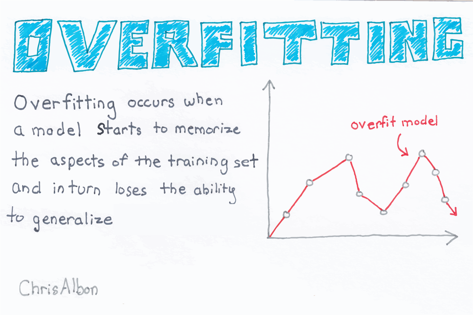 ] .pull-right[  ] .font60[Source: Chris Albon [@chrisalbon](https://twitter.com/chrisalbon) [MachineLearningFlashCards.com](https://machinelearningflashcards.com)] --- # Loess Regression ``` r ggplot(reportCard, aes(x=Pass2012, y=Pass2013)) + geom_point(alpha=0.2) + geom_smooth(method='lm', formula=y~poly(x,2,raw=TRUE), size=2, se=FALSE) + geom_smooth(method='loess', formula = y ~ x, size=2, se=FALSE, color = 'purple') + coord_equal() + ylim(c(0,100)) + xlim(c(0,100)) ``` .pull-left[ <img src="08-Linear_Regression_files/figure-html/unnamed-chunk-60-1.png" style="display: block; margin: auto;" /> ] .pull-right[ ``` r library('VisualStats') library('ShinyDemo') shiny_demo('loess', package = 'VisualStats') ``` See this site for more info: https://visualstats.bryer.org/loess.html ] --- # Shiny App ``` r shiny::runGitHub('NYSchools','jbryer',subdir='NYSReportCard') ``` See also the Github repository for more information: https://github.com/jbryer/NYSchools --- class: left, font140 # One Minute Paper .pull-left[ 1. What was the most important thing you learned during this class? 2. What important question remains unanswered for you? ] .pull-right[ <img src="08-Linear_Regression_files/figure-html/unnamed-chunk-63-1.png" style="display: block; margin: auto;" /> ] https://forms.gle/sTwKB3HivjtbafBb7